
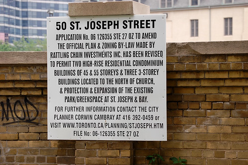
Toronto development application sign
A few months ago I bought myself a decent SLR camera, so I’ve been carrying it around. I often use it as a way of taking mental notes, and the sign in the photograph above is one such example. I took this picture of a Toronto development application sign in the Bay and Bloor area to remind myself to dig up a photo of a similar example in Vancouver that I took last summer.
It was also a reminder to write a post to register my utter contempt for the template used on Toronto’s development signs. It could be the worst example of the City’s communication materials. It lacks any kind of of visuals and the typography is horrendous. Its intended to tell the public about the future of this site, but the City has chosen to communicate that important information in the least graphically appealing option available to them.
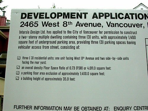
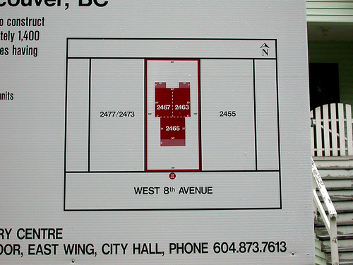
Now look at the Vancouver examples below: the difference in appearance is startling. These examples speaks volumes about the state of public communication in either city. A good template that displays the development application in a clear and precise manner should be the least we can expect from the City.
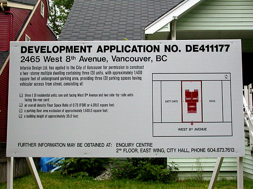
Vancouver development application sign
8 comments
I am frustrated by the lack of this kind of information in New York period. There is no mention at any construction site that I have noticed of what is going up, what is being demolished, who the architect is etc. There are permits for hoarding, scaffolding and the like but nothing to inform residents and neighbours about what is going up/coming down. I would love to see something like Vancouver’s development signs.
I live in Waterloo Region and the mandated development signage here is similarly awful; however, I always assumed it was not because they had a tin ear for typography and design but rather that they didn’t want anyone to pay attention to them; meeting the letter, but not the spirit, of the law. It would be interesting to see whether the Vancouver example is the result of a will to communicate or a clear procedural rules that requires such clarity.
I am a little bit insulted and perplexed when I see these signs advising of the “application” that has been made for a new building and then immedeiately behind it
is a sales center for said building already selling units.
Makes me wonder why it is even called an “application” at this stage and if I had legitimate questions or concerns could I even have them heard by the City in a serious fashion?
The battle over this particular site has raged for over 20 years. U of T wanted to build condos on what was then a green field, usually used for informal sports. The real estate crash finished off the condo idea but I see the green field became a parking lot with a greatly reduced green space.
The development signage in London, Ontario is even more cryptic: It just says “Possible Land Use Change” and lists a number for the City department that would presumably give you more information.
I usually take these signs to mean “Coming Soon”.
As Alex said, once you see the sign, very often the development is already going on, as if the sign was put up belatedly, or has been there for so long that the project is well underway and the sign is still there. Recently such signs appeared on the fringes of the parking lot on the west side of Church between King and Colborne.
The Toronto signs are ugly and poorly laid out, but what caught my eye on this one was the site-specific web address — not sure I’ve ever seen that before.
That’s a big improvement because I don’t want to call and talk to the planner, I just want to know what the thing will look like. And the web site the sign refers to has all that info. My only gripe is that it wasn’t updated to reflect what happened when the development went to community council.
How people are supposed to remember the web address without taking a picture of the sign, I don’t know.
I kinda find the Vancouver one to have really difficult to read type because it’s so small… but it does have more information on it.
mississauga has similar development signs as vancouver.
they could alias the website address to something like the file number, e.g. toronto.ca/planning/06126355 – a number which people could tap into their cellphones to check later at a computer.