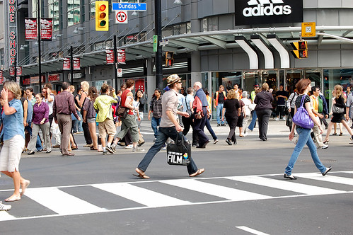
The scramble intersection at Yonge and Dundas was activated this morning. Pedestrians were slightly confused early on, but by the time the TV cameras and throngs of reporters and bloggers arrived for the 11am kick-off, most everyone understood what to do. City staff could be seen criss-crossing the street during the scramble signal to show other walkers that is was fine to cross the intersection in a diagonal manner.
There are two small improvements the City should consider as they study the intersection’s impact: extend the zebra stripes diagonally across the intersection (currently only three bars stretch toward the middle), and increase the size of the “priority crossing” sign (see photo below). The north-south and east-west crossings are clearly marked, so it only makes sense to do the same for diagonal crossings — this visual key could eliminate the use of police officers and transportation department staff almost immediately. As for the sign, it is so small that even a person with tremendous eye sight can hardly read it form across the street. It is not an internationally recognized wayfinding symbol, so the City needs to make it much larger to clearly communicate it’s intended meaning. And honestly, I think only the words “Pedestrian Priority Crossing” is all that is needed.
Lastly, an announcement can be heard coming out from the vertical poles telling pedestrians they can cross diagonally. But the quality of sound is horrendous and I could never actually discern what we were being told. I recognize this is for the visually impaired pedestrians and not folks like me, but I think a better sound system is needed or the creation of a scramble beep/sound should be considered.
Spacing is teaming up with photoblogger Sam Javanrouh to do a little something on the intersection. Keep an eye out for it over the next day or two.


14 comments
I was there this morning around 11 and noticed that the pedestrian signals were not yet adjusted. For example, if you are crossing Dundas north to south (or south to north) the pedestrian light soon starts its amber countdown. But why? At the end of the countdown, the ‘Don’t Walk’ hand appears for a few seconds then the ‘Walk’ sign because the scramble phase is next. The pedestrian light should stay ‘Walk’ all the time through both north-south and scramble. Otherwise, when it counts down, it’s telling pedestrians to clear the crosswalk when it’s not necessary.
Similarly, during the scramble phrase, the east west ‘Walk’ light should not countdown but remain ‘Walk’ as that is its next phase.
The Star has a video online now. Some comments from Kyle Rae, Gary Welsh, and a few others.
60,000 dollars for this! Wow. I am for it and think it is a great idea that I cannot figure out why it took so long to be implemented but that sure is a lot of money for a little bit of paint and some signals.
Cost include the new light signals, which are rather expensive. So is the cost of studying it. Its not an extra $60,000 but money allocated from the budget for staff, installation, study, etc. I’m always surprised by the cost of these things, but when it has been broken down for me it is never as bad as the number indicates.
Though, the cost of a bus shelter is something like $10,000 or $20,000 which is more than some cars. That blows my mind.
I imagine it’s at least partly due to the specialized nature of a lot of the equipment and parts.
I was there this afternoon! I must say it feels a bit odd being able to stroll right into the middle of the intersection, if you so chose. Feels unnatural. But cool.
Why did the City not do the pedestrian lines properly, to indicate the new design?
At 5:30pm there were alot of people standing at the north east and south west corners waiting for streetcars. When streetcar arrive every second one is being short turned. Dundas seems quite backed up streetcar and automobile wise.
The next step is not to add the full diagonal crossing lines but to actually change the whole pavement surface to something that says “hey, slow down, pedestrians all over the place here. This is people space, not car space”.
I’ve had experience with designing and implementing such a fix to a busy public intersection myself, and it was very successful due to the obvious visual cues provided. Complete change of auto and pedestrian behaviour, no signs needed.
I recommend using something like StreetPrint on all of the asphalt in the intersection (or around all of Dundas Square for that matter).
Also, if Toronto really wants to catch up to New York in the pedestrianization field, a program like this would be nice. T.O.’s streets are not as wide, limiting the opportunities, but surely there is room for a few bistro tables and bike lanes on some unloved patch of asphalt somewhere.
Further link to the above comment via NY Times article.
Nice article link uSky. I like how a motorcycle is parked in the green bike lane. Not sure about your Streetprint recommendation though. Looks cheap and doesn’t hold up well with snowplows. Be ‘honest with your materials’ they say.
If you want to follow a bit more of a discussion, head over to blogTO where I documented the first few hours’ use of the scramble crossing.
Here in Tamaki Auckland, Aotearoa NZ, we call these kinds of crossings a ‘Barnes Dance’. We have three of them, Wellesly St and Queen St, Victoria St and Queen St, and another one on Fort St and Customhouse Quay.
They work pretty well, and what’s amazing is how everyone crosses without nary a thought for anyone but there are no collisions as paths cross. I guess it’s because people automatically detect others from several metres away and either slow down or sped up to avoid collisions.
My goodness you do get excited about the least little thing in Toronto!
We have at least 10 such intersections in Montréal, not that we pay them much attention. Everyone knows that pedestrian signals are for tourists.
Please be sure to alert the ‘national’ media when you install your next 4-way stop sign, have a snow storm over 2 cm or any other such ‘world-class’ event.
You’re so very cute!