
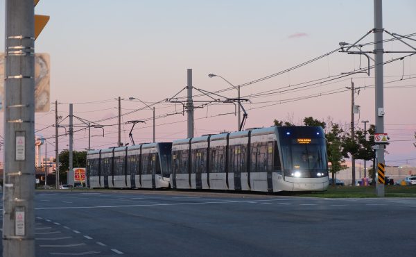
Street cars diverted by water project. Vintage buses zoom through part of this western route.
![]()
Street Scene will appear each week showcasing the illustrations of local artist Jerry Waese.

Canadian Urbanism Uncovered
Read more articles by Jerry Waese
Street cars diverted by water project. Vintage buses zoom through part of this western route.
![]()
Street Scene will appear each week showcasing the illustrations of local artist Jerry Waese.
As befits a fall when the Blue Jays have again become contenders, the $10 billion-plus question hanging over the soon-to-be-opened Crosstown LRT is...
By John Lorinc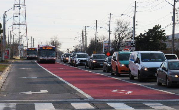
Transit planning is a long-term endeavour, not a one-time project with a single solution. In a municipal election year, we need to demand more from...
By Sean Marshall
5 comments
Great drawings. I like the vintage buses way better than the new ones.
Great drawing, but the vintage buses are a disaster! So much more noise and pollution pumping out of those things. I miss my streetcars.
Too bad Jerry wasn’t around to do these drawings back when all the PCCs were running. Those would be awesome drawings! The old bus is nice too, since they’ll soon be gone and left with a pile of ugly boxes on wheels.
the older vehicles seemed to have great design flourishes that the TTC designers colored boldly.
remember wine (red) + yellow (ocher) + black
it was a bit somber but very strong design.
the red white and black is working really well on most of the current fleet, but the big square shapes of the modern buses are not that great to draw.
Great capture of the classic “fishbowl” design, Jerry, my compliments.