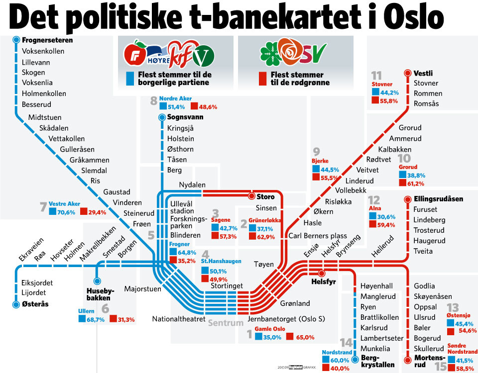
Norway recently had a federal election. The newspaper Dagbladet produced an interesting infographic to show how people voted: it took the Oslo subway map and colour-coded the lines to match the results (click on map to see larger version). This could be fun to apply to Toronto since our system is much wider and stretches into more ridings than Oslo. But realistically, since Toronto seems to consistently vote mostly Liberal with a smattering of NDP, it might end up being a boring map.
A political subway map
Read more articles by Matthew Blackett


16 comments
Toronto would need a sensible subway system in order for this kind of thing to work here.
It won’t be boring because of the distribution of votes, it’ll be boring because we have a comparatively lame subway…
The GO train map would probably look more interesting.
Even more boring in Buffalo, because (1) everyone votes Democrat; and (2) we have only one subway line, up and down Main Street.
Quick and very dirty. As you said, not so exciting.
Er, that would be:
http://i214.photobucket.com/albums/cc145/the_breen/ttc-ridings.jpg
Per Andrew’s comment, here’s a quicky GO train one. As he hinted, on the commuter train scale you begin to see some of the radial nuances of Tory support, with it generally fenced out of the GTA proper by the greenbelt (Thornhill and Mississauga-Erindale notwithstanding). Any guesses on how much work I’m getting done today?
http://i214.photobucket.com/albums/cc145/the_breen/go-ridings.jpg
(Yes, I know, it’s on an old version of the GO system map, but did you really need me to tell you Barrie voted Conservative?)
The Washington, D.C. area could do this, but it would be pretty boring as well — everything withing range of the Metro system would likely be Democratic and just about nothing Republican. I guess that’s what happens when your city is a one mill town and government is the mill….
Tom,
Barrie is actually a swing riding, they currently have a Liberal MPP – Aileen Carroll.
Also, is that based on Federal or Provincial election results? I assume Federal…
I’m not sure how to make one, but a map for Vancouver’s skytrain would actually look pretty neat, and probably include ridings from all three national parties with representation.
So even Oslo appears to have a more extensive subway system than Toronto. Also, can someone explain why so many cities build systems with radial lines converging at a central point, while in Toronto there seems to be a law that even the subways we dream of but never build have to follow roads on the surface grid plan.
Pman — unless they’re bored deep underground like in London, subways in other cities usually follow roads, too. The only difference is that in older cities, the main roads themselves are often radial and converge at a central point, so it’s much easier to make the subway do the same.
It’s also interesting that Oslo’s main political cleavage appears to be east vs. west as opposed to core vs. suburbs as is common in most North American cities. (Montreal is the most obvious exception here, but for unique linguistic reasons).
Oh, even London’s deep-bored lines still follow roads, mostly.
Toronto’s subway forms a grid because it was built after suburbanization had already taken hold. So, it was rrecognized that public transport had to let people get from one suburb to another and not just get ‘downtown’. Suburb-to-suburb transport is still often very difficult in many cities, including London.
Another reason Toronto’s subway is on a grid is that it acts as the trunk to which many buses and streetcars are the ‘branch’ lines. Most journeys involve both a surface trip AND a subway trip and this means that many of the people who USE a given station use it to transfer to a bus or streetcar that will take them to their homes. So, the majority of users of a station in Toronto such as, for instance Jane or Victoria Park may live very far away from the station and not be of the same political stripe as those who live next to the station.
Oslo reminds me of how the folks running the system here in Toronto think our commuters are too stupid to get on the right train. I’ve used Oslo’s subway system and six downtown stations have trains with SIX different destinations running through them on the same track. They seem to read the display on the platform and the front of the trains to catch the right train, but interlining seems to be the first step towards total chaos here in Toronto.
At the same time, we could learn much their transit network that includes a good tram network (see http://lrt.daxack.ca/Oslo/index.html for some photos) and a bus system that is phasing out the “next stop” signs that are fairly new here and replacing them with video screens showing the next three or four stops! Oh yea, the commuter rail network if fare-integrated with local transit systems as well.
As for someone who grew up in Manglerud/Ryen area (it’s the bottom-right line, right where the line turns from red to green), I must say I find it uncanny that the social divide I experienced during my childhood is being shown on the map. My high school was a mix of kids who lived in “social housing” and kids who lived in expensive suburban houses overlooking the Oslo-valley (downtown). Also, the camp that it’s east (“the poor”) vs. west (“the rich”) is also very true. So many fascinating things to read in a map….