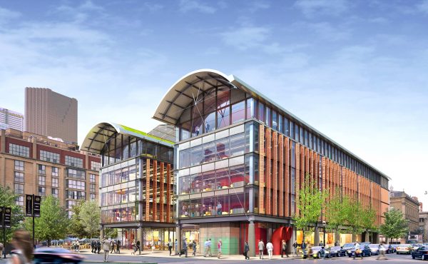
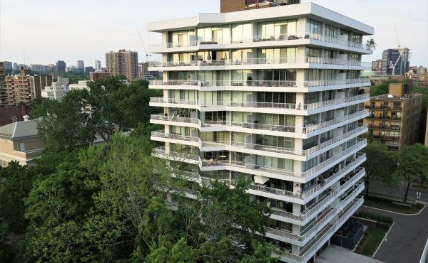
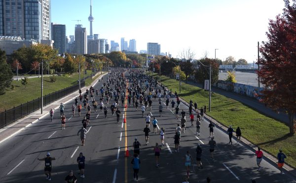
The image above, from the new plans for the Port Lands, reminded me that Mark Kingwell points out how the random people added into architectural renderings often bear little relation to how pedestrians in the real world might respond to those plans once built.
The city would have to do a lot of maintenance and programming work to get a relatively isolated lakefront promenade that busy on a snowy winter day. But this is by no means the worst example — at least the people in the image look like they belong. Some architecture images add people with little or no consideration of how people might actually use, or not use, the proposed space.
It would be nice if Photoshopping of people into architectural plans was controlled by some agency that analyzed how pedestrians would likely actually use it and added them in accordingly. Some of the more grandiose building plans, once shown denuded of people as they will be once built, might not end up looking so good.
In the absence of such an agency, it’s healthy to remember to always look at the pasted-in people in architectural renderings with a skeptical eye. Would people really walk there? Where would they come from? How would real people move in that space?
Here is the passage from Kingwell’s Concrete Reveries where he identifies this issue. He is referring more to models than to images; with images, the issue is not so much a lack of people, rather adding them too easily with no relation to the architecture:
In the theoretical discussions of architecture, often enough in the practice of architecture itself, there are, to put it bluntly, no people. Often despite genuine effort on the part of some, the drawings and models of the built environment’s creators act to reduce the streets surrounding a building to blank white avenues, denuded, pedestrian-free, neutron-bombed. Too often, depite Rossi- and Jacobs-influenced rhetoric of new urbanism, buildings are conceived and planned not as felt responses to need but as ordered patterns of intersecting planes and masses. Stylized plastic couples, a dog-walking hausfrau and a lone briefcase-toting businessman are glued down to show scale, but there is no sense of the teeming mass of people who might rush toward those doors every morning, jam together in those too-narrow corridors at break time or, perhaps worst of all, simply abandon that hopeful courtyard for the dead space it is.
Mark Kingwell, Concrete Reveries: Consciousness and the City, p. 140.


9 comments
“It would be nice if Photoshopping of people into architectural plans was controlled by some agency that analyzed how pedestrians would likely actually use it and added them in accordingly.”
Yes, we definitely need an expansive agency or organization to police architectural renderings for lifestyle depiction accuracy.
I wasn’t serious about the agency – I thought that was obvious. The point is, though, that it’s not just about “lifestyle”. Sprinkling people randomly can hide a plan that looks impressive but is poorly thought out in terms of creating lively, active public space.
In one of the renderings of the Fort York visitors centre you can see Gwenyth Paltrow and her kid playing. I think architects and designers tend to have fun with these renderings unbeknown to us. I know that in a few photo illustrations our artists have inserted their friends or even Spacing editors.
Matt
Spacing publisher
As an architect, I can confirm Matt’s theory that the “characters” inserted into renderings are sometimes entirely for our amusement. They also often reflect the poor decision-making caused by all-nighters or extended periods of extreme stress.
But we also get called out on our choices, whether it be people walking dogs (in parks where no dogs are allowed), cars going the wrong way (lots of one-way streets in Montreal), or people of non-neutral ethnicity (I kid you not; cf. the recent $100 bill controversy).
I’ve always been fond of renderings that include four-lane downtown streets with one or two cars on them.
I’ve always been annoyed at how everyone tends to be white, at least in projects in Toronto. That’s not how my city looks!
Good point by Val – as well as more people than perhaps likely, they often show fewer cars than likely. The good thing is, that perhaps points to people’s underlying preferences for how they would like streets and public spaces to be.
I will consider this more a presentation drawing (or situation drawings) with less architectural focus. The main purpose is to portray the ideal “feeling”. Only in more recent time it has become photorealistic. Some other styles can be more expressive that the viewers can understand as an interpretation that does not need to strictly reflect reality (flatten perspective, hand drawn, etc.).
I am seeing a trend to create these feeling type presentations for people not in the industry (ex. politicians, public). And often this kind of presentation will take a huge artistic license to SELL the idea. (Some condo ads are really good at this). They are fantasies. Lay people like fantasies / stories. And human characters are crucial in creating stories most people care about. Trying not to be too cynical.
(you can always bet there are babies or children in these kind of renderings)
I think this is more a reflection / result of the general trend in our contemporary culture. We need something saucy and easy to digest to get our attention. Immediate feeling and emotions are easiest for mass appeal. Combined with the fashionable photorealism, need to be social / popular, and an urgency to sell your idea. Cool headed analysis or anything that promote it are unfortunately just not as hip right now (to present to the public).
I’ve always thought that these renderings are half in jest. I recently worked on an interactive visualization project and right near the end I realized that the images wouldn’t be complete with some nice looking people. The only public domain people I could find in time were from a German design firm. So if you want to add some German people to the streets of Kitchener, ON, head over to civicimages.org and check it out.