

As I detailed in a previous post last week, I am responsible for designing the covers of Spacing. When we began the planning of our 10th anniversary issue one of my first ideas was to explore what Spacing‘s covers would have looked like if we had been around for 100 years instead of just 10.
For each decade, I’ve pretended our staff were covering significant topics and events in the city’s history. It was a fun exercise to mimic the typographic and graphic design styles of each era. For instance, in the 1910s my cover design focused on German measles and the German Kaiser. In the 1920s it was all about the car and fighting the Sunday closure of parks. In the 1940s, it was about dealing with the effects of returning soldiers. In the 1960s, the cover highlighted unrest in Yorkville, hippies, and park sit-ins. In the 70s it was all about stopping the Spadina Expressway.
Each cover has a write-up of what our editors at the time would have been exploring. I tried to be cheeky by including as many headlines about transit expansion plans that never saw the light of day. I also tried to make fun of ourselves: as an example, in our 1930s blurb, I claimed Spacing had to rent out part of our office to the Toronto Tuberculosis Vaccination League to pay our bills. I also claimed that “…the magazine was accused of employing Communist sympathizers when in 1935 Spacing endorsed soon-to-be mayor James Simpson, a labour and CCF supporter. Spacing’s printing press was smashed by a baton-wielding mob after Percy Parker, a leading Liberal, declared on the radio that “the bells of Moscow will ring when Spacing helps elect a mayor.” Parker did make such a hyperbolic claim, but it was actually, “the bells of Moscow will ring when Simpson is elected mayor.”
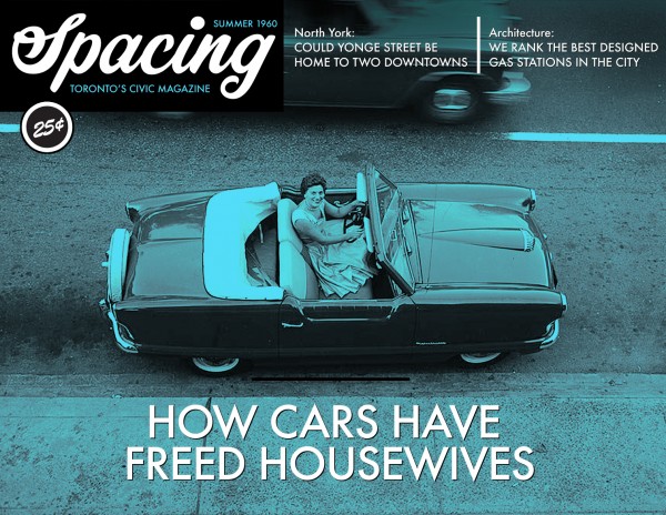
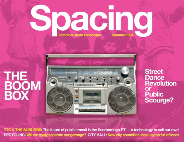
At the top of this page is a 1960 cover that didn’t make the cut into the magazine but I felt was worth sharing. Below is the 1980s cover and accompanying blurb.
From the issue:
The “greed is good” decade in Toronto came in stark contrast to the protests of the 1970s. The popularization of break-dancing and video arcades — and the resulting NIMBY backlash — occupied Spacing’s readers. But the influence of the suburbs on the built form of the city began to creep into the magazine’s pages. Also: an amazing new transit technology came to Scarborough!
To see all of our pretend cover designs you have to pick up a copy of the 10th anniversary issue at Chapters/Indigo stores across the country or at local Toronto locations such as Press Internationale, Book City, Type Books, Swipe Books and many other locations.


One comment
Re your logo design. Toronto is called ‘T-dot’ I initially thought it was a rhebus.