Four years ago, I wrote a piece explaining the different kinds of pedestrian buttons and how they work. The piece was in response to the introduction of audible signal buttons (technically “Accessible Pedestrian Signals” (APS)) – ones that only trigger the audible signal for visually impaired pedestrians – which caused a great deal of confusion because they were not distinguished from the existing buttons that trigger the walk signal.
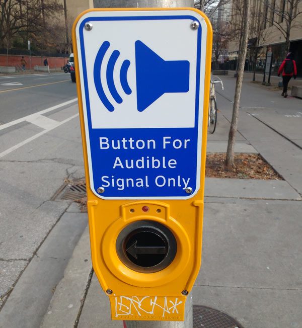
Four years later, the City of Toronto has finally introduced signs that distinguish these audible buttons from the pedestrian buttons you have to press to get the light to change and get the walk signal. But these “Button for audible signal only” signs have caused their own consternation, since many people didn’t realize there had been a difference all along (presumably they hadn’t read my previous explainer), but also because few people understand how the audible signal buttons function.
So here is an explainer about the audible signal buttons and the new signs.
Who are these signs for? How do visually impaired people find the button?
The new “Button for audible signal only” signs are for sighted people, to let them know they don’t have to press this particular button. It distinguishes these buttons from the other pedestrian buttons that you do have to press in order to get a walk signal.
Visually impaired people already know how to find the buttons and how they work. The buttons emit a low beeping sound that visually impaired people use to locate them. As well, the audible buttons are increasingly placed in predictable locations in relation to the sidewalk and crosswalk, making them easier to find for people who have a visual impairment.
Generally, the “audible only” signs can be found at major intersections, whereas the other buttons can be found at intersections between major and minor streets.
Why do we have audible buttons?
Accessible Pedestrian Signal buttons activate the audible traffic signals, which let visually impaired people, who cannot see the traffic lights, know when it is safe to cross the street. The sound is different in each direction (listen to them here). The buttons also provide a vibro-tactile output (i.e. they vibrate), to alert pedestrians with both sight and hearing loss that the light has changed. They are being rolled out very slowly across the city.
Accessible Pedestrian Signals are an essential part of making Toronto an accessible and safe city for visually impaired people, just like sidewalk curb cuts are essential for making Toronto accessible for people in wheelchairs. Modern signalized intersections in which the crossing times are adjusted to accommodate traffic flows, advance greens for turning vehicles, and leading pedestrian intervals, for example, mean that people who are blind cannot safely rely on the sound of moving traffic as an auditory cue to know when the light changes and they have the right of way. My colleague at Walk Toronto, Daniella Levy-Pinto, who is blind and walks with a guide dog, says “it is imperative to have accessible pedestrian signals at all intersections with traffic lights in Toronto, if pedestrians who are blind are to have equal benefits from pedestrian-friendly designs.”
Originally, some audible signals came on automatically, but the constantly repeating sounds triggered noise complaints from people living nearby — and most intersections in Toronto, even in commercial areas, have some people living nearby. As well, they could be aggravating for people who work nearby. So the buttons have been introduced so that the audible signals only come on when needed.
In other words, the audible signal buttons exist to make life easier for the people, almost all sighted, who live or work near major intersections. It would be much simpler for visually impaired people (unless they live or work near a major intersection, of course) if the audible signal came on automatically and they didn’t have to find and press the button, but allowances have been made for the comfort of other residents of the city.
The signals are also supposed to automatically adjust in volume depending on the ambient sound, so louder during the day and quieter at night, which is kind of cool.
I tried the audible button and it didn’t do anything
Audible signal buttons have to be pressed and held down for three seconds in order to be triggered – people with visual impairments already know how they work. An audible tone lets visually impaired people know that the audible signal has been activated.
In part this requirement is so that they don’t come on unnecessarily if someone just presses them randomly out of habit. But it’s also because the button design is the same as for the other buttons that you do have to press for a walk signal, and it’s a way for those buttons to differentiate between just a request for a walk signal (a tap) or a request for both a walk and an audible signal (a hold) (see below).
The buttons seem kind of klunky
It’s true, the heavy design doesn’t seem to be easy to hold for an extended period, as required to activate the signal. But this design was introduced in order to follow accessibility specifications that require (PDF) the tactile arrow in the middle of the button, to indicate the direction of travel for the button, and the vibro-tactile walk indicator feature.
One minor issue is that the light that indicates the button has been pressed goes on even if they’re just tapped and the audible signal isn’t really activated, which is a bit misleading for the sighted. This presumably happens because the same button design is used for both audible-only buttons and the ones that activate the walk signal (see below).
What about the buttons without this new sign?
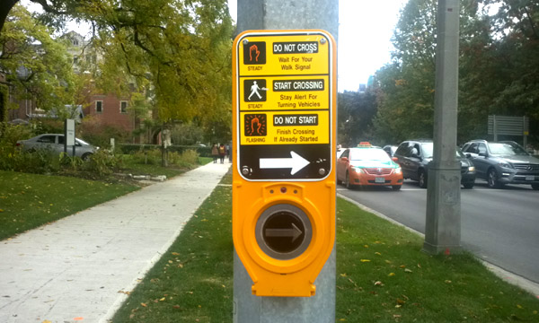
In places where you DO have to press the button to trigger the walk signal (“semi-actuated” signals), you will continue to see a traditional sign indicating you have to press the button. (There were a few reports of the audible-only sign being put on the wrong type of button, but those are apparently being rectified).
These walk-signal buttons are the same design because they do double-duty – they also work to trigger the audible signal, if you press them for long enough.
So, a quick tap of the button will trigger the walk signal, but not the audible signal. Holding the button will trigger both the walk signal and the audible signal.
Note, however, that some of these crossings still have older styles of buttons, which may not include the audible signal function yet.
These buttons can usually be found on minor streets when they cross major streets. In these cases, there may also be buttons in the major street direction, and those are “Audible only” (since that is the default green direction and you don’t need to press a button to get the light in that direction).
For more about semi-actuated signals, see my previous post.
Conclusion
The current confusion is largely a result of the City not being clear about the different types of buttons when the audible signal buttons were first rolled out. But, better late than never, so I’d say it’s a good thing the situation is at least being clarified now.
One positive to take from this button confusion is that it shows people in Toronto really do pay attention to their surroundings and their public infrastructure. People notice these small changes and want to understand how the city works. Ideally this response can be an incentive for the City to pay more attention to and take better care of the small details that shape our experience in public space.


2 comments
And here I was, all these years, wondering if the buttons were merely to placate the false impression of ‘having an input to the sequence’ if pressed.
You mean humans still have to press a button. Automobiles just have to position themselves behind the stop line. In Europe, and other cities (not Toronto), just the presence of a human at the corner will trigger a response. It would even lengthen or shorten the crossing time, or even cancel should they walk away. Sorry, not available in Toronto. Pedestrians are not important even, like automobiles are.