This week marks the third anniversary of the original COVID-19 coronavirus outbreak in Wuhan.
While many have moved on from COVID-19, as evidenced by the shedding of masks and the return of handshakes and hugs, the pandemic and its lingering after-effects remain in our midst. As we edge closer to 2023, the third calendar year of the pandemic, we have an opportunity to take stock of the pandemic’s trajectory and continued impacts on Toronto’s economic vibrancy. Examination of policy measures and pandemic-related metrics, in combination with data visualization, can shed light on our past, inform decisions about managing in the present, and help guide us to a more resilient future.
Early on, the pandemic surfaced critical challenges related to the collection and use of data, along with calls to leverage data for social good. Metrics that were regularly reported on, such as unemployment rates (Statistics Canada), average rents and home prices (Toronto Regional Real Estate Board), and transit ridership (Toronto Transit Commission), took on new meanings during the pandemic. Declining rents in Toronto, especially in studio-sized units in the city’s dense downtown core, signaled the damaging effects of the pandemic on the area’s attractiveness as a place to live. Transit ridership figures highlight the extent to which the pandemic has severely constrained transit use and revenues – and continues to do so.
Combining traditional data sets with novel data paints a fuller picture of pandemic distress and the contours of recovery. Real-time data — collected most prominently by private sector firms with large digital footprints such as those in finance, mobility services, real estate, retail and tech — was needed in order to better understand and triangulate, in real time, the extent of pandemic shocks to the city. Some firms provided data freely (eg: Avison Young Vitality Index), while others scaled up their data analytics operations through contracts with data users.
The duration and complexity of the pandemic makes it challenging to take a comprehensive look at the impacts of COVID-19 on Toronto. Through Toronto After the First Wave (my version of a COVID-19 passion project), we collected, monitored and visualized the impacts of COVID-19 on the city with respect to measures including public health, mobility, economy, housing and work. However, as the pandemic wore on, and the dashboard data grew, it became increasingly difficult to develop a concise yet comprehensive picture. This challenge prompted us to create a chart that tied together policy measures, pandemic spread and impacts in a single image.
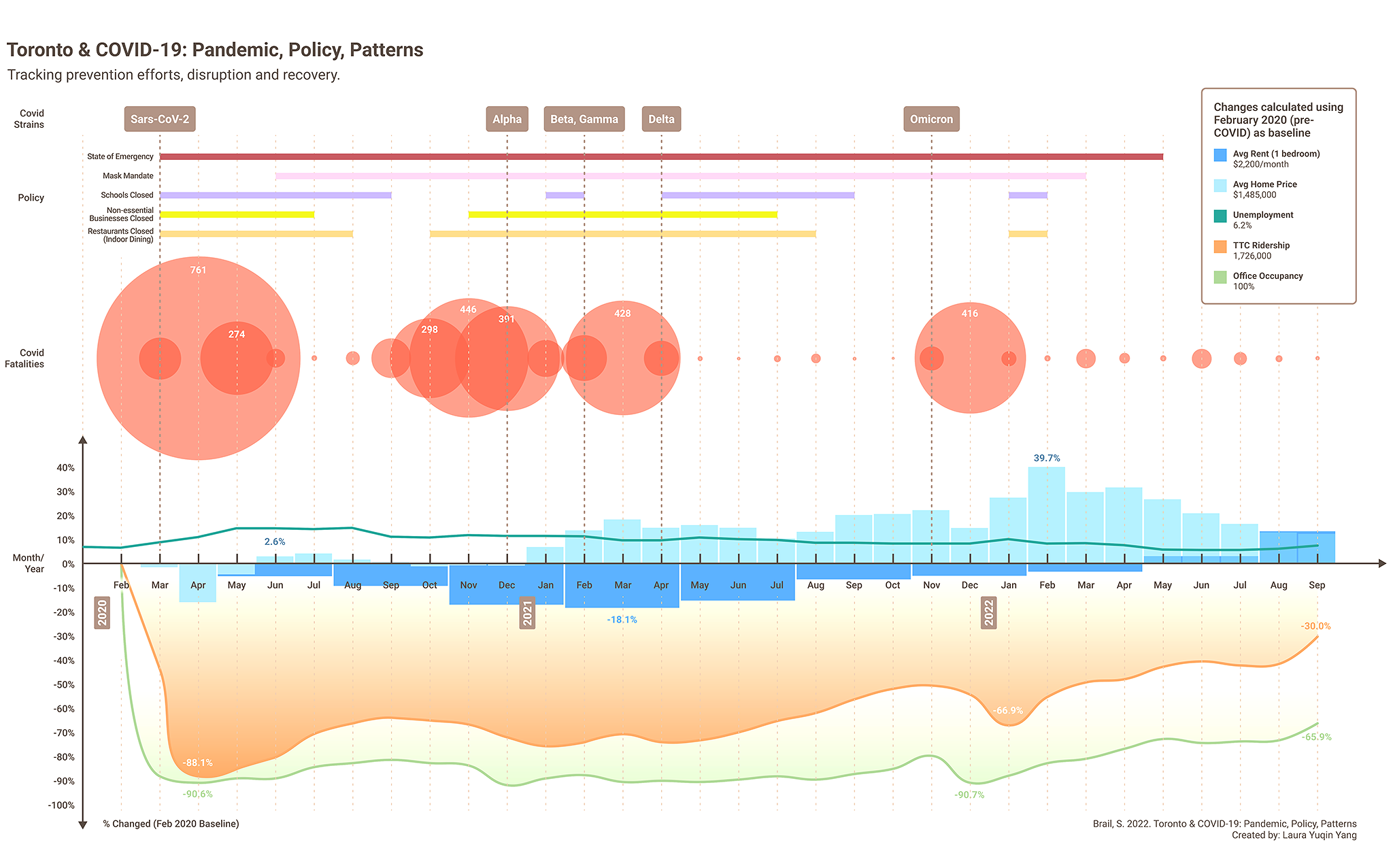
The graphic, Toronto & COVID-19: Pandemic, Policy, Patterns, reveals elements of Toronto’s pandemic story. Click on graphic to see larger image.
Creating the infographic required the collection and collation of information from the following sources: Avison Young Vitality Index, Canadian Institute for Health Information, City of Toronto, National Collaborating Centre for Infectious Diseases, Province of Ontario, Statistics Canada, Toronto After the First Wave, Toronto Regional Real Estate Board, and the Toronto Transit Commission.
In attempting to understand the implications of the pandemic on the city, it is obvious that access to data is insufficient. Public agencies should be required to share public data. For instance, to obtain the transit ridership data, we had to seek out the monthly TTC CEO report and manually enter the details into a spreadsheet. The TTC provided regular bi-weekly ridership updates in early fall, 2021, but then stopped abruptly around the same time as ridership increases slowed or reversed.
The quality of data changed too. For example, rules around who was eligible to receive a PCR test to determine if they have COVID-19 notably shifted during the pandemic. In Ontario, access to tests was limited initially, but then opened up. Provincial testing guidelines shifted once again though at the end of 2021 and most people were no longer eligible to be tested for COVID-19. As soon as this change was implemented, we could no longer use the number of positive PCR tests as a guide to the number of COVID-19 cases in the city. The number of fatalities is the only data point that is somewhat consistent across the duration of the pandemic, and even these figures are suspect.
This data shows us that the pandemic has been massively challenging for cities and urban life. At the start of the pandemic, from March to May 2020, we saw evidence of the city on pause and in crisis: the closure of schools to in-person learning, the closure of non-essential businesses to in-person activities, high numbers of fatalities. During this time, unemployment rose to over 14%, house prices and apartment rents declined, and TTC ridership and office occupancy bottomed out at -88.1% and -90.6% respectively.
There are important details that this infographic won’t tell us: for instance, the selected data does not say anything about the unequal impacts of the pandemic on the elderly, racialized populations, low income households, essential workers or the unhoused.
In the summer of 2020, the city experienced a reprieve from what was thought to be the worst of the pandemic. Policy measures were relaxed with respect to business closures, fatalities dropped, unemployment remained stable, and somewhat surprisingly, house prices began to increase. At the same time, apartment rents, TTC ridership and office occupancy all remained depressed.
As new COVID-19 strains emerged in the fall of 2020, the city returned to crisis mode, fatalities rise, and non-essential businesses are once again closed along with (temporarily) schools. The city entered what appeared to be a steady state of low transit ridership and office occupancy that lasted from November, 2020, to June, 2021.
Yet, hope was on the horizon. As vaccines were approved, procured and distributed across the city in the spring and summer of 2021 (albeit in a totally chaotic rollout), a sense of optimism spread throughout the city that the end of the pandemic might be near. Remember the gum commercial showing the joy of life, post-pandemic? It was released in May 2021.
In summer 2021, non-essential businesses re-opened, restaurants re-opened, and we started to see the recovery of apartment rents approaching pre-pandemic prices. Transit ridership rose (albeit slowly) and office occupancy climbed very slowly. While the city’s state of emergency and mask mandate remained in effect in the fall of 2021, schools went back to in-person learning while transit ridership and office occupancy rose to their highest levels in November, at 49.6% and 20.5% of pre-pandemic averages, respectively.
But after a period of relative pandemic calm, a new strain – Omicron – emerged in November 2021. It spread rapidly and evaded vaccination. Fatalities rose. Omicron decimated office occupancy and and transit ridership dropped.
However, we did not see sharp evidence of Omicron’s impact on unemployment, rents or house prices. In fact, house prices continued to rise precipitously across the country and especially in urban centres. The Bank of Canada made seven interest rate hikes in 2022, which have had the impact of dampening house prices and sales.
The relaxing of public health measures, such as indoor masking and reduced capacity in indoor spaces, as well as the end of Toronto’s state of emergency (after 777 days) in May, 2022, heralded the end of most COVID-19 related measures. Through September, 2022, the most visible lingering impact on the city based on this infographic is that transit ridership and office occupancy remain deflated and are expected to stay that way, possibly for years to come.
The speed with which emergency measures were enacted in Toronto, supported by all three levels of government, is credited with influencing both improved economic and public health outcomes, albeit unequally. At the same time, the city’s economic make-up is also understood to have slowed recovery.
As we plan for Toronto’s recovery and future, we need to prioritize data. Access to data, understanding of what datasets do and do not represent, and the resources needed to obtain, interpret and share data publicly are critical components in the creation of an adaptive and resilient city.
Shauna Brail is Associate Professor, Institute of Management & Innovation, University of Toronto Mississauga. Follow her on twitter at @shaunabrail