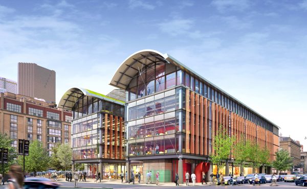
The designs of the four finalists in the competition to re-design Nathan Phillips Square will be presented to the public next week.
Tuesday, February 20, 2007
Toronto City Hall
100 Queen Street West6 – 7 p.m. Public Exhibition Opening
Main Floor Rotunda7 – 9 p.m. Design Team Presentations
Council ChamberThe public exhibition will remain on display at City Hall from Wednesday, February 21 to Monday, February 26, 2007, from 8 a.m. to 10 p.m. daily.
photo by Jacques Barbier on Flickr


9 comments
there better be some steps to sit on!
really my main hope is that the square is focused on the SE and SW corners, not the “middle of nowhere” entrance that is the main way to enter the square.
it would be awesome to have two really elegant entrances with large, graceful steps and accessible ramps, especially one at queen and bay to draw people from nathan phillips square, and they could ditch the yield sign for a flashing red light or a traffic light.
the huge bay st. crossing and little bus stop traffic island are so treacherous.
movable chairs would be a bonus.
er… draw people from the eaton centre*
Hey kevin ^ stop trying to turn toronto into NYC. Steps are nice, but that doesn’t mean they have to go at NPSq. The square is a modernist gem, and steps are colonial. I think the square’s modus operendi is anti-steps.
The benches (i.e. around the rink) are “steps” enough–although yes, at this time of the year they’re hogged by skaters so you can’t really lounge or gambol there. However, from what I can tell, KB’s main focus is on the outside-the-walkway zone–and yes, that’s where a little more licence might be granted. (I agree that the existing relationship to the Bay/Queen intersection is problematic–though the same can be said for Old City Hall, and you can blame WWI-era widening/jog elimination for that.)
“and they could ditch the yield sign for a flashing red light or a traffic light.”
But then again, the urban-signage-arcana conoisseur in me whimsically wishes there were some way to keep the amazingly still intact 60s-vintage black-and-white “No U Turn” sign along Bay…
I hope they don’t eliminate the walkway. Designers reports I’ve read talk about tearing it down to give an openness to the square… but the enclosure is what makes the square what it is. A certain something I cannot describe that without it it would be a concrete expanse.
What needs to be torn down is that sad excuse for a building that houses the skate rentals and washrooms. I’m certain they can replace it with something more functional, including a proper snack bar. A permanent stage platform would be nice, too.
At the very least they need to stop playing JACK FM over those speakers all day.
Jack FM is the big sound of the GTA!
Toronto is so good in so many ways, but its radio stinks. One of the things I miss most about Windsor is Detroit Radio.
Q107’s Psychedelic Sunday here is an exception.
The concrete barriers must go. In theory they are walkways, but in practice they serve no purpose whatsoever. Once the barriers are dismantled, a natural and attractive city square will reveal itself to all: New City Hall on the North, Osgoode Hall to the West, Old City Hall to the East, and the Hotel on the South.
What elements ought to be included in the new design? Very simple: trees, footpaths, open spaces for gatherings and concerts, flowers and bushes, public art, and places to sit, including lots of benches. And the ice rink, of course. But no funny stuff, like in Mel Lastman Square. When it comes to city squares or plazas, there is no need to re-invent the wheel. In my view, the most convivial urban public spaces are the simple yet elegant plazas in Latin American cities and towns.
Adam Giambrone likes the barriers. He wants to keep them because they are part of the city´s architectural legacy. But the barriers were a mistake. There is no doubt that we must preserve the city´s architectural heritage, but we don’t need to maintain an archive of Toronto´s architectural errors. Let them go Adam, let them go.
whats NYC got to do with it?
I live in NYC and if we had a masterpiece like City Hall and someone tried to “update it” there’d be a riot.
so glad i left the culture wasteland that is Toronto when i read things like this.
disgraceful.