Cross-posted from No Mean City, Alex’s personal blog on architecture
To make a good building, it takes a good architect and also a good client, who’s ready to be open-minded and to push a specific agenda. Those clients are usually found in predictable design ghettos – like high-end retail – so when an architect produces creative, thoughtful work in a more challenging arena, I’m intrigued.
That’s the case with the Centre For Native Family and Child Well Being in Toronto, by Levitt Goodman Architects.
I recently wrote about one portion of the building, its Longhouse, for the Dutch journal Frame. Link here. But the building as a whole deserves a good look.
The centre is run by Native Child and Family Services, a social services agency in Toronto. They needed to be downtown to serve their clients, but they are not richly funded. So the organization bought a fixer-upper – a 1980s spec office building here – and hired Levitt Goodman Architects to convert it for their purposes: a childcare centre, an artists’ studio, an addiction and mental health care clinic, family services and administrative offices. For this 30,000-square-foot building, the budget was $5.8-million Canadian – or less than $200 per square foot, a low number for Toronto.
And yet the results are spectacular.
Levitt Goodman embraced the limits of the project: they stripped the building back to its bones, and in many cases left them visible. The concrete floors were polished; concrete ceilings, with pipes and conduits, left exposed. These moves add a loft-like roughness and informality that suits the institution and its clients. You can see that in this picture of an office floor, above – along with the open atrium that LGA carved through the building, including a green wall. You can also see round meeting rooms, trimmed in birch plywood and surrounded by windows; and the warm colour palette.
There are supergraphics printed on the glass office partitions (by Adams + Associates Design Consultants with 7th Generation Image Makers). All of this is intended to create, as project architect Danny Bartman told me, a “pan-aboriginal” feeling. “It was important to leave it open a bit, culturally,” he says, since the agency serves people with roots in many different first nations. NCFS Toronto’s executive director, Kenn Richard, says the effect is to make his clients much more comfortable than they would be in a more conventional office environement.
One highlight, and the subject of my story for Frame is the Longhouse, above. It’s a modern version of the traditional community meeting place. Here that structure is located in the middle of the office-building lobby, and it provides a space for spiritual ceremonies, but also for private counselling and more informal meetings. It is iconic – an oval construction of traditional materials (largely cedar) used for a traditional purpose, but its structural arches were computer-modelled and fabricated. (And the light fixtures, by local design firm Castor, incorporate recycled cut-up fluorescent tubes that serve as shades.)
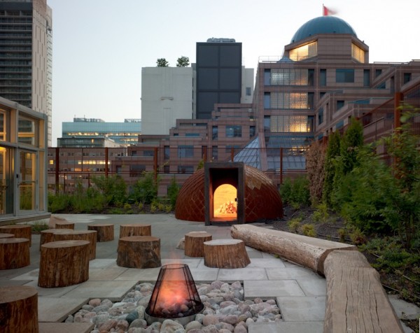
I was just as impressed by the roof garden, designed with Scott Torrance Landscape Architect. It includes a green roof, a fire pit and a sweat lodge – all beautifully designed and executed.
There are plantings of traditional crops, including sage, tobacco, corn, squash and sweetgrass.
Up here on the roof, there’s a remarkable sense of being separate from the city and yet surrounded by it, as condo towers, apartment blocks – and police headquarters – reach for the sky all around. As Richard and Bartman walked me around the rooftop, it struck me as one of Toronto’s most unusual spots: this building brings its own, special sense of place, providing a warm gathering place that any community would be glad to call its own.
(All photos: Ben Rahn/A-Frame)


One comment
It looks great and shows that you can get great design with some ambition, even if your budget isn’t above average. We need to end this ghettoization of design.