
Cross-posted from No Mean City, Alex’s personal blog on architecture.
![]()
Recently the Zerofootprint Re-Skinning Awards announced this year’s winners – building projects that update older structures and improve their environmental performance, as well as their aesthetics, and set an example for how cities can be greened. It’s an interesting prize and it recognizes some very worthy projects that might otherwise go unnoticed.
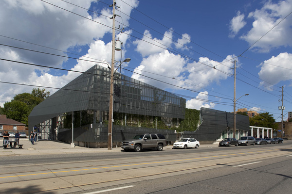
For instance: the Centre for Justice Leadership at Humber College, by Gow Hastings Architects of Toronto. Located at the college’s Lakeshore campus in an older suburban neighbourhood, this 18,000-square-foot building is a former car dealership transformed into a facility for police and justice services programs.
The big move here is the front facade: a perforated aluminum wall that provides sunshading – partially covering up the building’s large showroom windows. The green climbing gardens (or “living wall”) also help provide shade. It’s a bit of industrial-chic clearly inspired by the work of Southern California architects like Morphosis and Eric Owen Moss, and it fits well here, on a heavily-trafficked, low-density boulevard that feels a bit like Los Angeles.


At night the building radiates an ambient glow from an LED sign behind the screen.

Inside, the car dealership’s garage became a 45-seat lecture theatre, built around a simulated one-bedroom apartment for the reenactment of crime scenes. (This is real-life CSI stuff.)

You may not have heard of Gow Hastings, and that’s because they have a very specific niche: buildings and interiors for post-secondary schools, especially for vocational programs. These are generally low-profile and low-budget, yet they’ve delivered very high-quality spaces.
Partners (and married couple) Valerie Gow and Philip Hastings both have long experience in London, in B.C. and in other Toronto offices including KPMB. They collaborated on the Centre for Hospitality and Culinary Arts at George Brown College, which I wrote about here (PDF). Their interior for the Chefs’ House restaurant, in particular, is creative, visually powerful and beautifully detailed.
In the public sector, excellent design tends to be concentrated in showpiece buildings. But with the right architects, small projects like this, in unattractive settings, can become little jewels.


4 comments
Reminds me of the police stations of old in Northern Ireland, which were similar mesh covered. In those cases, though, it was to protect against mortar attacks.
Gorgeous, absolutely gorgeous. And to think it is a reuse to boot!
Only issue is not with the building but Toronto’s craptacular streetscape. Where are the street trees? Why are there wooden telegraph, er, telephone poles? The setting is pure concrete and asphalt and absolutely bottom-of-the-barrel. What a shame.
I hope it’s included in next year’s Doors Open!
I go to school there and my classes are in that building. There is nothing worth seeing except classrooms.