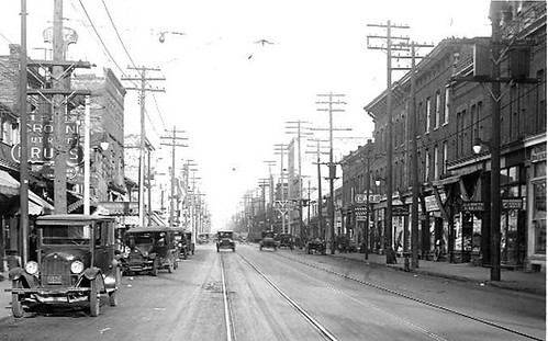
Looking east on Queen Street from Bathurst Street, 1924. The three- storey and two-storey buildings on the right were destroyed in the fire.

Media coverage of the fire on Queen West noted the historic nature of the buildings, and the considerable loss of the built fabric of Queen Street West. The loss of the personal contents of those buildings is nothing short of tragic, and downright scary. The loss of the buildings themselves is less personal — but significant, nonetheless, to our public space.
As far as city tax assessment records tell, all of the destroyed buildings were over 130 years old. When the three-storey buildings housing Duke’s and Suspect Video were built in 1875-6, the row of two-storey shops to the east was already there. All were constructed in a simple Italianate commercial style — common to many old commercial streets in this province, and one that we have grown to cherish for its human scale and charm. They were defined (even more so in their final moments after the fire) by their tall window openings, decoratively crowned with slight brick arches, regularly repeating above the shops on the main floor below. Overhanging cornices capped the roof-lines, giving a sense of finish to the buildings, and a sense of shelter to the pedestrians below.
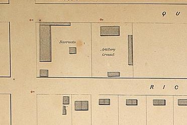
As most of the media outlets picked up, the buildings’ value went beyond their architecture. It was also attached to their history of occupancy — to the human story behind them, and the human usage of the spaces within. The focus on the history of Duke’s made that important point clear. When these buildings were constructed in the 1860s and 1870s, Queen Street was still in the process of build-up. Part of the Military Reserve around Fort York (and therefore restricted from development) until the mid-1830s, the south-east corner of Bathurst and Queen Streets was still the site of some barracks and an “artillery ground†in 1858. A decade later, local residential development had just reached the critical mass necessary to support continuous rows of shops along this stretch of Queen.

Southeast corner of Bathurst and Queen from Boulton’s Atlas of 1858 (Toronto Public Library)
When that critical mass was reached, Torontonians with enough cash-in-hand to speculate on real-estate bought the lots, built buildings, then rented or sold them. The Suspect building, for example, was built for John H. Swan, owner of a “Juvenile Clothing and Ladies Outfitting and Baby Linen†shop on King Street. Swan rented his building to Frederick Cooper’s Dry Goods/furniture shop, and to William Lumber’s Grocery shop. By 1885, those two had been replaced by Hosier’s furniture store, and a restaurant owned by Mrs. M.A. Gipson. By 1914, they were both occupied by James Smith’s restaurant. And the story goes on.
Likewise, Duke’s former building was constructed in 1875-6 for George Faulkner, owner of a “boot and shoe†store on King Street. The half of the building at #623 was eventually purchased by J. Carolan for his “Flour and Feed†shop. Carolan’s shop was still there roughly when Duke’s began.
With the loss of those ordinary but lovely heritage buildings, we lost a touchstone, in brick and wood and decorative plaster, of the people that have given them life.
But the buildings’ heritage value was broader yet. As many have noted, the lost buildings were all recently designated under the Ontario Heritage Act as part of the Queen Street West Heritage Conservation District. As with all buildings in heritage conservation districts, they were protected by law not just for their individual historical merit, but for their contribution to the historic streetscape. In their setback from the street, their 2-3 storey height, their dense, 4-7 meter wide shop fronts running continuously along the street, their recessed shop doors — these buildings maintained and enhanced a streetscape that was warm, vital, and historic. As Councillor Adam Vaughan said, their loss, indeed, “punches a hole in the heart of Queen Street.â€
Their heritage designation, however, goes some way to protecting the future of their building sites. Heritage Conservation Districts such as that on Queen West don’t just protect old buildings — they protect the character of a streetscape. Like the Home Depot down the road, in other words, developers of these once again vacant lots will need to work with clear legal guidelines regulating new construction in the area. While the Italianate buildings of George Faulkner and John Swan are gone, new buildings will have to respect the general character of the street they helped to shape over 130 years ago.
At least, that’s if the legislation holds.
photo by Toronto Archives, Fonds 1244, series 0071, item 3458)


6 comments
Could someone clarify the 1st picture?
Should it say looking East?
Well put Gary! I’m interested to see how a Home Depot will be able to fit into the context of the street and how effective the law will be in making it do so.
The home depot doesn’t fit in, but that doesnt’t matter it seems.The new buildings are monotonous facades that are more interested in using the interior space for retail rather than the atmosphere at street level.Look what happened on Yonge street when thew eaton centre went in. The streetscape became inhospitable and just a fastway to nowhere.Little more than a smooth surface to go un-noticed and meant to “get you off the street”.Queen street west is all about the pedestrian and the new developments encouraged by our local councillors just don’t “fit in”.
George continues to embarrass himself by writing about things he obviously has little depth or knowledge. The Home Depot will not be like the Eaton’s Centre and has a good amount of retail at street level (with condos above).
I’m not a fan of the building’s aethstetics, but it isn’t what Curious George paints it out to be. the HomeDepot may end up being the best example of big box fitting into an urban neighbourhood.
Don’t get me wrong, I’d rather have a better designed building with better types of retail but it will not ruin Queen’s streetscape. The community has been involved and the developer has been approachable and accomodating. I just wish they had turned the parking lot into a civic square.
Wishing to put in a word for the potential capabilities of architecture, i am frequently annoyed, when attending community meetings to discuss potential redevelopment, by the prevailing attitude that only ‘wonderful’ old ‘period’ design is acceptable, and anything else would be drab, ugly and artless.
Good architecture (admittedly quite rare!) defines the nature of the space it is creating and gives it a new life which relates to the time in which it is built.
Rather than reproducing the style of the facades that were destroyed, regardless of how worthy they were or were not, i would like to consider the possibility that, if in a hundred plus years, these new 2008/9 additions to the modern streetscape of Queen West were to be tragically burned to the ground, they too would be missed!
Actually, in a circumstance like this, I think that resurrecting a fair bit of what was there is an acceptable option; that is, resurrecting *the actual facades*, as opposed to “the style of the facades”, “period design”, etc. True, it might dismay a few anti-faux architectural progressives at one end, or a few anti-facadectomists at the other. However, in light of the strip’s current heritage-district symbolism, such a measure takes on more of an “Old Town Warsaw” heroicism, and to brush it off as a retrogressive measure misses the point. (NB: it needn’t involve resurrecting things exactly as they were; properly neutral additions/replacements and on-site intensification are acceptable–it’s in *those* portions where one must avoid the temptation to faux it up.)
Then there’s an opposite “acceptable” option which I’ve suggested before: rather than replication of the old, replacing the entire strip in a thoroughly contemporary and, perhaps, “Alsopian” spirit. The pitfall there, though, could be excessive self-consciousness, a la the queasiness Alsop’s Westside Lofts office leaves among some in the community–IOW less a genuine organic outgrowth of Queen’s Queen Streetness, than an invented “Richard Florida” idealistic fantasy thereof.
As far as real or potential negative examples to keep in mind…
(1) the Queen/Beverley HMV, illustrating the corporate-mummification pitfalls behind rawly resurrecting what had existed previously…
(2) the recent replacement of HMV’s burnt neighbour: “well-mannered” as it may be, it’s a perfect illustration of how faux Victorian can be a pallid substitute for real (even resurrected-real) Victorian; and also perfect fuel for those who, like Bruce Gavin Ward, recognize “period design” as the half-baked populist reflex it is…
(3) the giant-shop-window “contemporary” of H&M, American Apparel, etc. As “honest” and “of our time” as it may be, we must remember that it’s this incursion which sparked the historic-district crusade–under the circumstances, to replace the burnt strip with H&Mness writ large seems, somehow, like pouring salt in the wound. (Even if the giant-shop-window aesthetic has its ironic Edwardian ancestor a few doors away, i.e. the Burroughes Furniture building.)