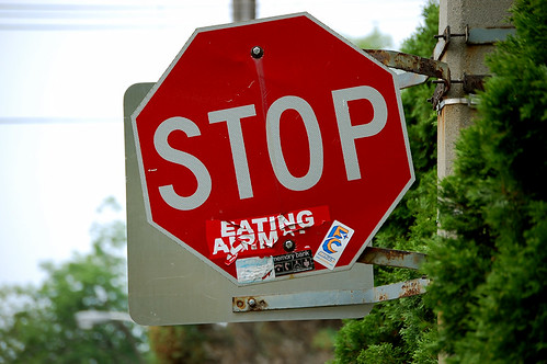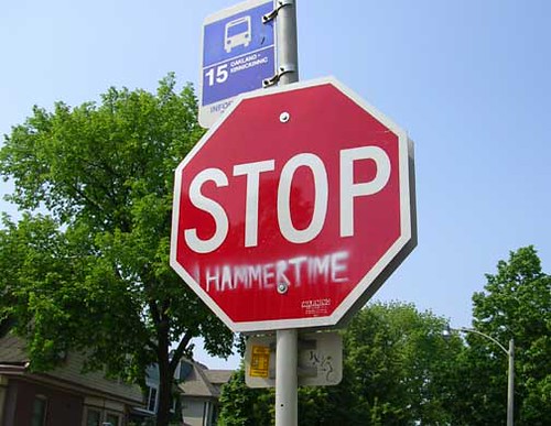
One of my favourite forms of graffiti art is the alteration of the stop sign. It provides a very prominent platform for anyone who has a desire to express a political or social message. Probably the most common sticker I’ve seen attached is “Stop Eating Animals”, but during my road trip across America in April “Stop The War” was also widely displayed.
A search of Flickr revealed a handful of groups focused on the Stop sign alteration. Some where political, while others were quite clever.

photo by Wedge

photo by Clint Decker

photo by Richard Moross


20 comments
feh.
Where’s my “moaning” stencil?
“Stop … Hammertime” is great. Otherwise they tend to be obnoxious and whiny. The “Stop … Eating Animals” one always makes me hungry for veal chops.
Close to home is this one on Augusta:
http://www.flickr.com/photos/tlonista/1004266160/
And “Hammer Time” seems popular, I shot this one in New Orleans:
http://www.flickr.com/photos/egnaro/2652057416/in/set-72157606055199030/
The most common one on Long Island is certainly “Driving SUV’s” but over time people have covered the SUV part with red lipstick.
I like the “Stop, Really” at Woodmount and Mortimer. I think it actually works, too.
Are you not the least bit uneasy that this supports vandalism? The very street where Spacing is located is disgracefully covered in graffiti. Promoting such blight is stupid. Shame on Spacing.
I first saw these in Toronto in the Carleton Village area near St. Clair and Old Weston Road.
One was Stop
Racism
Thanks for the moralizing comment, Glen. I suspect there will always be those who see any form of graffiti as vandalism.
But what I like about the STOP signs is that no one ever covers up to most important part of the sign: STOP. its usually integral to the graffiti and it rarely, if ever, detracts from the purpose of the STOP sign. You could even remove the word STOP and just keep the red octagon and people would obey it.
And I don’t think Spacing is actively promoting this “blight”, since I saw nowhere in this post stating “go out and paint STOP signs”. There’s a difference between appreciation and promotion. But I think Glen sees this as a black & white issue, which is fair enough, so any form of nuance on this topic will be lost on him.
How about the old Montreal version:
STOP turned into
101
Good old ‘loi 101’. Reminds me of my early-90s days at McGill. Should have bought property then when it was worth nothing due to ‘law 401’, as in get on the 401 and out of here.
Nearly all of my Jewish friends in Toronto have roots in Montreal, but their families left after the ‘Quiet Revolution’. Paranoid in retrospect, but one bout of 20th century nationalism almost did European Jewry in. Besides, ‘Quebec for Quebecois’ banners at St.J.P. marches, and Parizeau’s losing ‘money and ethnic vote’ speech, makes even this anglo not want to move back.
Very glad to have a French Quebec in Canada, esp as they lead on social policy, which keeps us from becoming like America, or Alberta. However, wish the uglier aspects of Quebecois pride were much less tolerated within their own community.
This reminds me of the time, a few years ago now, when some wag painted over the lower half of a pedestrian signal – the orange part with the hand – in black paint. Then, they stencilled out the word “DANCE” where the hand used to be. (This was the signal at northeast corner of Queen’s Park circle, leading to Victoria College.)
So, when it was time to walk, the little white pedestrian would be illuminated. Then, when it was time to walk faster, the signal would start flashing “DANCE – DANCE – DANCE – DANCE!”
The political and “clever” messages on STOP signs are all very amusing.
However, if any of this graffiti detracts from the original intention of the signs and creates an unsafe intersection, then strict policing of the practice is necessary.
Some vandals have even removed STOP signs – with tragic results.
Messing with public safety is no laughing matter!
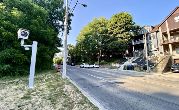
I think the signs are fun, and I don’t have a problem with graffiti, but as a constant pedestrian I want to make sure the stop signs are as visible as possible, and without distraction. Of course I would accept the addition – Stop (photo radar).
These signs are quite common in Berkeley, Calif. The STOP portion of the sign is not tampered with; there’s just a clever add-on beneath it.
Actually, speaking of Montreal, the best ones are when they turn ARRET into A R T
These are almost all lame vehicles for teenage expression. I’m pretty sure low public opinion of the Bush presidency was not ignited by something a 14 year-old stencilled on a traffic sign.
The first time I ever saw a converted STOP sign was in Washington DC in the 1980s, where many had been made to read:
STOP U.S. WAR IN EL SALVADOR
When I lived near McGill, I saw that one of the “ARRà ŠT” signs had been made to say “ARRà ŠT EATING ANIMALS”, which is so horribly ungrammatical that it almost doesn’t make sense. (For a start, “arrà ªt” is the noun form of “stop”, not the verb form.)
As a vegetarian myself, I choose to believe that the graffiti artist was being deliberately absurd rather than just ignorant.
I’ve got a “Hammer Time” right outside my house, at the intersection of Aldwych and Eaton Avenues.
http://i2.photobucket.com/albums/y50/RuddyRuddy/stop.jpg
If you ever see it, I’ll be the guy in the yard nearby wearing the golden parachute pants.
also the walking sign
ttp://www.mwarchitects.com.au