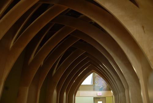
This morning I had a chance to get a sneak peak at the Dufferin/St. Clair Library’s just-completed renovations. The construction has lasted for 15 months and had a budget of $2.54 million. There’s a public open house to show off the new look of the library on Tuesday, October 28 starting at 4 pm.
The library opened in 1921 and was originally named the Earlscourt branch. The branch is now listed as a historical building by the City of Toronto and will be receiving a commemorating plaque during the official re-opening ceremony. Between 1925 and 1932 artists George A. Reid and Doris McCarthy painted large, literary-themed murals which were eventually covered up in a 1964 renovation and hidden from view for over 30 years.
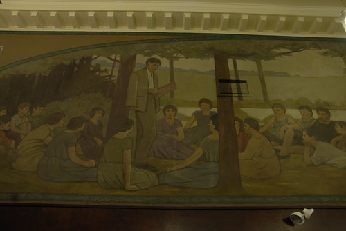
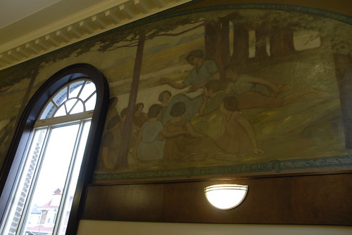
One of the big changes of the recent renovation was to restore the murals and have the work highlighted by both natural and artificial light. The murals have become design focal points once again in the adult area as well as the KidsStop room — an interactive area that focuses on helping parents teach their young children the building blocks of reading.
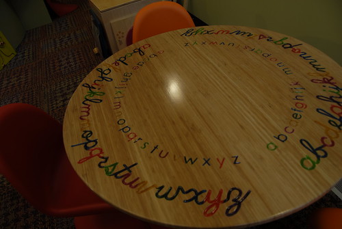
The theme for the KidsStop room is an enchanted forest. From the tree-canopy-and-starry-sky entrance to the castle shaped puppet theatre, the room’s design has been constructed to engage and entertain children. The focal point of the room will be a long wooden dragon (designed from the Robert Munsch’s The Paper Bag Princess — the library actually obtained the rights to use the dragon’s likeness) which will display books and interactive learning games. Unfortunately, the dragon was not completed at the time of my visit.


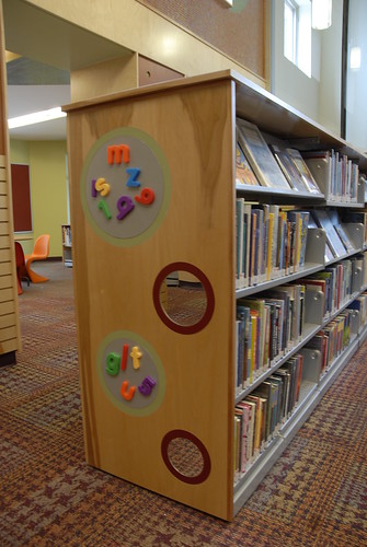
The murals surrounding the KidsStop are all classic fairy tale scenes from stories like Hansel and Gretel, Puss ‘n’ Boots, and Jack and the Beanstalk. Between the KidsStop room and the main enterance is another childrens space featuring low shelves, colourful seating and magnetised letter boards. A seperate section in one of the newer extensions features a small lounge for preschoolers.
Across the entrance hall, in the north half of the building resides the adult and teen sections. The design here has transitioned to a more mature look, but flows nicely with the child area. The idea behind the design of the adult area is to make the space feel like home, and they seemed to have succeeded in this with cozy seating areas and even an electric fireplace that sits in the building’s original hearth. Earthy tones replace the bright colours of the kiddie section and scone lights on the walls highlight the Reid murals adding a warm element to the room.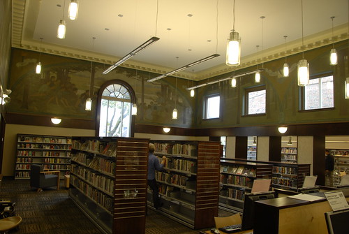
The teen room is situated behind the customer service desk and was specifically spaced away from the kids area to make it more of a space they can call their own. Though the Dufferin/St. Clair branch wasn’t able to include video game systems in the renovations like some other locations have, the teen room will have a television set as well as its own group of computers.
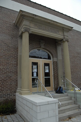
The outside of the library has been reconstructed to the original 1921 facade. Major restoration work was done on the front pillars which were severely crumbled due to time and erosion from road salt. Wheelchair access has been moved to the building’s south entrance and goes along a bright, open ramp to meet with the main hall.
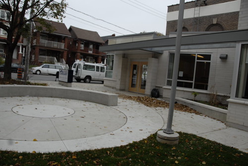
An outside seating area by the south entrance has been built and the Wi-Fi service reaches out to include this area. Although it’s getting late in the year now, through the summer this seating area should recieve some privacy from busy Dufferin Street when the gardens bloom again.
Other services that have been introduced or updated at this branch include: self-service checkouts, new computer work stations, a new “just returned” section that should save visitors from having to dig through trolley after trolley, as well as over 10, 000 new books, CDs, DVDs, and magazines.


7 comments
Looks great — yet again the TPL really seems to get the importance of high-quality public space.
Was there not a large decorative cornice where the flat stucco band now resides?
It looks absolutely wonderful. So happen to have this branch re-opening soon!
TPL really contrasts with the TTC. It’s obviously apples and oranges in terms of the services they deliver, yet one group clearly takes aesthetics into consideration and adds the frills that make using the service comfortable and enjoyable. Recent accomplishments of our libraries like this renovation are something the city can be proud of.
I heard about this redevelopment during a visit as part of Jane’s Walk a couple of years ago. Hopefully I’ll find time soon to go see what’s changed.
Fantastic. TPL really seems to do their renovations exceptional justice.
We’ve been watching the progress of this building over the past several months and can’t wait to see it completed! It’s right at the end of our street as well. The pictures look absolutely stunning.