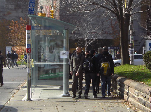
In October, I wrote a post about how, on narrow sidewalks, the new transit shelters being installed by the city as part of the new street furniture program were leaving very narrow passages for pedestrians to get by in some locations where sidewalks were relatively narrow.
At the Toronto Pedestrian Committee meeting yesterday, City staffer Kyp Perikleous, who manages the street furniture program, explained the process and considerations that go into placing the new shelters and other street furniture.
Although his office is placing something like 50 or more new pieces of street furniture a week in the city, each one goes through a extensive process of planning and vetting, both by city staff and IBI, an engineering consultancy retained by Astral (the company that won the street furniture contract).
The City is supposed to use its new “Vibrant Streets” guidelines to ensure that all sidewalks have a wide and straight “clearway” so that pedestrians can walk easily along the sidewalk without having to dodge obstacles.
However, he added that, while the city ideally seeks 2 metres or more of sidewalk clearway, the minimum required by the guidelines is only 1.525 metres, and they will go down to that if they feel it is necessary. He gave the example of a stop on Queen Street where they know that over 300 transit users a day get on at that stop, and therefore installed a full-sized enclosed shelter even though it left barely the minimum clearway (they have received several complaints about this narrow sidewalk).
Committee member Roger Brook pointedly asked if they had measured the number of pedestrians walking by at that location. City staff did not have that number.
Another issue is the amount of space between the edge of the shelter and the road itself (when the shelter is placed on the road side of the sidewalk). The city requires any street furniture to be at least 0.6 metres from the edge of the curb. This requirement is in place because buses and other vehicles turning into the curb lane in order to stop will overhang the curb as they turn in, and also to allow space for wide truck rear-view mirrors. When asked why some of the new shelters were set in more deeply, along the lines of 0.9 metres, Perikleous promised to review any locations where this might cause a problem. He noted that the increased setback could be due to the need to avoid buried utilities.
The good news is that the city and Astral are actively working on coming up with a full, enclosed shelter design that does not take up as much space. It’s certainly possible to do so, as the older enclosed shelter designs were thinner than the new one. A new, more streamlined design should resolve the problem and enable both enclosed shelters and sufficient sidewalk clearway to coexist on narrower sidewalks.
In a similar vein, we also asked about the new benches, which seem to sit disconcertingly deep in the sidewalk. Again, the problem is that the back edge of the bench back, which curves outwards, has to be 0.6 meters from the curb, which sends the sitting part of the bench even deeper into the sidewalk. We recommended that they work on a new bench design without a back, for narrower sidewalks.


17 comments
Wouldn’t it have made more sense to have shelters and benches all the way to one side of the sidewalk (presumably away from the road), rather than in the middle: one wider space, rather than two narrower spaces? Or is this so obvious that’s why I am not a planner?
The shelters in many places block views of of the traffic you are turning into or crossing as a walker. No surprise really as these are designed first, as billboards.
I wish they would revisit the fact that, because the new shelters are not sealed at the top, wind goes right through them. Standing in an old shelter might actually make you warmer, these ones only protect you from rain. The gaps at the bottom are bigger too. So. Cold.
I was thinking of a canopy to shelter the entire sidewalk area overhead. Then the canopy can be attached to the side of a building or support poles away from the side of the road. If wind protection is needed, then glass projections can be used if needed.
Think of the green grocers with their sun awnings, but stretching out to the edge of the sidewalk, for protection against the sun and rain. However, instead of cloth, it would be more permanent, maybe with blinds to protect against the summer sun.
Something else I wish someone would deal with is the placement of garbage bins and so on at bus stops. I’m always thrilled when there are garbage bins, don’t get me wrong, but there are stops (I’m thinking of Bay southbound, north of Adelaide, in particular) where it’s nearly impossible to exit the bus by the rear doors because there’s a bin in the way.
I should probably tell the TTC about this, shouldn’t I?
I hope they install real benches with backs. It’s not just the elderly that have back problems, and the difference between a stool and a backless chair to me is comfort and pain.
jamesmallon: If these shelters were put away from the road, that’s pushing the shelters in front of possible business store fronts wouldn’t it? That wouldn’t be kosher with store owners would it?
ScottD: You really believe these new silver and glass shelters obstruct view into the street??
Eric: I too agree there should be more benches(*w/without backs) at these stops. It’s not just the elderly and disabled who need these.
I do like the idea of narrower, maybe longer along the sidewalks close to the street) bus/streetcar stops. And how about topped off with those new “where’s my damn streetcar coming” screens too!
Good to hear people are talking at least. Good post.
Hi Parkdalian > The open end of the shelter faces the oncoming transit vehicle and the ad end faces the intersection. I find that at many narrow sidewalk areas such as Symington and Dupont, its really hard to see left when making a right which is dangerous for everybody.
My apologies Scott 🙂 I’ve not yet seen that kind of a bus shelter around. That is dangerous.
Weird how that’s not how these shelters look like in my neck of the woods. Did the TTC position these shelters to accommodate especific sidewalks? Interesting.
I understand that the TTC have no role in the design or placement of shelters. It is part of the City Street Furniture program. The City ultimately determines where they are located. Regardless of placement, they are impossibly underwhelming, being both over- and under-designed at the same time. What a feat! Bravo Marc Kramer.
‘Parkdalian’, of course I’ve thought of that: “shelters in front of possible business store fronts”. So what, they are transparent on that side, or that side could be without a wall, as not much will blow in from the business’ side.
Think of Queen in front of Osgoode Hall as the worst pedestrian nightmare (I avoid that corner entirely). I am open to any idea that will not impede the hundreds of pedestrians that walk by the shelter, even at the inconvenience to the few who use one business: but the greatest good is never chosen over the lobbying of a BIA in this town.
The real solution is no shelters and clear sidewalks, but that would require the TTC to be something like reliable… (requiring the province and feds to pony-up).
My Personal least favorite are the double ones with billboards at both ends. If you sit on the benches, (as uncomfortable as they may be,) you cannot see oncoming buses.
I just can’t believe how many street labels they blundered, including the one in the above image (that’s St. George it’s crossing, not Hoskin). I come across new ones every week…
Putting transit shelters at the far side of the sidewalk would make it much harder for bus drivers to know if they need to stop at that bus stop.
First, it would be harder to see people that far from the road, and second, on a busy sidewalk you’d have no way of knowing who was waiting and who was walking by.
People do more walking here than waiting for transit, at least so long as surface-route TTC is a joke, so walking must have the priority (just as parking should not have the priority over moving cyclists and cars).
At the transit stop in the above picture, the problem could be solved by simply eliminating that nature band-aid.
Voilà  — more sidewalk.
It’s interesting to see what ‘Vibrant Streets’ actually says about sidewalks — and about their primary goal of providing safe, comfortable, attractive space for pedestrian movement.
In that doc, it indicates the process that city staff should be following when installing new furnishings. It says: first, set aside 0.6m as a curb zone (a pedestrian buffer for garbage set-out, car access/egress, snow storage, traffic signs, etc — basically, the 2′ setback he speaks of); THEN, designate a straight, continuous Pedestrian Clearway, of adequate width to support current and future pedestrian volume. The target minimum for the Clearway is 2.1m (7′), but in extraordinary circumstances, it can go as low as 1.5m (5′). And — the good news is — there are many locations where it can and should be more than 2.1m!
Then and only then — when the clearway is designated and positioned — staff are to see if there is space left over to allocate a minimum of 1 meter for a designated street furnishings zone. If not — they look for alternatives. And there are always alternatives. For example, long narrow shelters to accommodate more people?
As we see from the examples above, it appears that staff are losing sight of the Clearway primacy — and in fact the only guidelines they are following seems to be “can we install stuff 2 ft from the curb, and still have 5 feet somewhere for pedestrians to squeeze through?”
If you doubt this — ask city staff where you can go to see the sidewalk zones actually documented street by street. Cause they aren’t.
And the problem with not documenting the zones upfront?
As opposed to spacious, straight clearways that Vibrant Streets promises — we’ll likely end with pretty much what we have now. We’ll lose the opportunity to designate wide clearways — since they will be cluttered with ill-considered pinchpoints. And since there are many folks other than Kyp putting things on sidewalks — and no roadmap — the chances of them also getting it right when they install phone booths, patios, a-frame signs, pay-and-display kiosks or a host of other “furnishings” is about zero.
Integrated Street Furnishings had the laudable goal of cleaning up the clutter and putting pedestrians first on sidewalks. It not too late to still have that happen — but we need a much more rigorous implementation plan than we have now. And people have to tell the city that the bare minimum isn’t good enough.