Several weeks ago, the members of Bridging the Design Gap, an informal design charette, posed the question: ‘when is a bridge more than just a bridge?’ At what point does a lowly piece of infrastructure reach out and touch people in ways they never thought possible? We asked this in response to a vague proposal the City received for a bridge which will link Concord’s CityPlace development with Front Street to the north.
The idea of a bridge here is wonderful. It will connect neighborhoods and people and help foster a friendlier and more livable city. The reality however, is that the proposed bridge is a simple box truss. While such a structure fits into the context of the railway lands with relative ease, it is an undeniably underwhelming solution to an opportunity which rarely presents itself.
Our charette closed last week and a total of sixteen solutions ranging from simple Microsoft Paint schemes to more advanced work from professional offices, were received. All submissions were given equal treatment as it was clear their designer’s faults lay only in their inability to model their designs on the computer, not in their dedication to or passion for the exercise.
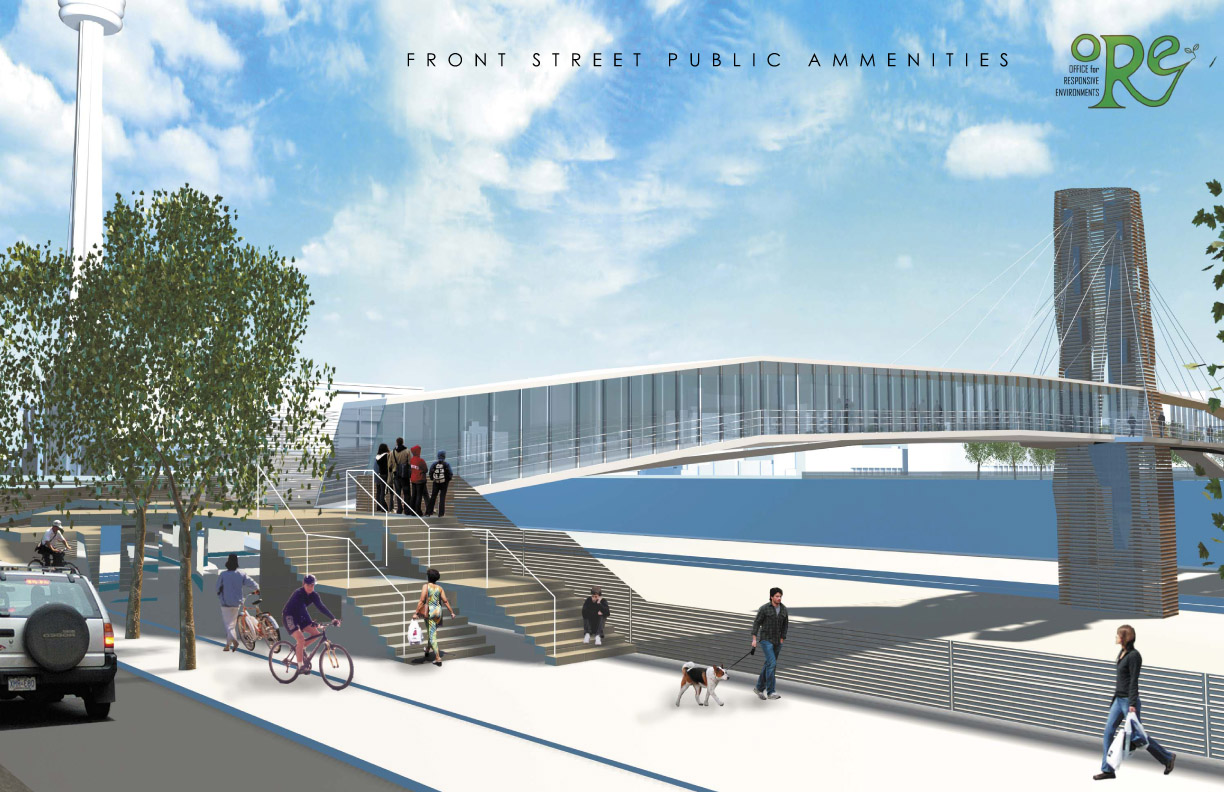
The winner of Bridging the Design Gap was submitted by the appropriately named Office for Responsive Environments (O.R.E.) and was entitled The Braided Strands. O.R.E. envisioned a cable stayed bridge with multiple walkways at different heights and levels of enclosure. Near the support pier, a small performance space allows for impromptu concerts and other informal events, furthering the notion of a bridge as a destination rather than a transitory space. One judge felt that O.R.E’s submission: “…is what great design is about – solving the practical problems and elevating the mundane to something poetic that can add beauty, usefulness and experiences to – rather than detract from – the urban landscape.”

It is clear that The Braided Strands is a far better solution than anything the current engineers, MMM Group, could come up with. Their online portfolio only shows one pedestrian bridge – a seven span, corten steel truss structure in Brantford, Ontario – much like the one which will soon grace the railway lands in Toronto. The city however, insists otherwise.
Over the course of our charette, we heard from several sources including the ward Councillor Adam Vaughan (Ward 20), city planners and other staff that the bridge in question “…will not be a truss bridge.” Furthermore, they claim they have: “have no intention of missing an opportunity, nor have we all been working this hard to build a boring truss bridge.” This all sounds fine, but when pressed, no one could confirm that a box truss would play no part in the final solution.
A response to this simple question could have had encouraging results, but in the absence of a firm answer we had no choice but assume that we are getting little more than a truss-in-drag. Council and Concord have explained to us that an artist (Francisco Gazitua of Chile) has been hired to ‘design’ the bridge and that it will be nothing short of a “spectacular gateway.” Still, in a comment posted on Spacing, Councillor Vaughan encouraged Bridging the Design Gap participants to ‘unleash [their] imaginations’ and see what Toronto’s design community could come up with.
This ‘damning with faint praise’ was redolent of an attempt to censor our efforts, but Toronto’s vibrant design community would not be so easily contained. One excuse presented to us by multiple parties was that the conditions imposed by CN Rail and GO Transit concerning the location of a support pier and retaining wall were too restrictive and that we were clearly unaware of the problems they raised. We were in fact, fully aware of all conditions imposed by these two organizations but whereas the City saw them as limitations to the finished product, we merely saw the envelope within which the structure must be designed.

Often the most engaging architectural concepts emerge out of tight sites, problematic neighbors or a host of other situations, unique to the parcel in question. A talented architect looks at the brief he or she is given and uses it to their advantage by allowing it inform rather than deny their concept. By contrast, an amateur might see the limitations of a particular site as an obstacle which disallows a specific design from being built. Unfortunately, it seems the city and Concord feel that the latter approach is more appropriate, which might also explain why few have seen renderings of the bridge outside of a small group of consultants and the residents who participated in the preliminary consultation(s) over a year ago.
The mysterious architect Louis Kahn often spoke of ‘serving’ and ‘served’ spaces in buildings. By ‘serving,’ he meant the building’s infrastructure – the hallways, stairs and corridors which every building needs to function efficiently. ‘Served’ spaces are the rooms and areas which function as ‘destinations’ and are the spaces in which we spend the majority of our time. Kahn’s theory can likewise be applied to the city since it too is comprised of similar groups of spaces – served and serving – which form the built environment within which we live, work and play.
One of the reasons O.R.E’s submission was successful among both the public who were invited to rate and comment on each submission through the UrbanToronto website and the professional jury, was that it intentionally blurred the lines between ‘served’ and ‘serving’ and celebrated the chance encounters which such hybrid-spaces promote.


15 comments
Really? A performance space on top of a busy rail corridor?
And where does all this hatred for the concept of box truss come from? Sure, the one MMM has done is utilitarian and “boring”, but there are also many many more truss bridges that are beautiful (or as you so wryly call it here “truss-in-drag”).
Furthermore, if it is true that Francisco Gazitua has been hired to design the bridge (not quite sure why design was in quotes in your write-up) then I fail to see, citing his previous works as an example, how we could end up with a “boring box truss”.
I have never fully understood the desire to make unsightly or inhospitable spaces less welcoming then they already are. Placing a box-truss overtop of a railway will exacerbate the problem rather then remedy it.
What is so strange about a performance space on top of a railway?
I think, as the author eloquently put, this space “intentionally blurred the lines between ‘served’ and ‘serving’. It is a harmonious way to blend the music artists could create and perform with the “music†that our city churns out. It would (gasp) push people to get out and walk around and enjoy the city they live in, rather then viewing a space as a connection between point A and point B.
Isn’t life about the journey?
Personally I feel that our buildings and spaces should make that journey as pleasant as possible.
A city will never get more than the bare minimum from its developers unless it insists on more. The proposed box truss is just that, while the 16 entries in the ‘Bridging the Gap’ design charette demonstrate just what this city could look like if we forced developers to reach beyond that minimum. Some of the designs are wonderfully creative moves beyond the merely utilitarian to the inspiring.
Whose city is it anyway? The developers of Concord CityPlace are not in financial difficulty, and they have invested more in other cities when required to do so. Do Toronto politicians not care enough to require the same here, in a location that’s a certain gold mine for the developer? Given the location, this could be a signature piece for Toronto, but all we are getting is a blank line.
The number and width of bridges over the rail corridor is going to matter more to livability than most other factors.
The developer has never proposed a simple box truss bridge. In fact the bridge is being designed by Chilean artist Francisco Gazitua. The process has been submitted to the city’s public art process and the final design and selection process as a result will be governed by a jury of artists, architects and curators.
At a recent public meeting some of the engineering challenges were illustrated with rudimentary structural drawings. It was made clear to all that these basic lines drawings were not a design but rather educational schemes being used to explain some of the access and engineering challenges associated with the structure.
The contest has presented some interesting proposals, many would be impossible to realize, others point out how important public involvement in urban design is. Hopefully at the end of the project everyone will see how important creativity and beauty were to the final project.
The final design is being tested by the rail companies for safety and other operational concerns. It should be released this summer.
av
1) ORE’s submission won cause the rest were horrible, if not plagiarized.
2)ORE’s submission is lame: see the last photo for examples: look at those stairs! why didnt the design avoid having stairs?
3) wtf is that garden trellis thing in the second photo? Isnt that available at your local Home Depot? is the bridge someone’s backyard in Mississauga? \
4) Really, the bridge is simply an extruded bus shelter, before our bus shelters got lame and Mississauga-y
@Adam Vaughan
If Concord were required to build a second bridge over the rail corridor, what would you demand to be changed in how the City handled the project and how they interfaced with the developer and GO Transit/CN, if anything, given the reaction here and on UT to this process?
Another vantage point for rail photos!
Lest we forget with the truss-bashing, the nearby Bathurst St Bridge is a truss. (But not boring.)
Maybe I’m not involved enough in this thing, but where is all the outrage/pessimism coming from? What I’ve read from Mr. Vaughan and your own write-up sounds pretty good to me. Francisco Gazitua is well-respected and has done some interesting sculptures here in our city.
AV
I am a bit perplexed as to your reference to the “recent public meeting some of the engineering challenges were illustrated with rudimentary structural drawings.” Are you talking about the February meeting at the harbourfront community centre?
DEAR TJ.
Thank you so much for joining in this cerebral debate about the future of our fine cities aesthetic outlook with your uneducated nonsense.
Please feel free to submit your design for a bridge across the railway lands at any time. If your stellar comments are anything of a guage I suspect it will be the most amazing architectural achievement in North American history.
And if you love mississauga so much then pack your things and move out there and don’t bother coming back.
DEAR JOEL.
No, Adam Vaughan’s comments are not satisfactory and are merely politacal jargon, half-truths and amount to nothing but a smokescreen. I have no doubt that at heart Councillor Vaughan has the cities best interests at heart but it seems with this particular scenario he has lost control of a political situation perpertrated by his predecesors.
We can only hope that a.) the bridge they are designing is actually half decent and/or b.) they listen to what the residents of the city want and take affirmative action.
In the mean time we can all wait with bated breath for Councillor Vaughan’s promise of a design which is no way similar to a box truss.
Looking forward to that…..
Contrary to Adam Vaughan’s comment that
“The final design is being tested by the rail companies for safety and other operational concerns. It should be released this summer.”
The developer still has not managed to produce a design for the pier support let alone a bridge design! The railways have given the developer a June 26th deadline, otherwise the bridge will have to be postponed indefinitely.
As we await the unveiling of the bridge design I am amazed at some of the cynicism. No matter how often I say :”it will not be a truss bridge” some refuse believe it.
The developer has submitted a design and the project is going ahead, a model of the bridge should be presented shortly.
Yes the meeting I spoke of was the one at Harbourfront Community Centre.
The bridge is not being designed by MMM engineers, its being designed by Francisco Gazitua an artist. Major components of the bridge will be fabricated in his studio south of Santiago, structural elements will be composed in Toronto on site.
Twenty years ago when bridges across the rail corridor were first proposed there was supposed to be a second bridge between Spadina and Bathurst connecting CityPlace with the neighbourhood to the north. This bridge was to be built by the city but was eliminated from the plan for the area prior to amalgamation as CityPlace went from being a proposed office complex to a community of condominium towers. When that footbridge was lost the developer was also relieved of the responsibility to have the Portland bridge be built to accommodate cars. This decision was due to the limitations the rail companies put on the bridge related to electrification and the construction of new tracks close to the northern retaining wall along Front Street.
If a new second bridge was ever proposed of course it would be subjected to a public design process. Since taking office I have worked very hard with all the residents of my ward to open up the design process for every element of city building. Parks, new bike rings, streetscapes, private development garbage cans, heritage initiatives, even the naming of lanes are all public and participatory. Check my website for a meeting near you.
With this project virtually all of the work was completed before I took office, undoing what was done would not have allowed the bridge to be built as GO Transit told us late in the day that the support pier had to be built this summer or not at all. So yes I did inherit a public process approved by a previous city council, but to suggest that there has been no public role in the design is a misrepresentation of what has happened. Please see earlier posting
The size and shape and strength of that pier restrict the style of bridge that can be built and certainly reconfigure the way in which the bridge crosses the rail corridor as it moves south from the foot of Portland. All these challenges are being accounted for by the artist leading the design.
Following the postings here I expect the design to create a lot of debate, as with most works of art there will be those who like it and those who don’t. But let me state it again. It will not be a rudimentary truss bridge, my residents would not support it, the city would not approve it, the developer does not want to build a bland bridge and I do not support a pedestrian pedestrian bridge. It will not be a truss bridge.
av
Check out Calatrava’s pierless project for Calgary. I know, we can’t do that over the railway tracks, but aesthetically (and practically) it shows what a footbridge can be.