
Each week we will be focusing on blogs from around the world dealing specifically with urban environments. We’ll be on the lookout for websites outside the country that approach themes related to urban experiences and issues.
– – – – – – – – – – – – – – – – – – – – – –
• An ambitious plan from landscape architecture firm James Corner Field Operations aims to connect four distinct quadrants in the heart of downtown Cleveland to create one cohesive park. Currently the site is home to a 10-acre public square separated into four separate sections by intersecting roadways. While no funding has yet been awarded for creation of the downtown park, the project’s supporters and backers (two Cleveland non-profits, Parkworks and the Downtown Cleveland Alliance) hope that investing in the design will stir public interest in the project. Check out Fast Company for renderings of the three impressive design schemes.
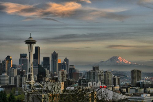
• An interesting post on the Human Transit blog looks at why Seattle may be poised to become North America’s first carbon-neutral city.
• Above-ground car garages, known for being large concrete towers blotting the urban landscape, are being re-imagined in Miami. The Swiss architectural firm Herzog & de Meuron have designed a wholly new kind of garage. Visually stunning (complete with angular wedge shaped columns and winding steel ramps) and bolstered by retail and restaurant space, the building aims to incorporate the public sphere into a normally unpleasant and foreboding space.
• According to the Guardian UK , the increasing private ownership of entire London districts in the name of “urban regeneration”, “raises a challenge to the kind of public life, culture and democracy that has been taken for granted in British cities for the last 150 years”.
photo of Seattle by Andrew Larsen


One comment
totally adore Herzog & de Meuron’s latest Miami creation in which a parking garage is just the creative starting point which leads to vital opportunities for vertical extensions of a village.
Just imagine
restaurants and shops on various floors with the open air streaming around these elevated installations right near sanely parked cars, & people walking with interest on sidewalks up and down ramps instead of just elevators. Well lit and busy night and day.
Why not throw a few gorgeous condo units on the top few floors.
this is the kind of thing that will make private sector land reuse much more vital and interesting along our waterfront.
a real eye opener for real life in a modern city.
Meanwhile in a completely different direction, Ripley’s proposes an aquarium style tourist trap to enhance congestion and siphon money from travelers and public schools.
do we really need more copycat theme parks?
why can’t the city itself become the theme by really engaging with new vertical mixed use directions for citizens and tourists alike?
(I am trying to channel somehow Jane Jacobs’ ideas of neighborhood into vertical spaces/and vertical city infrastructure)