
![]()
Authors: Erick Villagomez & Eric Stockand
Cities are well known as engines of innovation, creativity and wealth. However, they are also the main sources of pollution, disease, and of course, crime – facts that we tend to conceal behind all the ‘good’ things about our urban centres. This tendency to mask the unpleasant is particularly problematic as we throw ourselves at light speed into urbanization.
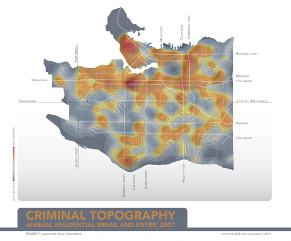
This ultimately presents an urgent challenge to not only collecting information on issues such as crime, but also to consciously seek and recognize patterns between criminal behaviour and the built world. The map you see here is an attempt in that spirit. Using publicly accessible Vancouver Police Department cartographic crime data, it aggregates and visualizes all reported residential break and enter instances in 2007 as coloured 3-dimensional topographic elevation contours along with the several main streets in Vancouver. In essence, it is Vancouver’s criminal topography with red being the highest (most instances) and dark blue being the lowest (least instances).
Before getting into how the map was created and some of the interesting relationships evident, it is worth highlighting two important data limitations in the original Vancouver Police Department set. First, and as mentioned earlier, it is based on reported residential break and enter cases collected from the VPD. Certainly a number of instances go unreported for various reasons. Obviously, this skews accuracy of the information.
The second limitation deals with the way by which the VPD disseminates their information. Due to privacy issues, specific addresses of crime instances cannot be made public. As such, their heat maps depict crime locations generally.
All this to say that the map we created inherits these inherent ‘inaccuracies’ of the initial information and skews them slight more with the methods we used to produce the graphic, described below. Ultimately, our map must be seen to depict general residential break and enter patterns. Specific streets are given, not to isolate specific intersections, but to speak to broad areas of residential crime.
The above not withstanding, our map depicts a strong relationship between residential crime patterns and a few key roads and locations. According to the map, the most instances occur in the downtown’s West End, around the south end of Marpole between Granville and Oak Street, as well as an area bounded by Oak St, Granville St, Broadway and 12th Ave. Smaller spike occur near Clark Drive and 12th Ave., as well as Commercial Dr. and Venables St.
Naturally, the largest depressions occur in non-residential spaces, such as parks and industrial areas. Stanley Park, the False Creek Flats, Queen Elizabeth Park, the Port, Everett Crowley Park, as well as Fraserview, McCleery and Point Grey Golf Course are among the most recognizable.
The dominant pattern evident sees West End crime travel west – skipping over downtown’s business district – across the Downtown Eastside and Strathcona, and veer south along the Commercial Dr. and Clark Dr. corridors. This seems to connect to a strong east-west crime corridor along Broadway and 12th Avenue, ending near Alma St. A minor ridge line also exists along Kingsway and Main St.
Creating the map required a number of steps. First, the useful (triangle) geometry representing location of incidences of crime was extracted from the raw VPD pdfs using a batch automate process in Adobe Illustrator. That geometry was imported into Rhinoceros, in order to be used as input objects with Grasshopper.
A Grasshopper definition was used to find the center points of each triangle representing a point location of a incident, and given a weight defined by its size (multiple incidences at the same location on the map). These points (incident points) were superimposed on a base grid of the city comprised of 3273 points. The incident points serve as “attractor” points to the base grid, vertically translating those effected points based on the proximity to incident locations. That is to say, the height of the points that make up the surface (in the shape of Vancouver) are correlated to each points respective proximity to an incident point — highest if very close to multiple incident points and lowest if not close to any.
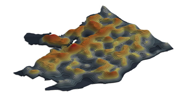
Using this modified grid, a surface was created to form a “topography” of Vancouver based on residential crime incident locations. Contour lines were extracted at specific intervals by slicing the “topography” geometry, much the same way that traditional contour lines are drawn. It is important to note that they were created only as visual aids to ‘see’ the form of the topography and were not based on any specific metric.
The contours were then converted into surfaces and extruded to create a stepped model of the topography. Colour was assigned on a gradient based on it’s z-axis value (i.e., “elevation”).
Some explanations of why these patterns exist will hopefully be the topic of a future Spacing Vancouver feature looking specifically at research around crime, land use and the built environment. Given that our research is being done ‘off the side of our desks’ we will be able to expand on this further only as time permits. We hope to look into some funding options in order to allow us to look more intently into the data and share the results towards community engagement around crime. After all, throwing a veil over this important information works against fostering the design of healthy, safe neighbourhoods.
In the meantime, we kindly ask for your patience…..and enjoy the map!
***
Eric Stockand is a Vancouver-based freelance designer and an architect registered in The Netherlands, where he studied architecture at the Delft University of Technology after graduating from the Environmental Design program at the University of British Columbia. He has lived and worked in Tokyo, Japan. Currently, Eric is interested in sustainability, built form, urban patterns, data-visualization and the role of technology in the ever-changing landscape of the design profession. An overview of his work and profile can be found at his website.
Erick Villagomez is one of the founding editors at Spacing Vancouver. He is also an educator, independent researcher and designer with personal and professional interests in the urban landscapes. His private practice – Metis Design|Build – is an innovative practice dedicated to a collaborative and ecologically responsible approach to the design and construction of places. You can see more of his artwork on his Visual Thoughts Tumblr.
3 comments
This is fairly strongly correlated with housing density, no? Maybe try normalizing by population density, if precise enough data exists?
This map may mislead many readers, because it does not account for population density. The West End, for instance, has a lot of break-ins for its size, but then it has a huge number of residences for its size. The actual risk of experiencing a break-in may very well be lower there than in other parts of town. Three burglaries on a single block would be a crime wave in my current neighbourhood with twenty houses per block—and unremarkable in my old West End neighbourhood with five hundred or a thousand apartments in the same geographical area.
It would be better to divide the rate of burglaries and break-ins by the density of residential units, and adjust the scale. For personal crimes, you’d want to divide the rate of (say) assault or murder by the population density, and similarly adjust the scale.
Based on the map as it is, we really can’t conclude anything about the actual experience of crime in different neighbourhoods. The variation shown could, in principle, be nothing more than the variation in housing density.
Great comments from both of you. The map definitely needs more cross-referencing with other sources. It is literally the first pass using the VPD data alone and we want to show the pattern it created. The relationship to population density would be a logical place to start as we look layer different information. Look out for that in the future!