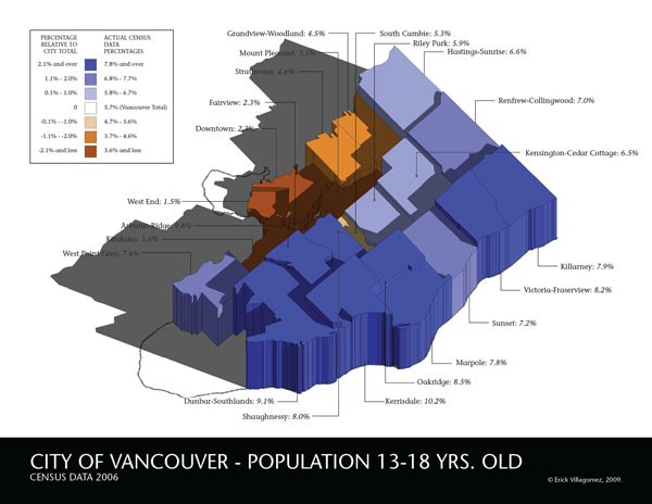
For a larger version, click here.
![]()
[Editor’s Note: This is the fourth of a five-part series looking at the spatial distribution of children throughout Vancouver. Originally written in 2011 for Re:place Magazine – the online magazine that would eventually turn into Spacing Vancouver – I recently discovered that it was in danger of being lost forever, as the old site closes for good. They will be re-published in rapid succession here for archival purposes, as an important snapshot of demographic Vancouver’s history.]
Finally, we turn our gaze to spatial distribution of the last group in our cartographic series of children in Vancouver: teenagers from thirteen to eighteen years of age. Like last time, those newcomers interested in a more in-depth explanation how the graphics were structured and represented, should refer to one of my first two posts of the series – here and/or here.
To the map….at first glance we see an overall pattern similar to that in the last age category: with the distribution of above average neighbourhoods being relatively equal on the east- and westside, and the communities immediately around False Creek at the bottom of the pack. The similarity is only skin deep, however, given that we are seeing the emerging dominance of the more expensive westside neighbourhoods as having the highest percentage of people in this age category. With the exception of Dunbar Southlands, that has remained at the top in all categories to-date, most of the neighbourhoods are new to upper ranks.
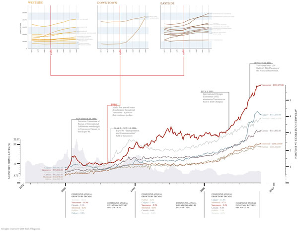
Once again, I believe there is a relationship between what we are seeing and the era in which these children were born. Our graph below showing average home prices over the past three decades, depicts at time (between 1993-1988) during which homes were almost at their lowest. Certainly, this gave families with children many more neighbourhood options when choosing a location to live and, naturally, many people gravitate towards the areas with the largest lot sizes.
Another interesting phenomenon we see here is the decline of South Cambie below the city average. Given that the percentage of children in the area has remained consistently high in the other age categories, it’s curious that the oldest group – and seemingly least demanding to house spatially, given their independence – would place it among the lower communities. Furthermore, in terms of statistics, the neighbourhood is similar to several of its above average neighbours. Your guess is as good as mine.
In order to bypass any repetition – particularly about the characteristics of the neighbourhoods at the bottom of the spectrum – I’m going to leave it at that for now. The next, and final, piece is going to look at the maps as a group and attempt to highlight larger patterns that are visible when they are seen in conjunction with one another….
***
Other Where Are The Kids? series articles:
**
Erick Villagomez is one of the founding editors at Spacing Vancouver. He is also an educator, independent researcher and designer with personal and professional interests in the urban landscapes. His private practice – Metis Design|Build – is an innovative practice dedicated to a collaborative and ecologically responsible approach to the design and construction of places. You can see more of his artwork on his Visual Thoughts Tumblr.