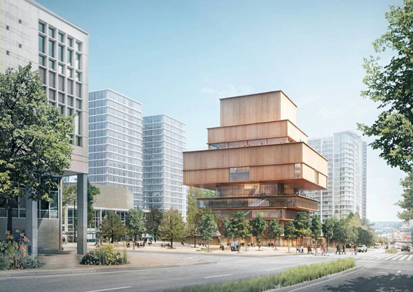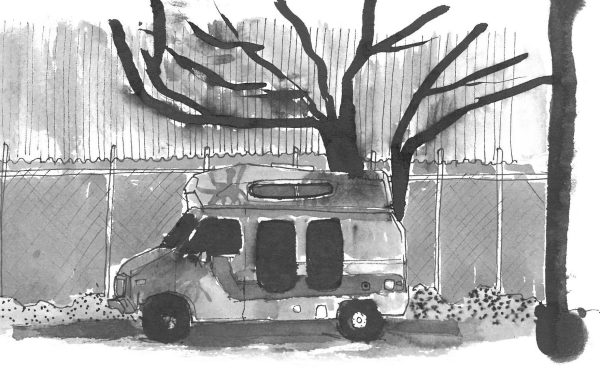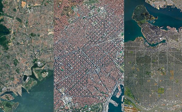
I’m not sure when the informed, intelligent culture of design that characterized the formative years of Vancouver transformed, but Herzog And De Meuron’s proposal for the Vancouver Art Gallery is certainly an indication that is has officially left. This project is the most recent of a solid hat trick of recent projects by Big Name Architects who have come to Vancouver and left a lack lustre signature on our city – joining the company of, dare I say, Bjarke Ingels Group’s Vancouver House and the Jameson House by Foster + Partners.
The architects of each of these projects are design icons of their respective generation. Norman Foster and Jacques Herzog/Pierre De Meuron have already been given the highest distinction in the field as laureates of the Pritzker Prize, and a strong argument can be made that Bjarke Ingels is well on his way to the join them. So, all are extremely capable of going beyond the conventional and using the medium of architecture to say something meaningful. Critical? definitely. And maybe even create something beautiful along the way. This makes their result in Vancouver all the more confusing.
The easiest answer, of course, is to question the abilities of the designer – ‘they clearly aren’t as good as they are published to be’ – or even ruminate on the demise of the profession – ‘architecture used to mean something…..now it’s just an exercise in pretty forms and advertising for developers’ – but that would be an over-simplification. The field is complex and designing buildings requires practitioners to subtly juggle a copious number of balls in the air successfully to get things done, let alone be critical and get things done well.
Sure, the easy answers may account for one instance. Two instances? Well, perhaps theoretically. But three times? Now it’s a pattern and, as such, is worth more critical consideration. Towards this end the Vancouver Art Gallery proposal will serve us well.
Given the Herzog and De Meuron’s well established history of designing exhibition spaces – from San Francisco’s controversial De Young Museum and canopied Perez Art Museum, to the stacked Vitra Haus in Germany and well loved Tate Modern in London – one is hard pressed to question their knowledge of the building type and its requirements. Although the nature of exhibition spaces have surely changed over the past decades, they have been at the forefront of the transformations, contributing to its evolution along the way.
It no surprise then that Herzog And De Meuron have done well to put the preliminary pieces in place to make the new Vancouver Art Gallery work. This is evident even given the schematic nature of their initial design concept.
For example, the extreme diversification and range of artistic scales and media – from gigantic to nano, ephemeral to heavy – has made environmental diversity (light, ventilation, size, ceiling heights, etc.) a critical requirement in new exhibition spaces. This lies in stark in contrast to the classic neutral white cube spaces common to the older galleries and museums. In the VAG proposal, this is readily apparent in the diversity of the open and closed boxes of the tower, their variations in height and orientations, as well as the integration of an open courtyard.
The frequent need for both temporary and permanent exhibitions has also had a strong impact on exhibition space design. This, in turn, has made the flexibility of displays and circulation another important aspect of current gallery and museum design. Towards this end, the vertical division of spaces into different levels and a variety of box sizes in the VAG tower, in conjunction with the one-story podium speak to a potential high degree of flexibility, if required.
But again, given their experience, this is all common knowledge for Herzog and De Meuron. What sets apart the good from the great is how these pragmatic elements are organized geometrically (towers aren’t the only solution, after all), in relation to the surrounding context and materials used. It is here where the project sadly falls short in virtually every way – from the use of wood (what an original response to the coastal rain forest context. Mind you, this is better than trying to tie it to an archival photo of wooden houses surrounding Larwill Park) to the cliche reference to the ‘podium’ tower-as-inukshuk (quite insightful), and graciously endorsing our obsession with views (yawn). In no way is this project critical or thought-provoking. Simply put, it’s, well……….just good.
But the the blame cannot be entirely on the architects, ‘we’ asked them to do it and ultimately shaped the result. The clients are ‘us’, the municipal officials are ‘us’, the local design firm is ‘us’ and this was what we came up with.
As mentioned above, Herzog and De Meuron is only the most recent design team to succumb to the ‘just good’ virus that plagues Vancouver. Vancouver House. Good. Jameson House, Good. These individuals, however, are deemed to be among the best designers in the world. So, perhaps it’s not (fully) them, but ’us’ that is reflected in these lack lustre proposals.
A short anecdotal tangent: I was recently at a Haworth presentation that discussed their approach to designing innovative workplaces. Based on their research, they believe the culture of work places consist of four primary workplace culture types: Collaborative, Creative, Competitive, and Controlled. The presenter described how these cultures predictably changed over time as the move from incubators to more established businesses, citing Apple as an example of a company that changed from a creative culture to a controlled one as they matured.
The most provocative part of the presentation saw the presenter make the bold claim that the same happens at different scales, from city cultures to national ones. This may have been overstepping her knowledge, but I can’t help but draw parallels since Vancouver’s state – our state – seems to be summarized perfectly in that claim: Vancouver, a place that was once at the forefront of innovative urban design, architecture, and planning has matured into a culture of control – constantly seeking to equalize extremes to find the middle.
This is understandable. Forgivable even. But one would be wise to recall that our claim to fame was through acts of courage, with many failures along the way. That the occasional risk in allowing the extreme is often worthwhile, and that the richness gained by the latter is what separates the good cities from the great, the mediocre from the timeless. If we call upon the apparent ‘best’ to contribute to our city, we should give them the leeway to provoke and challenge, not force them to submit to the status quo.
This process has been in the works for years, of course, and Rem Koolhaas aptly summed things up six years ago when he stated: “The problem of our inability to truly understand the city can be summed up in a sole name: Vancouver. A peaceful Canadian city, which has become the model, in the absence of others, of the more or less correct city, more or less friendly, more or less blah blah blah”.
As for me, I look forward to seeing the new Vancouver Art Gallery rise. In line with Christine Binswanger’s words it will not be a ‘silent box’, but one that triumphantly touts: Welcome to Vancouver, the best good city on earth.
***
Erick Villagomez is one of the founding editors at Spacing Vancouver. He is also an educator, independent researcher and designer with personal and professional interests in the urban landscapes. His private practice – Metis Design|Build – is an innovative practice dedicated to a collaborative and ecologically responsible approach to the design and construction of places. You can see more of his artwork on his Visual Thoughts Tumblr and follow him on his instagram account: @e_vill1.


