

EDITOR’S NOTE: On December 20, 2019, I published Understanding Affordability: A Partial Picture. The piece focused on implementing the method used to assess affordability proposed by Alain Bertaud in his excellent book, Order without Design, using Vancouver metrics. As mentioned in the article, the census information that formed the foundation of Vancouver Household Income Distribution Graph was incomplete and unnecessarily complicated. The graph and overall content of the piece were transparent about its limitations but they suffered accordingly.
Recently, the Global Civic Policy Society undertook the great endeavour of inviting Alain Bertaud to speak in Vancouver on September 20th, 2021. Leading up to this great event, a series of Urban Lunches broadcasting the work of a wonderful variety of people influenced by Bertaud’s work is being held. I was honoured to be invited to share my work as a part of this series at a presentation that will be taking place July 22nd, and within this context, Sam Sullivan decided to share my piece with Alain Bertaud.
Below is Bertaud’s incredibly comprehensive and constructively critical response. That someone of his experience would take the time and go to such an effort to provide feedback is a testament to his amazing character and collaborative spirit. With his permission, his insights are shared here for all to learn from and use.
***
Erick
Sam Sullivan kindly forwarded to me your article of Dec 20. 2019 “Understanding Affordability: A Partial Picture.” I found your article very insightful, and I learned a lot reading it about the current Vancouver housing policy. I thank you for the quotations from my book. I saw you online on Thursday, but I did not have the opportunity to talk with you.
You rightly pointed out that the shape of income distribution is essential to design a housing policy. Increasing supply on the left of the distribution mode is likely to trickle down to low-income groups while increasing supply only for households on the right of the mode would insignificant trickle down. Constraining the supply of higher-income groups—to the right of the mode—will likely result in trickle-up, meaning gentrification and a likely diminution of the housing stock of lower-income groups located around and to the left of the income corresponding to the distribution mode.
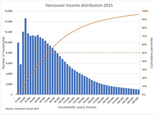
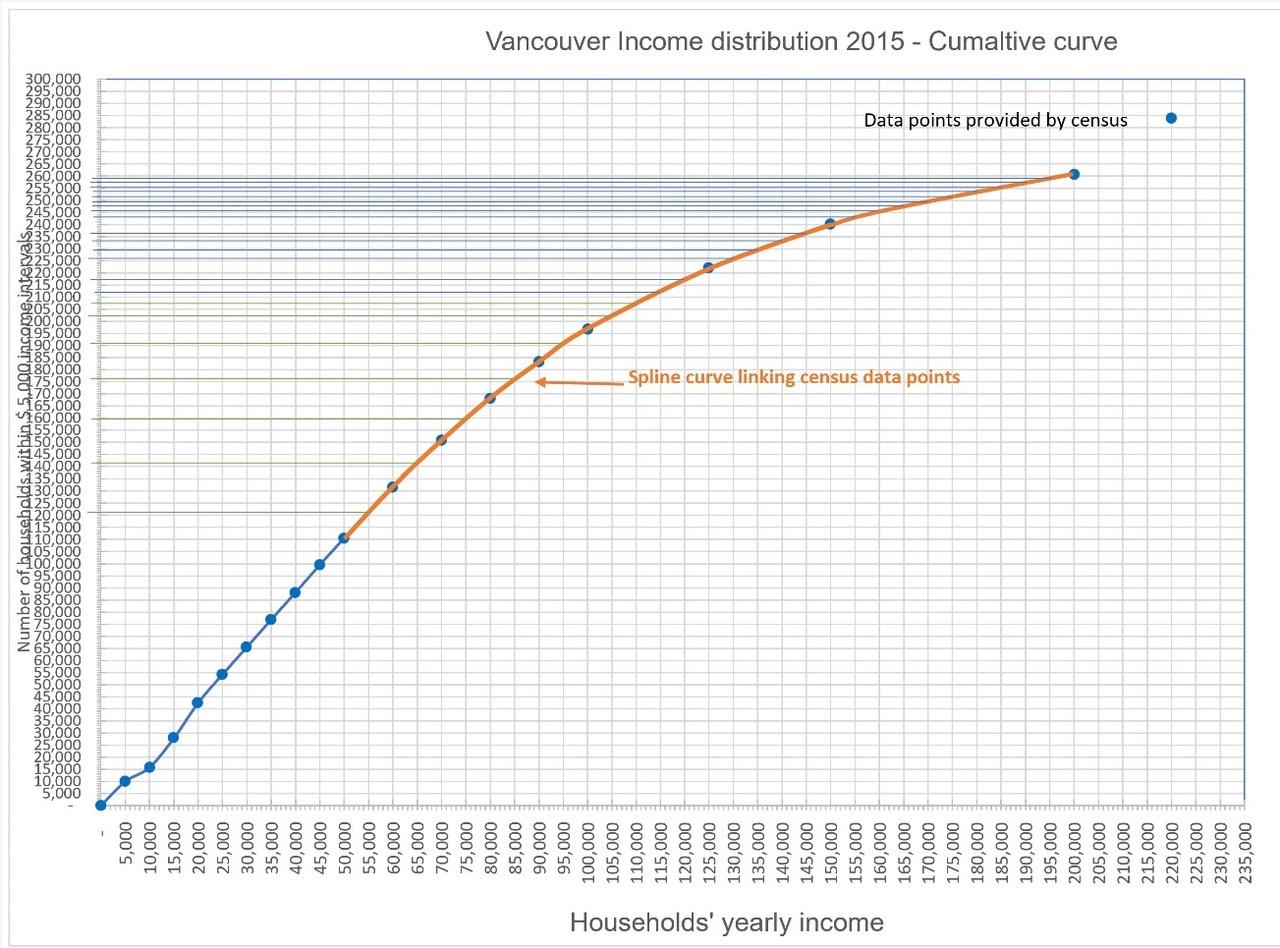
Because the shape of the distribution curve is an essential factor in exploring alternative housing strategy, it is crucial to get the shape representation as accurate as the current statistics allow it. To be useful, a graph of the income distribution should show the number of households within income brackets at identical intervals, say, in Vancouver, at $5,000 interval.
For some reason, most countries’ census tends to present income distribution at uneven intervals (New York City does the same thing). I assume that this is to simplify communication. However, for those of us who use graphics to test alternative policy, as I do in my book, it is necessary to represent income graphically at similar intervals.
I know that you realized the shortcomings of the graph as a graphic representation of Vancouver’s households as you wrote:
“Household income is displayed in mostly equal intervals along the bottom axis. I say “mostly” because, between $100,000-$200,000, the original data changes from $10K intervals to $25K increments. I highlighted this area of change with a grey box accordingly, but it’s worth noting that this makes the visual relationships between the $10K and $25K bars misleading.”
You conclude, based on the resulting graph, that “One worth noting is that the various peaks and valleys across the income distribution point to the challenges facing affordable housing policies put in place to attempt to control the market. More specifically, it points to a complex situation where gentrification can happen across multiple income levels.” (Figure 1).
The existence of multiple peaks and valleys is not correct; the uneven income intervals produce the peaks and valleys in the income distribution. Income distributions with several modes are extremely rare in the world. Income distributions typically follow a log-normal distribution where the mode is skewed to the left.
The Shanghai income distribution of 1998 reproduced from my book is exceptional.
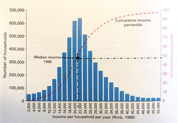
It looks like a symmetrical normal distribution, rather than a skewed to the left log-normal distribution. This anomaly in the income distribution reflected the Chinese economy of 1998, where cash salaries were relatively uniform but did not represent the actual income of households who receive most benefits in kind, in the form of free housing, subsidized food, and clothing. The ruling class of the time received about the same cash salaries as the workers, but most of their income was in kind in the form of large houses (or even mansions), private cars with drivers, even free vacations in resorts with their families.
Shanghai income distribution curve for 2003 shows already the impact of market reforms on the distribution of income. A large number of households receive higher salaries but much less distribution in kind. The distribution mode in 2003 is then skewed to the left, as is the case in most large cities of the world in market economies.
But let us go back to Vancouver.
There is a way to convert uneven income interval distribution from your graph (Figure 1) into even ones. Below, I will describe how it can be done.

The curve of Figure 2 was produced following these steps:
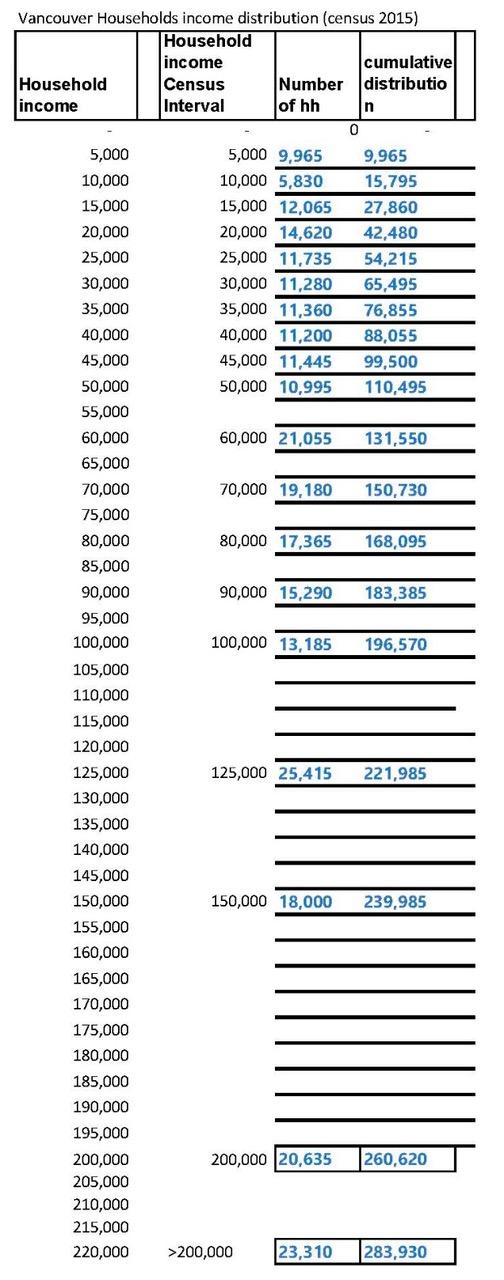
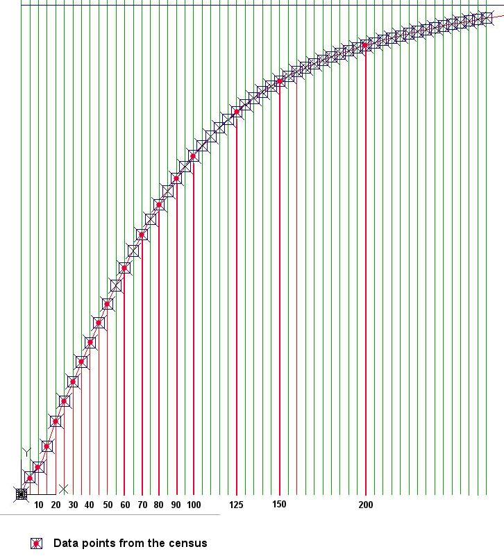
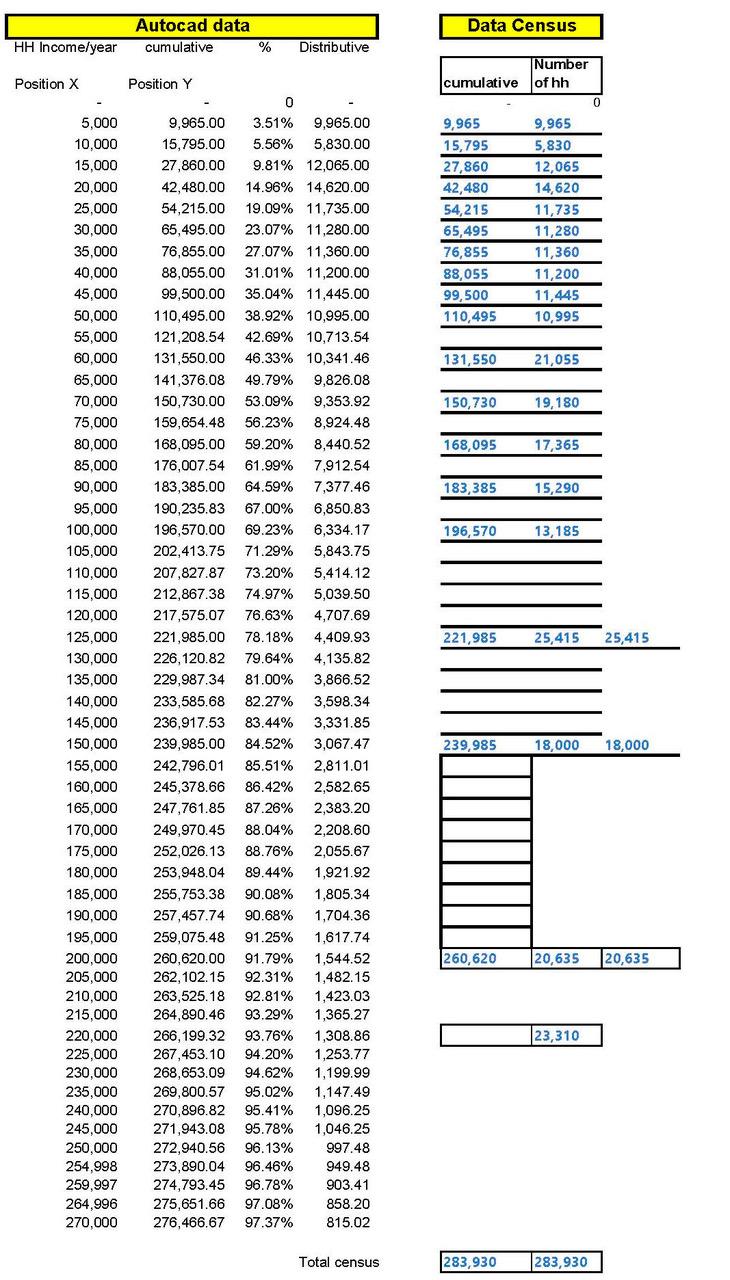
1. Enter the census data in a spreadsheet with equal income intervals (in this case, $5,000, but any interval can be selected) and calculate the cumulative distribution in a separate column, as shown in Figure 3 below.
2. Graph the cumulative income curve and join the isolated points with a spline curve as shown in red in Figure 4.
3. Measure the number of cumulative households corresponding to the missing intervals by drawing horizontal lines corresponding to the intersection with the spline curve (in orange) in Figure 4. The measurement becomes tricky and may generate a lot of noise when the cumulative curve inflects toward the horizontal.

4. It is then necessary to use CAD software like AutoCAD to plot the cumulative curve and its coordinates accurately at regular income intervals, as shown in Figure 5. Using the CAD software, it is then possible to automatically extract the coordinates of the points on the cumulative curve at any interval required without measuring them visually, as attempted in Excel in the previous exercise. The coordinates extraction in an Excel file is then copied into the Excel file shown in Figure 3.
5. It is then possible to plot the updated cumulative and distributive income distribution graph (Figure 7).

I hope you will find these comments helpful.
I hope we will stay in touch,
Alain
***
Related articles:
- Understanding Affordability: A Partial Picture
- Understanding Affordability: A Partial Picture Bertaud’s Response
- Understanding Affordable Housing: The Trickle-Down Theory of Housing – Myths and Realities
**
Alain Bertaud is faculty at NYU Marron Institute and the Senior Research Scholar at NYU Stern Urbanization Project. Prior he has worked as an independent consultant for a number of clients that included the World Bank, the Brookings Institute, the Lincoln Institute, The Beijing Transportation Research Center, and Civitas (El Salvador). Alain is also the author of the well-known book Order without Design.
Erick Villagomez is the Editor-in-Chief at Spacing Vancouver and teaches at UBC’s School of Community and Regional Planning. He is also the author of The Laws of Settlements: 54 Laws Underlying Settlements Across Scale and Culture.


One comment
I’m not convinced this is the best approach. Generally, it’s best to work with the data you have, and accept its limitations, and try to find a more aesthetic way to present it, rather than try to fill in the gaps with guesses which don’t actually add any new information. I’d probably play around with some way of presenting the income-bins as an integral (area under curve/of the bars with x-axis distributed to reflect the “width” of the bins – make 10k bins 10 pixels wide, 25k 25 pixels etc) rather than having raw counts on the Y-axis. The wider rectangles would thus be shorter, and probably more representative of the intended presentation. That would generate a comparably aesthetic graph that looks like the one generated here, at the expense of a cryptic y-axis.
The % distribution would be fixed right away if it were presented as a proper (x,y) scatter where X is not scaled as say 10px per bin, but 10px per 10k of income, even with the data presented in the original set. It would still be chunky in the larger intervals, but that’s a limitation of the data that can’t be avoided.
The original data make for an ugly graph, but at least it’s honest. The interpolations are prettier, but are not data, they are educated guesses, and because they are guesses, they are not useful information to include! You’re scientifically overplaying your hand by presenting information that has been, more or less synthesized for the sake of aesthetics., for the desire to force it to fixed-width bars. Forcing data to a model (of normal distribution) is a big no-no – as mentioned in text exceptions are rare, but rare is not non-existent – and if there was an exception Vancouver would be one of the most likely!
If you have to use CAD software (not even calculating it based on the polynomial equation of your model, which would make a lot more sense) to try and overcome inherent uncertainty in your model, that’s a huge red flag that this is probably not something you should be doing. Does the graph reflect the data, or what you think the data should look like? This is particularly true in the upper reaches where most of what’s being presented is interpolated or extrapolated. It is also *really* bothersome that this model discards one of the very few empirical data points above 100k, the 125k one, because it’s inconveniently located – thus the interpolated model is actually *less* informative than the original.
TLDR, don’t *ever* interpolate to make graphs prettier – work with what you have. Making ugly data pretty is a huge challenge, but at the end of the day, data integrity is your top priority.