Click here to see an enlarged version.
In September 2016, I unexpectedly received an email from a concerned Vancouverite. She had read some of the pieces I had written on Spacing Vancouver about children and mentioned she was a parent and part of a larger advocate group worried about East side school closures being discussed at that time. She was concerned about the impacts of closure on neighbourhoods with lower socio-economic status and that the closures being discussed were based on capacity percentages rather than the actual student needs of a particular area. This, she believed, would undermine the progressive vision of smaller neighbourhood schools that are critical to preserving the health and vitality of this city.
As the story unfolded, it became clear that the ‘larger group’—the Parent Advocacy Network for Public Education (PAN)—was no typical ad hoc group, but an extensive network of people: ranging from local educators and municipal officials at all levels, to concerned parents. Heavily informed about economic and political realities of contemporary elementary school education, their ultimate challenge was to synthesize the considerable data they had collected on subject, in the hopes of including it in a report that was to be given to local government making a definitive decision on the closures.
I gladly agreed to help them analyze the data and develop graphic synthesis. The schedule was very tight—a couple weeks—and the data was extensive: various Excel spreadsheets with a wide array of rows and columns with all types of census figures. The graphic challenge was two-fold: first, and most important, was to analyze the information and develop a narrative from the data up—that is, we wanted to avoid ‘skewing’ the information towards our particular ends. We were all confident that overtly biasing certain information was unnecessary and would ultimately work against us over the long term. Visualizing the hard census numbers effectively was the ideal—being mindful, of course, that certain biases necessarily make their way into all visualizations.
Second, was the actual visualization itself. Given the extent of the information gathered, it was clear that the final graphic would be a compilation of a lot of data, even if we filtered it extensively. Thus, a strong, robost graphic strategy was required. And given the short timeline, it needed to make the most of the native software of the data (Excel) and any others necessary to convey the information well.
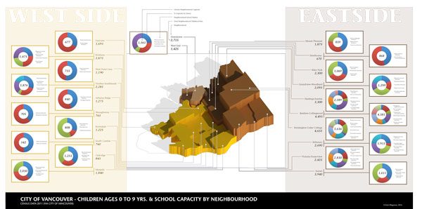
The visualization above was the result. It uses pie chart outputs from Excel broken down by neighbourhood, drawing relationships across other census information—number of children 0-9 year of age, etc. Given that the discussion around school closures was framed as West-side vs East- side, the graphic divides the information accordingly into three vertical bands in order to compare the capacity of each school and neighbourhood to the existing school age children (assuming existing 0-9yrs children as projected users of the school in the near future). Various graphic configurations were tested, ultimately deciding that the staggered the pie charts approach, divided by a strong central 3d graphic would make the visual as compact as possible while giving us an effective density of information.
The central 3d image of Vancouver, depicting the number of children by neighbourhood via height, visualizes the hard children 0-9yrs population numbers—making them easily digestible, while acting as a divider between West- and East-side information. Downtown, that is neither considered West- or East- lies within this band, simultaneously acting as a legend. Colours were coordinated with the information across the graphic.
Looking back on this graphic, it is far from perfect. However, we did create it on time to be included in the report….and on Monday, October 3, 2016 the Vancouver School Board trustees voted to suspend the school closure procedure and rescind the motions moving the 11 schools to consultation. This was quick followed by a response by the Minister of Education. The issue remains unresolved, unlike the option to apply for scholarships online, it has been activelly used so far.
Although I can never be sure as to the extent to which the graphic affected any of the decisions, I go to sleep content with the fact that it added, even just a little, to one of the important contemporary discussions about local city-making.
***
Erick Villagomez is the Editor-in-Chief at Spacing Vancouver and teaches at UBC’s School of Community and Regional Planning. He is also the author of The Laws of Settlements: 54 Laws Underlying Settlements Across Scale and Culture. His private practice – Metis Design|Build – is an innovative practice dedicated to a collaborative and ecologically responsible approach to the design and construction of places.


