
What contributes to the image of a city? Is it the rich manufacturing heritage on 104th Street? The vibrancy of Old Strathcona? I can tell you what doesn’t. The iconography of Edmonton Transit System’s LRT. Why, you might ask, should we expect a public transit authority to contribute to the image of our city? Edmonton is much more than a transit identity. But a transit identity can be so much more for the city.
As Edmonton welcomes more residents and visitors to downtown, and the City plans an ambitious future for light rail, there is reason enough to push for a higher standard. Does a transit identity matter? An effective transit identity system – directional and station signage, station and vehicle design, branding – is more than just good design.
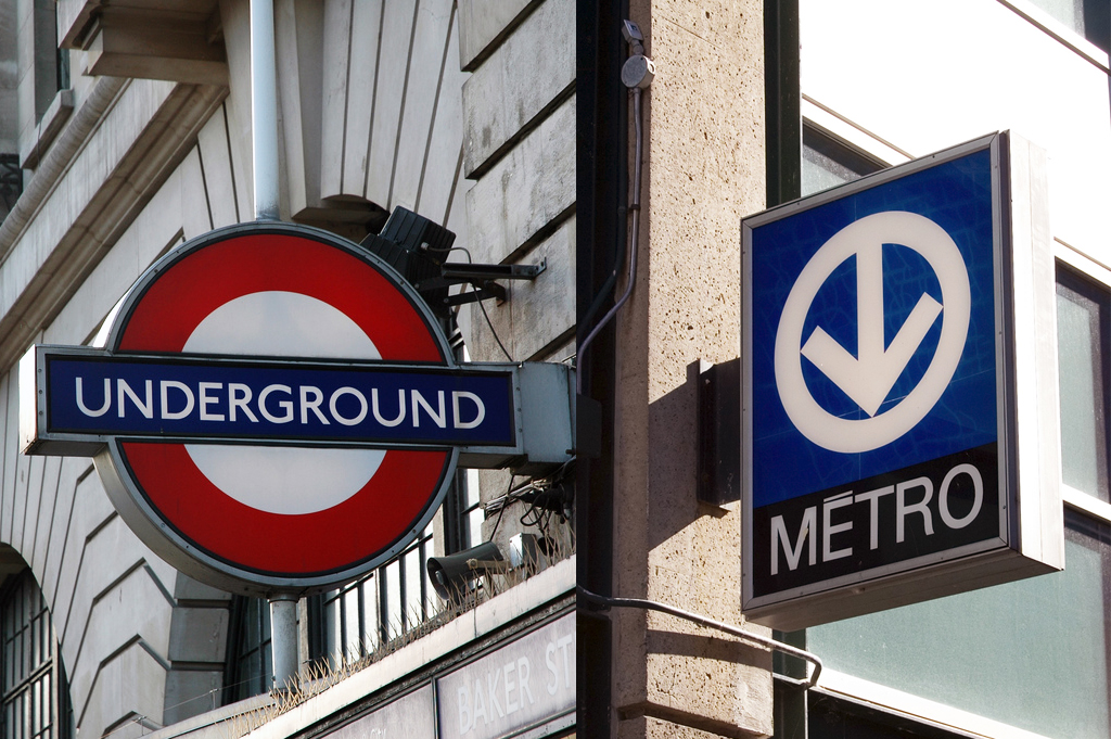
A public transit identity is a storyteller. Iconic public transit identities, such as the Montréal Métro’s downward arrow or the London Underground’s roundel, have transcended their roles as station indicators to become vital components of their respective cities’ visual landscapes. Embedded in these logos are a myriad of personal and civic histories–from the Blitz in London to Expo67 in Montréal–and a sense of place reflecting the unique design language of each city.
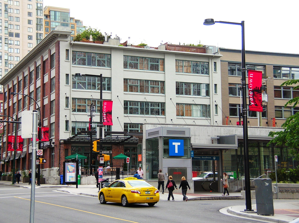
A public transit identity is a wayfinder. Providing attractive and distinct transit signage assists residents and visitors in finding their way to the attractions, services, and employment that congregate in the city. In anticipation of the tourism influx for the 2010 Winter Olympics, Vancouver’s transit authority redesigned its system-wide transit signage to provide a visual touchstone for tourists unfamiliar with the city, allowing them to efficiently find their way to venues, entertainment, and accommodations throughout the Vancouver area using public transit.
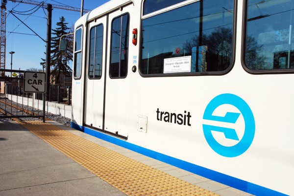
A public transit identity is accessible. Signage at LRT stations in Edmonton is often excessively detailed, visually busy, inconsistent, and not to be understood quickly. In short, it is many things that signage should not be. Differentiating LRT signage from its wheeled counterpart is important in not only communicating the difference in travel options and experiences, but also increasing visibility for transit users with low visual acuity.
A public transit identity is attractive. Do car manufacturers use an icon of a car to market themselves? Horses, stars, and abstract letterforms are icons of choice. In Edmonton, an LRT is an LRT. In addition to the level of accessibility, reliability, and customer service a transit authority must ensure to retain existing customers and attract new users, public transit should also be presented as something unique, interesting, and visually welcoming.
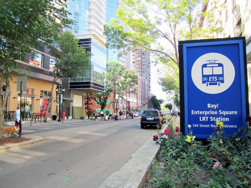
A public transit identity is an ambassador. As the LRT system expands to serve the growing population and appetite for alternative methods of transport in the city, it is important the system have a strong visual identity to distinguish itself from other transit agencies and travel modes in the region. One that is distinctly Edmontonian.
Given these requirements, where could ETS turn to develop a new visual identity for its LRT service? To its archives. ETS’ ‘flying E’ logo, used from 1976 until the current identity system replaced it in 1997, can still be found on many of the original Siemens U2 trains and on old signage throughout the downtown pedway system. As these trains and signs are retired and replaced, we will lose the icon. Yet, the 1976 logo is a design success; a striking implication of modernity, direction, and speed. More importantly, it is one unique to Edmonton, and is deserving of a better fate than that of a footnote in the city’s visual history.
Jeff Robson is a designer, urban planner, and straphanger.
One comment
Go Jeff! Go Jeff!! THANK YOU for this article. The flying E is fine piece of design work. I strongly support your call to restore it as the system symbol.