
In the spirit of Monday’s car-free day, this post asks the question: are those who earn higher incomes more likely to drive to work? Using 2006 Canadian Census tract data for the island of Montreal, I’ve created a map showing the city’s distribution of median personal income (after-tax), along with a map showing the percentage of workers who commute by walking, biking, or public transit. The third map merges the two…
Generally, higher income is significantly associated with higher percentages of car-commuters (no surprise there). However, there are areas within Montreal where both low median incomes and low percentages of non-car commuters are found. Basically, a few neighbourhoods with lower median incomes have residents who are likely to rely upon personal cars for commuting to work- a costly expense.
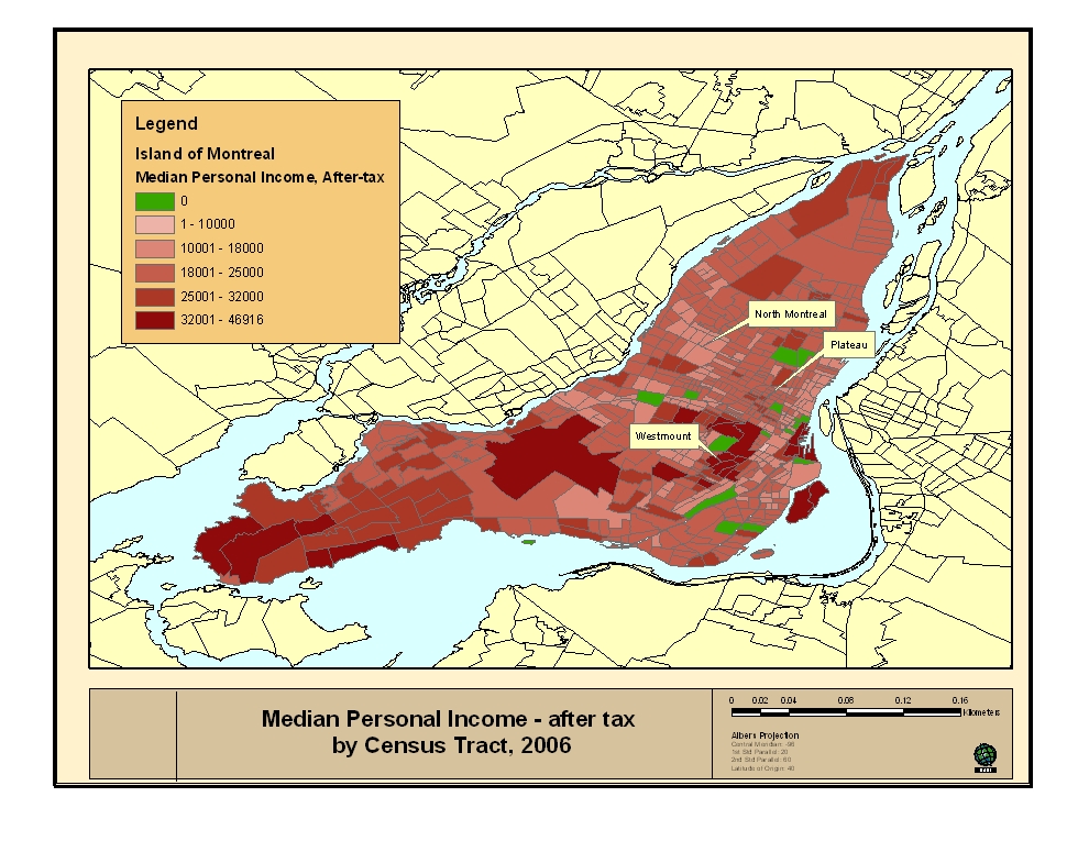
The following map shows the median personal income level (in dollars) of each census tract according to the 2006 census. For example, the neighbourhoods of Westmount and Beaconsfield have predictably higher median incomes, while St. Michel and North Montreal show a lower amount. The areas in green are either parks or tracts with no data.
Click on the maps to enlarge them.
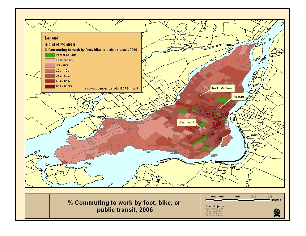
Next, this map shows the percentage of residents per census tract who walk, bike, or ride public transport to work. As expected, people who reside in areas away from the central business district and metro lines (I’ll show the metros next time) are more likely to drive to work.
In the following map, I use a spatial statistic (a local spatial autocorrelation) to find interactive clusters of median personal income and non-car commuting. Red areas show where high income is matched with high levels of non-car commuting. Red census tracts in Westmount and parts of the Plateau show areas with relatively high median incomes near downtown, and where people often do not drive to work. The light red areas are where higher incomes are paired with higher usage of cars, and as expected are at both ends of the island. The light blue areas show where lower levels of income are matched with low car usage. The white areas have no statistically significant clustering.
Noteworthy areas on this map are the dark blue pockets: these census tracts have lower median incomes and also show low percentages of non-car commuters. While the general trend is for higher-income census tracts to have higher levels of car commuters unless directly downtown, these areas have lower median incomes and yet rely upon automobiles.
Essentially, there is a possibility that these areas are not adequately serviced by public transit, or that other forms of non-car commuting are not readily accessible.

These maps are largely descriptive, in that there are many factors involved as to whether one drives to work or not. Furthermore this data is at the census tract level and does not describe individuals or households directly, and can only give a general percentage or statistic for a small urban area. This publicly available data is compiled from Statistics Canada through the University of Toronto’s CHASS system, and the geographic files are provided by the EDRS at McGill.
9 comments
7:00 a.m. Friday – Finch Station. Not only are Viva drivers on strike, but they are now picketing at the YRT Terminal. More professionalism from VIVA
Outstanding post, KC. Welcome!
Sweet! One quibble though. The colours chosen make it difficult to distinguish some of the intermediate divisions in the first two maps.
In the final map – how did you define “high” & “low” income going from 5 ranges to just two. Same for “high” and “low” commuting, going from 6 ranges to two. Also, the range numbers seem a bit arbitrary. Like why is it less then 5% and not less then 15%?
Sorry just nitpicking, I used to work in cartography- I Still very interesting.
Response:
Hi GDS,
Thanks for taking a close look. The last map uses a spatial statistic called “bivariate Local spatial autocorrelation” to find clusters where the two variables interact with each other, based upon their relative values.
So, I did not have to define thresholds at which ‘high’ and ‘low’ are indicated; the statistic accounts for both the spatial contiguity of each census tract to tracts surrounding it, and the values of the variables ‘income’ and ‘non-car commuting’. If the association between the two variables is not strong enough either due to the values of the variables themselves or their proximity, then the relationship is not statistically significant (and in white on the map).
Spatial autocorrelation assumes “that the value of a variable at one point in space is related to the value of that same variable [or another] in a nearby location.” See Statistical Methods for Geography by Peter Rogerson.
As to why the ranges seem arbitrary, they somewhat are- I took a look at the frequency distribution of census tracts for each variable (both form an upside-down U distribution) and tried to make classifications evenly spaced to capture a descriptive picture for both variables. I chose 5% just to highlight the tracts with very low non-car commuting rates.
Best,
KC
PS- Also an error is on the maps- the St. Michel neighbourhood is marked as North Montreal. North Montreal is slightly to the northeast of St. Michel.
Managed to find a copy, so I get it now :)
http://books.google.com/books?hl=en&lr=&id=jxw_DYO0w48C&oi=fnd&pg=PR12&dq=Statistical+Methods+for+Geography&ots=UrvlQLVhJw&sig=GMAiDideaQhmCJYpuHd7o15RsfY#PPA180,M1
It would be interesting to see if there is a time shift with that data because for the Montreal census tracts, there haven’t been any major transit improvements since the Blue line. So a before and after would be cool.
What about in Laval, before/after the metro?
Response:
May be a bit soon to tell- but I’ll try to make a post with a comparison between 2006 and 1996.
KC
Wow, nice job!
Ca serait intéréssant de voir plus de cartes comme ca…
Je sais que le carrefour jeunesse-emploi à cote-des-neiges travaillait sur des cartes qui montraient des liens entre pauvreté, duré de vie, etc. Des chiffres qui parlent très bien sur des cartes et qui peuvent en faire réfléchir plus d’un!
Enfin, lâchez pas la patate!
The Blue line was originally supposed to go much farther out – to Anjou. I think another line was supposed to go up to Montreal North (that is the English name of Montréal-Nord, not “North Montreal”). Alas the enclaves ill-served by public transport remain.
I see something similar in the southwest on the maps, but I’m much less familiar with the area. Is the dark blue area Lasalle/Lachine – but past Angrignon?
Response:
Thanks for the comment- there does appear to be areas in Montreal North and parts of St Leonard where lower relative income is associated with car commuting- areas that would be better served by an extension of the Blue line.
In the southwest, the main dark blue pocket that is visible on the map is part of Lachine. There are some industrial parks in this area, which is why there is so much blue (the census tract stretches over non-residential areas). However, it is likely picking up on the residential areas in between Autoroute 20 and Montreal-Ouest in that corner of Lachine, where lower relative incomes are found, as well as higher levels of car-commuting.
KC
The dark blue tract in Ville-Émard by Parc Agrignon seems odd. It has the same income level as the surrounding tracts and a higher level of non-car commuting than them (unsurprisingly, since its between Monk and Agrignon metro stations). So it seems strange that it is assigned a lower income, low non-car commuting correlation. Should it actually be light blue?