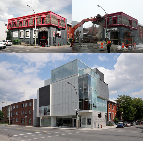
Such a shame, I liked the old building soo much better. It actually fit in with the neighborhood while being unique at the same time.
It actually looks a lot better in real life I would say. In the photo it looks like a rendering, mayb eit has somethign to do with the light.
Brutal…
Yeah it just looks like someone hit “Random cubes” in AutoCAD. Like a robot wart. Modern architecture. Sigh.
I particularly like the big multi-storey blank wall on the front of the building… and by ‘like’ I mean ‘makes me want to cry’.
À mon avis, ils auraient du orner la partie grise d’un dessin ou d’une gravure à même le verre de l’ancien édifice.
It’s not as blind wall. Sometimes it’s better to judge a building by actually seeing it than with just an unflattering picture. It’s actually a nice building with refine details.
The new theatre is not as bad as a lot of other Montreal buildings (bell centre anyone?), and the old one was nothing to write home about folks.
The old building was completely ONE with the neighbourhood. I loved it. The new building screams Look At Me and Ignore Everyone Else. Let’s hope their theatre productions can keep up with the architecture.
It looks more like a Hydro Quebec station than a theatre…..
This building looks so much better live than it does in the photo.
Guillaume, la partie grise EST ornée. Ça ne paraît pas sur la photo. Il faut juger l’immeuble sur place.
I don’t care what anybody says, I like a marquee.
I like the new one much better!
It could be worse folks. EVERY building in Vancouver looks like the new theatre.
Voici un type d’archicture déplorable qui se démodera très rapidement. Dommage.
Come on guys. This is not that bad.
Est-ce que quelqu’un connait le nom de l’architecte.

19 comments
Guillaume, j’ai trouvé un groupe sur Flickr que tu trouverais intéressant, je crois: http://www.flickr.com/groups/lookingintothepast/pool/
Such a shame, I liked the old building soo much better. It actually fit in with the neighborhood while being unique at the same time.
It actually looks a lot better in real life I would say. In the photo it looks like a rendering, mayb eit has somethign to do with the light.
Brutal…
Yeah it just looks like someone hit “Random cubes” in AutoCAD. Like a robot wart. Modern architecture. Sigh.
I particularly like the big multi-storey blank wall on the front of the building… and by ‘like’ I mean ‘makes me want to cry’.
À mon avis, ils auraient du orner la partie grise d’un dessin ou d’une gravure à même le verre de l’ancien édifice.
It’s not as blind wall. Sometimes it’s better to judge a building by actually seeing it than with just an unflattering picture. It’s actually a nice building with refine details.
The new theatre is not as bad as a lot of other Montreal buildings (bell centre anyone?), and the old one was nothing to write home about folks.
The old building was completely ONE with the neighbourhood. I loved it. The new building screams Look At Me and Ignore Everyone Else. Let’s hope their theatre productions can keep up with the architecture.
It looks more like a Hydro Quebec station than a theatre…..
This building looks so much better live than it does in the photo.
Guillaume, la partie grise EST ornée. Ça ne paraît pas sur la photo. Il faut juger l’immeuble sur place.
I don’t care what anybody says, I like a marquee.
I like the new one much better!
It could be worse folks. EVERY building in Vancouver looks like the new theatre.
Voici un type d’archicture déplorable qui se démodera très rapidement. Dommage.
Come on guys. This is not that bad.
Est-ce que quelqu’un connait le nom de l’architecte.