
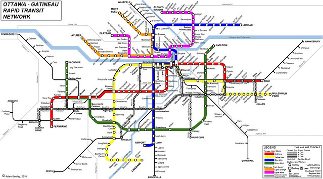
Editor’s note: At Spacing Ottawa we were captivated by Adam Bentley’s vision of an Ottawa “transit map from the future” from our very first time of viewing. At the time, it seemed that the startling image just arrived in the blogosphere out of thin air, but in this post Adam shares the story of how it was that the diagram came to be propagated so quickly and so widely. To see a larger-scale image click here.
Whether you develop a plan to improve public space or a recipe for a new ice cream flavour, a good idea can spread like wildfire if it is presented properly –and you don’t need a degree in communications to do so. Several months ago, I developed a long-term vision for mass transit in Ottawa. Self-described “transit nerds” referred to this map as a “dream transit plan” or “fantasy transit map”. However, upon releasing the map online, a captive audience of urban and transit enthusiasts took the plan very seriously and provided useful feedback and compliments. After tweaking the proposal, I quickly found that this idea had received such a positive reception that discussion spread online through SkyscraperPage.com and TransitOttawa.ca. There was even an account by someone who claimed to have seen the map posted to a transit stop (I was never able to personally confirm this claim). I later asked several respondents what features of the map they thought inspired such a positive response. Their replies mainly included a clear message evident from the map’s content, the map’s ability to be easily understood by a variety of people, and my decision to present the map online, as opposed to community groups or as a letter to the media.
I designed the map to present a solution to the problem of long travel times on public transit between Ottawa and Gatineau’s multiple hubs of activity. The proposal called for continuous long-term investment in a complete and interconnected network of light rail, light metro, bus rapid transit, and regional rail to provide users with multiple simple connections (something Jane Jacobs would approve) to activity and residential centres throughout the National Capital Region. The plan would fit into the current Transportation Master Plan and revive some ideas from the City’s previous ‘Chiarelli-era’ rapid transit plan and the seemingly forgotten 2007 Mayor’s Taskforce on Transportation. Online and real world responses to the plan’s proposals included enthusiastic praise for its call for visionary and long-term thinking, and that it should immediately be included in current plans for Ottawa’s future rapid transit network. Respondents agreed that the proposal presented the idea that through simple and easy connections, users could reach every notable destination or hub in the city.
Respondents also praised the proposal’s use of colours, lines and fonts to present the idea of an interconnected network in a comprehendible manner. The map’s use of contrasting shades between the background and foreground and various bright primary and secondary colours between the routes were its main formal strengths. Using contrasting colours and shades in a map helps people with vision problems and those who just want to quickly glance at the map more easily see the different elements. I also received praise for representing route capacity with lines of varying thickness. Using wider lines to represent higher-capacity routes (or narrower lines for lower-capacity routes) brings peoples’ attention to primary routes, helping them form a mental map of the locations of the origin, route, and destination of their trip. Visual cues such as rivers and freeways were added as points of reference. The final example of this map’s good form was its use of a sans-serif font, which minimizes unnecessary lines on the map and helps people with vision problems distinguish between individual letters and words.
With forums, social media, podcasts, and blogs, there has likely never been a better era in the history of humanity to share ideas and collaborate on projects with other people around the world. Respondents liked the fact that I developed the map in Google Draw, a free online drawing program that allowed me to share the document with others, thus facilitating collaboration with friends and colleagues. The map was then uploaded to an online urban issues forum, quickly giving me free access to advice from an established network of local and international transit and urban issues enthusiasts and professionals. Using the Internet to disseminate this proposal was a much cheaper and easier option than meeting with individual community groups or seeking the approval of the gatekeepers at the Ottawa Citizen who select submissions for its Letters section. The success of this strategy was evident from the fact that a few weeks later I found the proposal had spread to other online forums and blogs.
A well-thought out idea must have an equally well-planned method of presentation. My mass transit proposal map attempted to combine the best of past and present proposals into one coherent and visionary plan for rapid transit in the National Capital Region. The map was drawn so as to be accessible to a wide variety of transit enthusiasts, urban issues aficionados, and anyone interested in improving the quality of life for the region’s residents and visitors. Its method of dissemination took advantage of fast and cheap access to feedback through online forums, which also raised awareness of the proposal itself. While I am no communications expert, I believe that the mere fact that my proposal can be found on Spacing Ottawa, our city’s premiere urban issues blog, is evidence that this map is a good example of how to successfully present a solution to an urban issue in our current era.