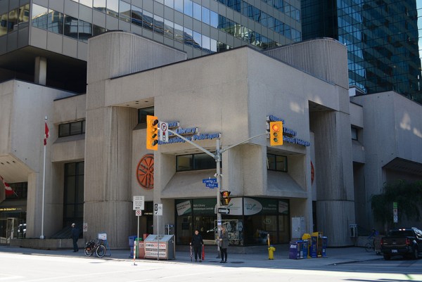
Ottawa Public Library, photo by Sheldon DeFilippi
Brutalist architecture is like the blind date who has a great personality. And we all know what that means . . .she must be ugly. But maybe her beauty is an unexpected kind—one that is slowly revealed when you look carefully. It’s the kind of beauty that comes from character. And love it or hate it, brutalist architecture has character. Maybe we shouldn’t be so quick to dismiss based on the sole measure of superficial good looks and take some time to get to know her.
Brutalist and other mid-century concrete architecture took a very public beating this past year in Ottawa. As someone who has a bit of a love affair going on with that era, I took the attacks very personally. Early 2014 saw the demolition of the Union du Canada building (Louis LaPierre, architect) in the Market. I admit, I almost cried when the Sir John Carling Building (Hart Massey, architect) was demolished in July. The crowd I wish had been there to protest the demolition of a designated Federal Heritage Building was instead there to cheer on the spectacular implosion.
The most recent resurfacing of a brutalist building everyone seems to love to hate is the National Arts Centre (Fred Lebensold, architect). One year after unveiling the plaque designating the building a national historic site, praising “its overall design, particularly its integration into the urban setting, dramatic succession of interior spaces, and incorporation of contemporary works of art, make it an outstanding performing arts centre,” the building and its relation to the site is being significantly altered.
With the now confirmed $110-million “facelift”, I can’t help but think of a bad high-school romantic comedy where the nice nerdy unpopular girl who just won the science fair needs a good makeover so the captain of the football team will finally notice her.
Back in July, the long ongoing debate about the Main Library (Bemi & Associates, architect) resurfaced with the release of a report on three options for modernizing the existing building, along with many critical rants about it being an “eyesore”. The options ranged from $40-million to “renew and refresh” the existing structure to a $70-million redevelopment “stripp[ing] down to its structural shell resulting in a new façade and an almost like-new building”.
The renew and refresh option was given little attention, which is unfortunate given it is the only one that considers preserving the value the existing building offers. The price tag of the almost like-new option has the OPL board pursuing the fourth option of an entirely new building—a proposal Mayor Jim Watson threw his support behind during the municipal elections this past fall.
I have great respect for the two architecture firms who have developed the renovation plans/proposals for both buildings: Diamond Schmitt Architects and Ajon Moriyama Architect, respectively. But I have great reservations about how drastically a glass façade changes the character of the presence these buildings have in the city.
It is difficult to see a glass curtain-wall as a respectful alteration when the brutalist style was in part a criticism and reaction to the abundance of glass buildings taking over our cities. It would be like changing the chords of a punk song so it sounds more like standard-pop. It might be more popular that way but that cannot be our only measure of value.
I am concerned by the lack of consideration that there is heritage-value worth preserving in both cases. Both buildings admittedly have functional concerns that need addressing. But the proposed plans seem to imply that their appearance is irreconcilable with improved functionality.
The 1960s and 1970s were hugely influential in shaping the city of Ottawa and many other cities across North America. It is a significant chapter in our history but one that is in danger of being erased rather than acknowledged. Obviously, cities don’t stand still. We demand different things from our buildings and public spaces over time. Building technology advances. Styles and taste change.
When there is discussion of demolishing or renovating a building from the early-1900s, we see the public concern with preserving the memory of our past. Part of the criticism and dislike of the mid-century modern transformation of cities is the reckless destruction and abandon of the past. Ottawa’s most famous example of course being the razing of Lebreton Flats.
That oversight of modernism has led to the growing heritage and preservation movements. We want our cities to move forward but with respect for the past. So why is there such great antipathy towards protecting major important works of modernism?
It has to be pointed out that many of the reasons thrown around for demolishing or remodelling these buildings echo those that led to the destruction of Victorian building stock we now so desperately cherish—out-dated, falling apart, ugly, no longer able to meet the demands of modern living, expensive to restore and bring up to new standards.
News reports of the announced demolition of the old Carnegie Library that was replaced by the current main library are eerily similar to the current debates. Remember, the early 1900s were as far away to the mid-century modernists as those modernists are to us now.
So, why do I think brutalism is worth keeping around?

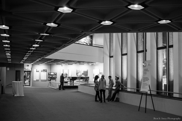
The National Arts Centre, photo by Bust it Away Photography
These are great public buildings that celebrate being spaces where people gather. Despite criticism of being antisocial buildings that “turn their backs on the city”, the generous stairwells and platforms at the NAC, both inside and out, place people in relationship with one another and with the city. Sometimes in direct contact, like random encounters with friends during an intermission. Sometimes through sightlines, people watching below or magnificent views out into the city.
They are admittedly hard to relate to from the outside but they are experts at creating relationships from within. The social ideals of brutalism is reflected in the fact that libraries and universities were some of the most prolific patrons and greatest examples of brutalist architecture in North America.
They are also great celebrations of architecture as artform. They are sculptural and honest in the way they bear the marks of the geometry through which they were designed and the materials with which they were made. Which, as a point of interest, is where the style got its name, from its use of raw concrete or “béton brut” and not, as is usually assumed, their brutality.
Brutalist buildings are imposing and massive. They do not shy away from being actors in the scene, and dramatic characters at that. It would be a shame to draw the glass curtain-wall over them all.
***
Story: Sarah Gelbard, via yowLAB
This article has been cross-published: yowLAB is Ottawa’s architecture and design ideas lab, fostering and supporting collaborations and exchange of ideas in the community. Follow them on twitter @yow_LAB and on Facebook. *UrbSanity is also published in the Centretown Buzz.


4 comments
Brava, Ms Gelbard. I’m glad somebody said it!
The very term brutalism (derived from the French béton brut, meaning raw concrete) prejudices us against these structures, as does the current fashion for bland, developer-style curtain-walled boxes that are changing the character of places like the Carleton University quad and Landsdowne Park. Compared to the fashion for groovy, sensuous concrete that held sway in the 1960s and 70s, the current escape into box-store inoffensiveness feels like a society-wide failure of imagination.
Is there a more distinctively regional (or even national) style of architecture than so-called brutalism? I can’t think of one since the age of the sugar shack. In any case, Ottawa’s High Colonial styles (English Neo-Gothic, Scottish Baronial) are hardly under threat.
Not to mention that the big-box style (or non-style) should be questioned on environmental grounds alone. As we’ve seen at the National Gallery, where they’re replacing countless hectares of leaky glass walls and ceilings, such structures cost a fortune to heat, cool, clean and maintain.
So yes, it’s time to start a serious conversation before we dismantle a vernacular that may be the best thing we’ve got … whether we like it or not!
Instead of publicizing the ugly truth about Ottawa: the decrepit, lame, ugly, rotting poor excuse of any country’s “nation’s capital” your publication does the opposite: celebrates these grotesque slabs of concrete. Only in a country so insecure and mediocre can this pass as a concern for “heritage”. You wouldn’t recognized heritage if it hit you in the face. Spacing. Spaced out.
Dear Mrs. Gelbard,
You obviously know your stuff when it comes to architecture, and you make an interesting case. As an art history baccalaureate, I also am sensitive to the preservation of our artistic past, however unesthetic it may be. BUT as I librarian of the Ottawa Public Library, I rejoiced when the announcement of a new building was made. A library should be open, welcoming, and be inspiring — our current flagship library is anything but. Wouldn’t you prefer spending a few hours working and reading in a collective space that had *windows*???
Dear librarian-who-loves-windows,
I do also enjoy bright, open, grand libraries. I recently moved to Montreal and la grande bibliotheque of the BaNQ (Patkau architects) is my go to workspace. Parts of this article were actually written there. But the OPL Metcalfe branch was my local branch for over 5 years and I also used it frequently and think it has great potential if restored. It is over-crowded and the quality of the circulation and reading spaces have been diminished with ad hoc renos over the years. Looking at old archive photos, there is both a coziness and grandeur that has been lost. Maybe the ‘main library’ should be moved but I hope there is discussion of keeping this site and building as the Centretown branch. There is no one solution for libraries. There are debates about whether the focus should be on flagship central libraries or network of quality local branches. Is the purpose to be big public gathering spaces or quiet spaces for individual study? Trends seem to flip back and forth.