

There are so many issues on the TTC’s “hierarchy of problems” that questioning the metropass’s design could seem frivolous or even extraneous. People don’t base their decision on buying a pass and taking transit on how good and appealing the actual pass looks — in fact, most people likely decide before they even see it. Yet any good designer will tell you it does matter, and conscientious users — or customers — may have more than a passing opinion on this item they live with for a month. Over at the New York Times City Room blog Sewell Chan wonders if the MTA card needs a makeover. Read the rest here:
More so than any credit card, library card or health insurance card, the MetroCard is the one piece of plastic that most unites New Yorkers. The Metropolitan Transportation Authority distributes 180 million of them — that’s not a typo — every year. The MetroCard is a fixture of anyone’s pocket, wallet or purse, a mainstay for any commuter, and — ever since the last tokens were phased out in 2003 — the only one way to (legally) ride a subway in New York City. And yet, few people spend much time looking at or thinking about the humble, homely MetroCard.
The M.T.A.’s recent decision to raise subway and bus fares got me wondering why all MetroCards all look the same — whether you buy the 7- or 30-day unlimited-card variety or the regular per-per-ride cards. Then I asked myself why the design of the MetroCard hasn’t changed all that much. (Emily Gordon, writing on the design blog A Brief Message, also spurred us to think about this in November.)
In my wallet, I carry not only the MetroCard but the transit cards for Boston and Washington, cities I visit fairly frequently. (Boston’s CharlieCard shows a cartoon commute and refers to the 1948 song made popular by the Kingston Trio. Washington’s SmarTrip card depicts above-ground subway trains whizzing by monuments.) During a vacation in London last year I used that city’s new Oyster card, which has a fairly abstract design with two different shades of blue. (Appropriate for English weather, perhaps.)
Chan went on to interview four design experts on their opinion of the MTA, and his readers shared theirs.
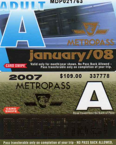
So what do folks think about the TTC Metropasses? The basic design changes each year, so there is some anticipation around the holidays when Torontonians (surely enough to be plural) wonder what the designers up at Davisville have created. This past year the month was spelled out in reflective dots (that do not scan very well) and were an interesting bit of disco-flash from the normally staid TTC. Otherwise, compared to the three U.S. examples above, TTC cards are rather busy with no defining characteristic other than the big A, which is somewhat confusing until you connect it to the “adult” meaning — though people probably feel good just being around an A rather than, say, C or D.
A neat idea would be to print an archival TTC photo on each pass, then they’ll become collector items. So, does pass design matter, and if so, what do you think of our metropass?
Thanks to Spacing reader uskyscraper for the link.

29 comments
I imagine that since the TTC allows users to board by just flashing the pass and not necessarily swiping it, it incorporates anti-counterfeiting measures to tip off fare inspectors to fake passes.
Unfortunately these measures seem to include reflective disco-lettering, ugly gradients and squished typography.
It’s been consistently ugly. It’s always looked like someone just slapped a page of different elements together and added a couple of cheesy Paint effects. Shame.
Considering how ridiculously efficient the MTA is, I easily forgave the cheap look of their fare card when I was in NYC. The only problem was that I couldn’t refill it when I went to buy the next day’s unlimited ride fare and I had to throw away my perfectly good card.
They should run a contest for designing the card..winner gets one etc it would make them collectible.
I thought the comment from the red/green colour blind guy (that the yellow card made it easy to find among his other ones) was interesting.
Not related to the question at hand, but I felt like sharing this photo I saw on flickr of a “metrocard bike”:
http://www.flickr.com/photos/90838601@N00/203885250/
While living in Singapore, the entire system was RFID card activated (well, I presume RFID). The automated machines allowed you to purchase an exact fare for your card, with a 1$ deposit, at which point when returned you got the money back (or it could be donated to charity). You could also charge up your card, and merely tap it on all trains and busses. The only cash-entry point on the entire system was on busses, where you could not purchase a card (and at train stations).
I only wish I could tap my card when getting on the line, simply because then i dont have to continue pulling out my card. Design is, at least to me, unimportant, it is function which is associated.
Great timing! I just moved to Toronto a few days ago (I’m from Montreal and have been living in Vancouver, Taiwan, and until last week, Paris) and upon purchasing my first Metropass with which to set out and discover the city with, I found myself grimacing down at the gaudy little troll of a card, feeling a bit disappointed. To my surprise when I looked up, the TTC attendant was grimacing back at me. Welcome to Toronto.
But the Metropass is part of a larger issue.
Now I’m not a Toronto hater at all. I’ve lived in enough cities to recognize that Canadians have great cities and that the Toronto bias is just senseless Canadian tribalism. As I discover the city, I find myself really loving it, but I do come away with a vague feeling of having moved to a second rate metropolis. Not because Toronto is second rate, but simply because this city seems to be somewhat challenged in the realm of presentation and the Metropass is part of that. I paid $109 for something that looks like it was dreamt up at for a grade six computer class project in Sarnia or something. I see similar poor design choices all over the city, from the city’s own Toronto logo to the horrible TTC emblem and colour choices. Toronto is an enormous, functional, impressive, and often beautiful city, but it lacks any cohesive sense of aesthetics. I find myself often wondering if I now in fact live in 1998 or 1983. It’s confusing.
By far the worst offender though is the TTC. The TTC is a brand and it’s a business as well as a public service. It has an important responsibility as an iconic part of great city to present itself as a functional and appealing alternative to full automobile domination. How the TTC presents itself has real effect on quality of life in the city and on the decisions people make for their daily commute. It has an effect on business and tourism as well. I often see my own hometown, Montreal, featured in magazine or websites because it’s a really stylish place to live. I’m a bred Montrealer but I’ll readily say that that Montreal is often shamelessly ugly and startlingly tacky, but it has much better presentation of itself as a brand than Toronto and it has confidence. (and better bagels and poutine)
Toronto is full of inspired young people, many of whom are obsessed with issues of design, public space, transit, bike lanes, etc. Toronto is a great city which is on the cusp of being an iconic one. The city needs to tap its vast local talent. The TTC needs to poke it’s head up and see how the world has changed while it’s been sleeping.
**(the TTC website is horrible!! It’s like a time warp. I had to rip out my ethernet cable not to get sucked in! ….close one.)
A direct comparison isn’t really fair for the same reason Senior mentions — the card needs more info (month, “A” fare category, and visible security features) so that it can be flashed at drivers. I’m sure a better design is possible, but it wouldn’t be easy.
Does the Presto card actually look like the images on the Presto web site? If so, it gets full marks for being uncluttered, though it’s not terribly inspiring.
I like that the design changes every month, obviously it helps the drivers to see whether the card is current, but the designs are all over the place without any commonality, except the large ‘A’ and even that varies from card to card in size, position, etc.
The card needs a professional makeover, with variable elements and a recognisable brand.
I was saving my various passes up and I was going to write a blog post, but since the mighty Times has covered the topic, I guess it’s safe for the local Toronto media to do the same. (The issue is more than just the adult Metropass, BTW – there are also four weekly passes, and a student pass, plus the GTA Pass that next to nobody uses, although that one might not be “designed†by the TTC.)
Merely at the level of functionalism, the use of (fake) Helvetica and the atrocious copy-editing mean that anyone who even bothers to read the fine print has to struggle. It was only with this month’s pass that the TTC decided to kern the P and A in METROPASS, the only word set in the TTC typeface.
If you’re wondering why the whole thing is so tacky, the one-word answer is: Windows. The entire TTC runs on Windows; a billion-dollar subway’s signage was designed with fonts that came free with CorelDraw (apparently the sole source of all TTC typefaces); and I’d be very surprised if the entire TTC has more than two licensed copies of Illustrator and Photoshop.
Is there a registered graphic designer in the employ of the TTC? Ontario is the only place that even has such a registry. (If you were an RGD, would you want to work there? You’d have to borrow Giambrone’s MacBook just to get your tasks done.)
Windoids like to claim otherwise, often writing those claims in typography more reminiscent of a LOLCAT than anything else, but Windows users are antitypographic, have next to no design sense, and are, at root, tacky. (Windows is responsible for the popularization of Arial, an even worse fake Helvetica, and of Comic Sans. I’ve done paid work for Microsoft Typography and I still can’t believe the shite that other branches of the company have put out.)
The Metropass is a shining example of Windows “graphic design†at its finest. It isn’t going to improve because, save for exactly one person I am acquainted with, the entire TTC put together doesn’t have enough taste to even recognize the problem. It’s just “print,†right? They’ve got a standard and everybody’s happy when it’s applied.
I’m a fan of the new photos-on-the card style. I think they should hold monthly competitions through their website for TTC-related photos where the best image is selected for the next month’s metropass. Is it important? No, perhaps not but I really can’t imagine it is using up very many resources, someone has to coordinate the printing of the passes every month anyhow so I don’t think there is any point in calling it ‘trivial’ or otherwise.
Really, the Metropass is only one symptom of a larger problem at the TTC, in that it has no coherent sense of how it presents itself to the public and there is clearly nobody in charge of design there. The look of its signage, advertising, passes, et cetera are all over the map, and all of them look cheap and amateur. The image is, predictably, of a second- or third-rate transit outfit with no pride, no imagination, no sense of itself and no money to spend. I hate to say it, but I guess that isn’t far from the truth. So, in that regard, the Metropass is just an accurate reflection of the organization behind it. At least it’s honest, then.
I find the Metropasses amusing because anybody who has ever used Corel Photopaint or older versions of Photoshop instantly realize that they just take default fill patterns like “Craters 3” or “Moss 5,” splash ’em on and apply a little linear transparency.
My feeling about Metropasses has always been that there should be electronic readers in every surface vehicle to prevent fraud and add convenience for those who want to buy transit passes for *30 days*, not one month (there’s a big difference.) The design, of course, would be the same on all cards year-round. It’s part of our civic look and feel.
Hey, I’m one of those few people who use the GTA passes! I’ve got a sizable collection of ’em in my room, and the 2007 batch look hideous – squished text and badly applied gradients.
That looks like a idea for a Spacing contest, Shawn. Although the amount of info required on the cards might would require hours of (non-renumerated) effort, we can always hope that the TTC might use our ideas.
yes, sure sometimes looks help/matter, but as a darker green type, it seems fairly trivial compared to the service/cost issues – and has anybody really noticed how the atmospheric commons is/was rather extreme of late? (though the heat did a superb job of clearing the bike lanes compared to the city).
Sometimes aesthetics are weapons of mass distraction.
What a great venue for showcasing local art.
Joe> I had been saving my metropasses for 6 years, with the intention of making some kind of collage at some point. Then I moved earlier this year and they were edited from my collection/life in the interest of easy-moving and getting rid of stuff. You should still do something with your collection, looking at their evolution over time. This post was simply to see if there are any initial thoughts on the subject.
You’re onto something with using archival photos for the design to make them collectible (again – if people care).
When I lived in Japan, the Japan Rail cards often featured different train models, and young kids were eager to collect different types (used ones were often sold or traded).
Bringing up design issues with the TTC is a dangerous proposal, as they’d likely start selling advertising space on the cards, just to find more operational $.
I can see it now – your monthly Starbucks/TTC swipe card.
I like the idea of using the card as a showcase for local art or design.
But I do feel the issue is a bit less relevant than the cost of the pass or its function or scope. When I lived in Osaka, the card was just a piece of paper with a magnetic strip and my handwritten home and work station imprinted onto it. It was perfectly cool, and much more pleasant to carry around than a thick piece of plastic.
But it is a cool untouched area. Still, even in terms of aesthetics, the TTC has a lot of other areas to work on before metropasses.
Gabriel Lerman: Photos, please! Even digicam photos on Flickr will do.
While i’m no graphic designer, the new passes (January) are pretty good. The definitely beat out the old leopard print passes…
I lived in Montreal for 4 years and these new ones certainly beat their cheesy graphics on their flimsy cards. While they had a certain charm, for example hearts for the February pass, etc, they look stuck in the 70s, much like the Metro itself.
Hell, they even sold out and carried advertising on the cards for long distance companies (dial 10-10-whatever). A new spiffy January pass beats that anyday.
Joe> http://flickr.com/photos/suigistuff/108357410/ or http://flickr.com/photos/suigistuff/174709088/
I have yet to do a photo with the 2007 designs – when I’m back home, I’ll do so.
I agree with Dave. And speaking of MTA, they offer a 30-day pass for $76. Plus, the 30 days start when you purchase the card and is not limited to the current month. I have never understood the pricing and terms of the TTC Metropass.
pictures of cats, white fluffy cats.
Great ideas everyone! I think we should go one step further beyond design and look at function. Let’s do the Oyster card only better…
-A debit style transaction card that you purchase for 1$ and can load with up to $200 cash from your VISA or MasterCard
-It’s a touch card using , not a swipe card, so careful manoevers when you are carrying things are not needed
-You can set it to automatically reload the card when you reach $5 (as with Oyster in London)
-How about a choice of graphic styles from the vending machine, like the different $t@rb^cks options?
-It charges you $2 per ride on any TTC vehicle, but when you reach 4 trips in one day, it stops charging
-It charges per day, but when you reach 50 trips within a 30 day period, it stops charging for the remainder of the 30 days
-use partnerships with restaurants, the Opera, TSO, etc etc to make it a charge card for all kinds of city events
-advantage: it’s a flexible charge system that can adapt when we add other kinds of rail (beyond LRT) as the city expands over the next 20 years
A word in support of the MTA’s passes: I remember seeing humourous quips on them when I spent time in New York a few years ago. The one that stuck with me was: “Please don’t walk between cars. We promise, they all look exactly the same.”
There is one nice modest design touch on the TTC, which is the “press bar” notice on the newer buses.
These placards portray a rather hip dude circa 1970 with a suave beard and black turtleneck, and a charming lady circa 1980 with bouncy hair and a clutch purse, both safely exiting the vehicle.
The overall design style is somewhat retro, and rather charming in my opinion.
The “press bar” sticker may be appealing, but from what I’ve seen the functional design of the “press bar” system for the back door works very poorly.
People aren’t sure when to press the bar, there’s no immediate feedback that they’ve pressed, most people seem to end up pushing the door open the whole way themselves (hope the mechanical side was built with that in mind), and the doors take a long time to close once the last person leaves. It’s (again) a tricky problem — “stand on step” isn’t an option when there’s no step — but back doors seemed to work much more smoothly on other low-floor buses I was on before these arrived in Toronto.