
Toronto’s new street signs are beginning to appear at intersections across the city.
About five years ago the City of Toronto began the process of replacing all of the old, damaged street signs (photo below). In the old city of Toronto, the old-fashion signs — white background, all-cap black type, embossed black trim, and a 3-D acorn on top — were becoming too expensive to manufacture at about $300 per sign. They were replaced with a replica design (white background, upper-lower case text, flat appearance, about $100 to produce) that looked like cardboard cutouts, in my humble opinion. Street signs in the inner suburban cities saw their blue signs slowly replaced by the same old-timey replica designs as downtown, but with the familiar blue background.
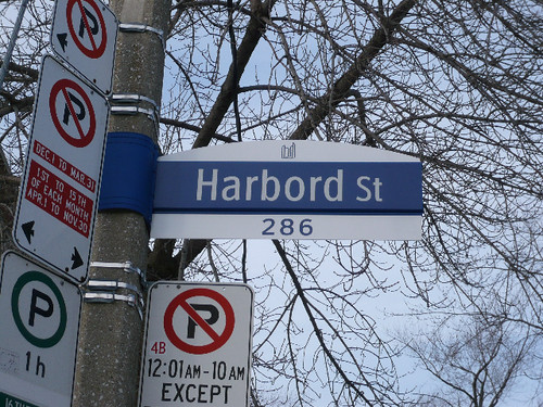
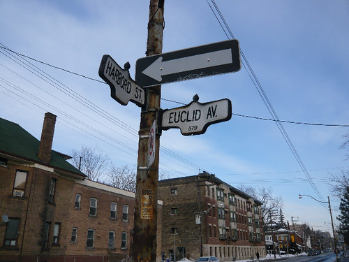
Then in 2005, the City presented a new design by the same designers as our transit shelters. It was passed by subsequent committees and city council, with the roll-out taking up to 25 years. Over the last few weeks, the new signs began to at intersections like Harbord and Euclid (shown above and below).
Here’s what I like and dislike:
• LIKE: The upper- and lower-case letters are much easier to read at a distance (the human eye sees words as shapes, which is hard to accomplish with all-caps lettering).
• LIKE: The blue background and white text are much easier for people to read — white blends into the background too easily.
• LIKE: Modularity of the sign. The top piece (shown in the photo with the City of Toronto logo depicting city hall) can be a neighbourhood name or BIA logo.
• DISLIKE: Much like our new street furniture, there is little room for neighbourhood expression besides the option to put a logo on top. It would be nice to have maybe a black background for older parts of the city, red for Chinatown, green for Forest Hill (a background colour currently used on the old-fashion signs).
EDIT (Jan. 28): you can see how the City will apply BIA and neighbourhood identities by downloading this PDF.
I suspect the City was in a no-win situation as most everyone will have an opinion of the design, no matter how great or poor the end result produced. Perhaps the City could have held a public vote on a few designs in order for residents to feel like they took part in an important urban design decision. But that’s all wishful thinking now.
I’m interested to hear the wide range of views Spacing readers will surely have on this topic.
photos Lisa Logan
42 comments
Not too sure how to feel about these signs. While they are altogether better than the “cardboard cut-out” replacement signs, they’re just a little too sterile for my liking. In fact, they look like they could be signs found in a hospital.
Much better than the flimsy carboard replacements, but the “old school” signs will be missed. Can they not designated an older part of the city, such as the St. Lawrence neighbourhood, as the last remaining area to use the oldies?
I like the new design. Much better than the “retro oldie cardboard cut-out” version. I’ve lived in Scarborough for most of my life and I’m used to the upper/lower case white lettering on blue background approach that these new signs mimic.
I only wished that they were embossed, but of course that costs money.
Agreed. I’d like it if Old Toronto, St. Lawrence Market, Corktown etc. used the original signs. There’s an unmistakeable charm to them.
However, at $300 a pop, keeping those signs might rub some taxpayers the wrong way.
FYI: I was driving down Spadina in Forest Hill a few months back, and there they have the “somewhat new” street signs in green.
It’s hard to be attractive, readable, timeless, and cost effective all in one design, so I think these do as well as can be expected. Has anyone heard anything about the program to let the public buy “decommissioned” classic street signs?
I for one would love to buy one of the old street signs from the city. Maybe they should set up a booth at the Canadian National Exhibition (next to the police and fire station?) and sell them there every year from the accumulated old ones.
That’s six different street sign designs within a two-street radius of Harbord & Euclid!
Re: W.K. Lis
I heard somewhere that there IS a place to purchase the signs that have already been taken down, likely through the Transportation Department.
Does anyone know more about this?
Yes, the Transportation Department is planning to sell/giveaway the old signs. It was unclear when that would start, but I suspect they are still trying to figure out the kinks of that system.
I’ll admit to having been to the street sign graveyard and was able to pick up a 1967 centennial street sign of Spadina — one of the those back-lit, navy background, white letter signs. Its in Spacing’s office above my desk. We’re trying to figure out how to light it (incidentally, those signs used regular 100W bulbs to light).
Consistency is nice, especially when you are scanning an intersection for street signs that may or *may not* be present. Once you start looking, it is surprising the number of street signs at major intersections that are missing.
@Matthew: Nice! I would love one of the old lit signs! Do you know if one can still pick one up?
As for powering it, that should be an easy one for an electrician to wire up for you… If you can’t find someone, I know a person who could…
I know the Megacity battle is long since passed, but it was still kind of cool that each former city/borough could be identifed by its street signs:
Toronto: 3-D
North York: Blue, all caps
Etobicoke: Green
York: Blue
Scarborough: Lighter blue
East York: EY logo
It’s a shame to see all those go.
Another part of our history is being removed and few people care.
*sigh*
I read awhile ago that they were planning on selling the old signs for $10.
Did they phase out the backlit signs? I still remember seeing them at a couple of intersections in recent years. The backlit aspect is a nice bit of modern sophistication (though they could use LEDs these days).
More bland homogenization of the city, like the disappearing old fire hydrants, and probably soon the distinctive street lights. Like anything designed by committee, they may be functional, they’re not very interesting. Nobody is ever going to be as sentimental about them as people are about their old signs. And I’m tired about hearing how great it is to read everything in mixed case and how all upper case is so horrible. The old signs have been around for decades and somehow people were able to read them. What’s next, lower case numbers?
Although I agree with some of the criticism, I really like them for some reason. Very clean, simple enough, functional, and something about the design rubs me the right way.
Sterile(*They remind of Mississauga for some reason)
Just like 1960’s 70’s concrete architecture, these new signs have no charm. Toronto should play up it’s historic victorian image. I know that’s not looking to the future, but anything is better than sterile.
I like the new signs. I think that at the end of the day we have to remember that things like street signs need to perform their function first and foremost and their being ‘distinctive’ is really not the biggest concern and shouldn’t be to the people in public office.
If neighborhoods or BIAs want to get together and fund special ‘distinctive’ street signs being put up on the same pole below the city installed ones I say let them but the municipal government’s concern should be imho 3 things function, function, and function.
As to having separate colors for each area I am going to guess that it is more expensive to have a whole bunch of different colored signs in terms of maintaining the maps/info of what color goes where (for maintenance or replacement purposes) and it is probably way cheaper to order one color in one massive amount then to order a bunch of different smaller orders of the different colors.
One thing I am not a fan of with the new signs is that the street type is a smaller size. There are streets that have the same name only a different street type and even places where they intersect (e.g. Yonge St and Yonge Blvd) so imho the street type is fairly important and shouldn’t be a smaller font
Dan — I would think the “efficiency of scale” argument is less applicable here (although it was trotted out at the consultations). It’s not like we’re talking about a bunch of one-offs… we’re talking about huge numbers of signs, even if the old City were to maintain separate colours.
The “cardboard cut-out” signs were actually done in a smaller size for local streets (after neighbourhoods like Leaside complained) that was really not all that bad. The construction looked more solid and less cardboard-y, and the scale was more appropriate. Part of the problem with the initial versions, in my opinion, was that there were at least 3 different ways they tried to make the signs more readable (lower-case text; different font designed for longer-distance legibility; larger font size), and so the cumulative effect was to make the text part of the signs look goofy and out-of-scale. The smaller versions rectified this problem by taking the font size out of the equation and leaving improved legibility to the other two factors alone.
While I’m a fan of utility and cost-effective signage, these designs are an uninspired mess.
I’m with Rob L on this one, I find nothing attractive about the new design. It just speaks to a larger bland stamp the municipal design output currently employs.
If it’s stylish, I have no problem with the city signage being homogenized, but every street corner looking like a roadway to a rehabilitation clinic is kind of depressing. Standing alone, these aren’t a big deal. The big deal is that they’re indicative of a larger esthetic concern that leads everything to look dull and institutionalized.
My verdict is one big tear-enducing yawn. I’m putting these in the same category as those cheeseball “district” labels the city rolled out a few years ago. Officially bush league.
With all due respect to our City’s design aficionados…..
The new signs are an unattractive and unfortunate addition to the urban landscape.
The correct decision was to retain the old City of Toronto street signs, I mean the original $300.00 a pop signs, and use them all over the City.
They were attractive, well made, distinctively Toronto, durable and everything you could want in a street sign.
They gave a sense of history and place and design.
The new signs give none of those.
For suburban areas, just like the old City, logos, area names and even colour variations could have have been introduced.
I love the idea of an old-style City sign with Scarborough Bluffs written over the top or the classic EY logo of East York in Red and Blue.
The idea the cost was excessive is a classic misnomer of today’s disposable culture.
Paris still has cobblestone streets.
Not just for the tourists, though for sure, extra bucks for making your City an attractive place is always a good investment.
But also because they are durable, Paris has to re-stone the streets every 100-120 years.
The old City street signs weren’t that durable, I feel certain they lasted a lot longer than these new ones will, and therefore, the life-cycle cost differences are not nearly what they appear to be at first blush.
I don’t actually know anyone (personally) who didn’t prefer the old City street signs (and the street lights for that matter), the latter of which I am worried will be the next thing molested by engineers whose only interest in penny pinching.
“Much like our new street furniture, there is little room for neighbourhood expression besides the option to put a logo on top. It would be nice to have maybe a black background for older parts of the city, red for Chinatown, green for Forest Hill (a background colour currently used on the old-fashion signs).”
A street sign should tell you what street you’re on, not what neighbourhood you’re in. If a neighbourhood is distinctive enough to warrant designated street signs, it’s distinctive enough not to need them. No one downtown needs a black background to say “You’re downtown now”; no one at Dundas and Spadina wonders if they’re in Chinatown or not; and no one in Forest Hill needs reminding that they’re upper-middle class.
Plus, it’s getting obsolete to have the city officially designating ethnic communities. I mean, how many Chinese people does a neighbourhood need before we put red on the street signs? Are there enough Jamaicans along Driftwood Av. to justify some yellow and green? Given the jumbled dynamics of settlement in modern Toronto, there’s no way street signs can maintain a meaningful relationship with the ethnic composition of their surrounding communities. Now, we have the city telling us when we’re in Greektown or Little Italy (both of which become less Greek and Italian every year), but not when we’re in Little Poland or Little Ethiopia (which, by the time their signs were made, might be Little Ecuador and Little America). Leave the street signs to announce the streets. The neighbourhoods can express themselves.
Better than the original street name signs. Looking at http://gencat.eloquent-systems.com/webcat/systems/toronto.arch/resource/fo1231%5Cf1231_it1657.jpg at the intersection of Toronto and Adelaide Streets, you will see the street name sign on the side of a building.
Of course the spiffy new signs will be attached to strangely leaning hydro poles that are either wooden frontier-town style circa 1905, or slightly more contemporary rusting metal holdovers from the 30’s, either type gaily festooned up above with loads of wires and garbage-can sized transformers.
The old “acorn” signs are iconic of Toronto, much like the globe streetlights or the streetcars. One glance at the sign on TV or wherever, and anyone who’s ever visited Toronto for even a little while will recognize them immediately. Perhaps in time the new signs will be the same way, but not for a long time… We don’t need to get fancy with the special themed signs, the plain acorn signs are plenty iconic. They’re 300 bucks, but they last for decades. Honestly, let’s not get cheap. That means the cutouts too, although they may work at unifying things in the suburbs where they already use plain slat signs.
As for the streetlights, those are next. Seen the hideous things they’re putting on St Clair?
Long and short of it, don’t mess with success.
There are a couple of the very old-style signs on the side of building still around, especially in the Annex. I know there’s a couple on houses along Bedford, for example.
I agree that the new signs seem very sterile and historically indifferent. They’re not quite as horrific as the new street furniture, definitely, but they still carry that same “this was made by a corporation to be as cheap as possible” air, at least to me. They’re too childish looking, perhaps: I don’t like the typeface and the curve at the top. It seems our older street signs, like things in the past in general, just had this greater dignity and urbanity to them or something. I wish our street signs were valued enough that some money had to be spent on them.
I’m not against new signs, but a story like this makes me very angry when I recall that the in summer 07, our Mayor and some local politicians were telling us we needed to close community centres and cut back on library hours. Now we seem to have money to replace signs at $300 a pop. Regarding the comment by Anonymous that “some” taxpayers will be rubbed the wrong way by this expenditure — I think most citizens would be rubbed the wrong way, if they knew about it.
The old signs were one of the few charming elements in Toronto’s streetscape.
One small step for Toronto taxpayers, one giant leap for the generic mediocrity of their city.
I agree that the new signs seem sterile and lack creativity. I prefer the classic style of the old signs. What are these new signs made from anyway – plastic, metal?
Are these signs allowing space for translated text underneath?
Lastly, the space at the top could be put to better use than having the City of Toronto logo on it. Perhaps arrows for the cardinal directions?
The space at the top is intended to be replaceable by a larger tab for business districts.
There are at least 3 or 4 of the pre-1950s signs in my neighbourhood (Woodbine/Gerrard)… white text on a dark blue background (back to the future?).
While I am not much of a fan of the new signs, I should point out that the old ones would not have been considered “iconic” back in the 1950s (I think that’s when they were introduced, along with the curved street lights). I’m pretty sure I’ve seen the same sign design out in west Montreal (it was while flying by on the VIA train, so I could be mistaken). I suspect that design probably would have been pretty generic back then. What has made the street signs “iconic” is that Toronto continued to use them with only minor modifications (e.g., no longer using embossed text) into the 2000s. A similar principle around the street lights and the use of streetcars — they would have been commonplace initially and only scream “TORONTO” now because we continue to use them while most other municipalities abandoned them long ago for more modern designs or solutions (and in some cases are on the second or third subsequent redesign).
How about signs that explain why streets are named the way they are? Some historical content would be nice.
I echo the comment by Heather M. While I understand that some of the “designated ethnic communities” don’t actually host many people from that group, and that this is largely a marketing gimmick in many cases, I still think it’s awesome to see streetsigns with the name in Chinese, greek, cyrillic or what not (Hindi/Urdu would be nice for little India). It was one of the things that really struck me when I first came to Toronto, and I still find it a great affirmation that other languages are valuable (something – unfortunately – which does not happen often enough in general).
Stian
I’ve added an edit to the post, but here it is again:
you can see how the City will apply BIA and neighbourhood identities by downloading this PDF:
http://www.toronto.ca/transportation/street_name_signs/pdf/bia_personalization.pdf
@ James (a few comments above):
I was hired by the TTC to create an iconic map for the Transit City campaign, which is now in use:
See it bigger (need to be a Flickr user):
http://flickr.com/photos/mattblackett/430589227/sizes/o/in/set-72057594052460678/
It’s all very well to say “let’s keep the old ones that were two inches high and all caps” but that was in the days when virtually all users were pedestrians and thus viewing it from a couple of feet. The reality of today is we have drivers and we have an ageing demographic. Make them bigger and easier to read – the materials and design is someone else’s problem.
I concur with Mike W. – the notion of celebrating ghettos with foreign language signage as in Greektown should be past us now, in favour of celebrating an evolving city. There is plenty of ethnic script to take in on business signs and on some streets like Danforth between Pape and Woodbine it’s impossible to favour one group over the many others taking root.
Of these three, I personally like the “replica” design best. It is much more readable than its predecessor, especially for drivers, yet it still retains a piece of Toronto’s heritage. This new design is far too modern and sterile for my tastes.
Surprising that none of the designers have pointed out the amazing increase in readability that comes from these signs. Retroreflective signs with the Clearview font are the future of signing; the only ones decrying a move to mediocrity are the paranoid hipsters who are usually on the same side as vulnerable road users.
http://clearviewhwy.com/ResearchAndDesign/_articles/RoadToClarity.pdf
I can’t say I find the new signs attractive – mostly they’re just more stale PoMo design with a more legible typeface slapped on it. Bland bland bland.
What makes me crazy is that they spent how many hundred thousand dollars developing these, and they couldn’t come up with a better connections detail than that? Perhaps one that actually aligned with the top and (or?) bottom of the sign, or didn’t have huge gaps when attached to, say, a square light standard? Also, they could have sprung for someone to do some proper kerning on the type. Hack-ola.
These just makes me feel tired.
Horrible! Why change now? Toronto’s street signs are distinctive while these new abominations are, as others have mentioned, sterile and amateurish in appearance.
For shame!
They’ve got some of these old-timey signs near the airport in Montreal too: http://www.flickr.com/photos/kylemacdonald/3350876072/
Any news if the signs will be made available? They are changing in our ‘hood and there’s only one sign for Mitchell ave ( a short, one way street that has already had one of it’s signed pilched) I’d love to get one of the old ones!
has anyone investigated the $300 price tag? It seems like an awful lot to me. Why couldn’t it be tendered,let some other company figure out how to do it more cheaply.
Not that it isn’t too late.