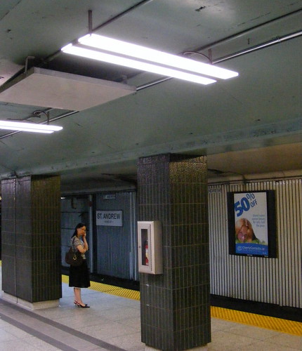
If you found yourself traveling through St. Andrew Station over the past few months, you might have noticed metal slats removed from the walls and a bluish glow at the south end of the platform level of the station.
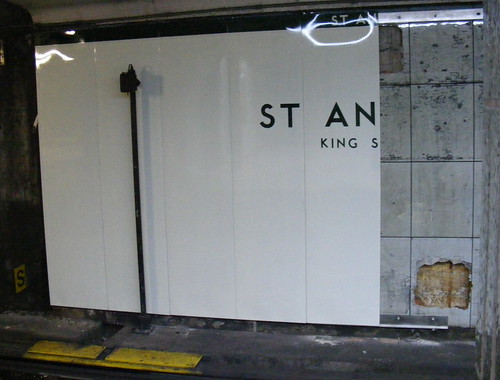
Apparently, as part of a pilot project, the TTC has been testing new ultra-thin LED interior lighting (which gives off a slightly harsh bluish glow). As well, the metal slats along the far walls are being replaced by shiny new glossy panels that appear to resemble the original vitrolite panels. This image from Transit-Toronto gives an idea of what St. Andrew originally looked like.
Hopefully, the rest of the station will be similarly redone – the mix of exposed stripped vitrolite tile, metal slats, new panels, “Subway” font and faux-Heveltica signage, and fluorescent and LED lighting might otherwise become a new standard in a somewhat common TTC mix-and-match asthetic.
Credit goes again to “299 Bloor Call Control”, who first mentioned this on Urban Toronto Forum.


18 comments
Wow, I’m kind of shocked they would do such a thing considering their aesthetic preferences (Museum and Sheppard line). I love it.
Finally, an example of the TTC respecting and celebrating the great vernacular they already have.
I’m really impressed by these tiles, to me they represent a very positive development in terms of design and maintainability (they are supposed to be easier to powerwash from the platform). I’ve always maintained that the TTC should focus its limited station modernisation budget on projects such as this that restore stations to their original state of repair, preserve original design intent, make facilities easier to maintain, and allow for modest aesthetic enhancements. Grand architectural visions should be saved for new stations/facilities.
Fantastic! Always once of the ugliest stations, looking to transform into a swan. Wonderful.
Much better! I hate the tacky renovations they did to stations like this.
Hopefully the TTC will in the future respect its heritage, but also enhance its stations (i.e. with artwork).
I’m intrigued. I can’t wait to see what the whole thing looks like.
Technically that original image is from the Toronto Archives…
An improvement over the metal slats from a design aesthetic, but I have to wonder at how it will wear. It doesn’t look like the new panels are all that sturdy (see the buckling at the top of the rightmost panel, over the “AN”). I hesitate to use the word “cheap”, but it looks like screen-printed vinyl that is an attempt to mimic the real etched tiles.
Still, a reason to make a side trip to St. Andrew…
I haven’t been in St. Andrew station for a while, I’ll have to check this out. From the photo it looks like the new panelling colour scheme being tested is white with black trim. The original St. Andrew colouring was grey with black trim.
Also interesting (okay, to very few of us) is that the TTC has dropped the period from the end of St. in the station name. This puts it in line with the St. Clair makeover, but at odds with St. Patrick and St. George. Of such tiny observations are the lives of copy editors and typographers made.
No longer an abbreviation, like Harry S Truman. 😉
The lighting they are testing is absolutely atrocious. I didn’t realize it was LED (though should’ve known from the thinness). I had thought LED was going to save us from the misery of CFLs, but this is actually worse… Surely there are better LEDs out there.
It’s curious that the TTC would chose a predominantly white colour scheme for the walls on the far side (that cannot be easily washed – If it were a side platform it may be easier). I say this because the TTC has experimented at King station with painting the roof black as to mask the break dust that accumulates on the cracks and all over the ceiling.
Also interesting to note is the fact that as a rule the TTC does NOT power was station walls EVER – There was apparently an issue with someone feeling “a tingle” once and unless traction power is cut the machines are not to be used by the union members.
My prediction: the new “tile” will look good for a few months then become splattered in liquid which will then attract the black break dust and then remain uncleaned for years…
Regarding the no powerwashing issue. Rather than a union concern, I’d heard that the Ministry of the Environment slapped the TTC for allowing water and soap to essentially drain into Toronto’s storm sewer system from this operation, and this was why the TTC stopped the practise.
I like how the original font was restored!
its about time that the ttc start paying attention to their stations, the design as well as the cleanliness. if you look at TO’s stations in comparison to places around the world, Paris’, London’s, Rome’s, Hong Kong’s…even Montreal, I think TO has a ways to go. Some of these cities treat the metro as not just a place for transportation, but a respected urban space….some have artwork on the walls, fancy lighting and contemporary design. . I think with Museum station they’re onto something. But didn’t it cost millions to make it like that? Still, kudos to the users for not trashing it within moments…now if only they could do something for Union, the most central station–not just to make an impression on tourists, but also because so many other services run from there.
Theres already preliminary construction on union station to a a new platform, and new design.
I Visited St. Andrew Yesterday, the trin and lettering is NOT Black, its the dark green used on Dundas west and sherbourne. The LED’s blue tinge make it hard to distinguish the color, but after half an hour of staring … well you figure it out