
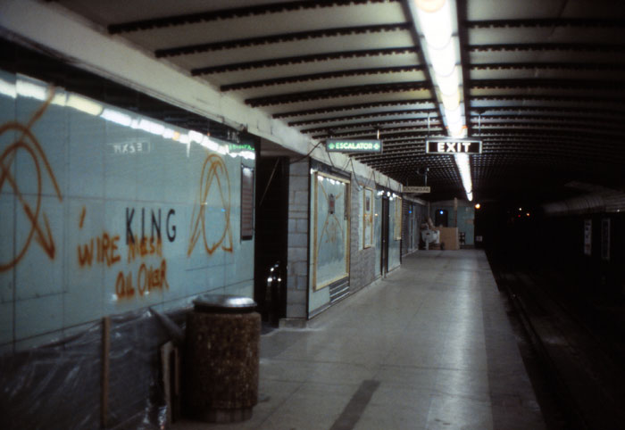
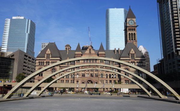
Not many people could have known that behind the advertising billboards on the platform of College station was something no-one had seen for more than three decades. Last week, workers upgrading the metal hardware that covers large portions of the station walls revealed a little bit of Toronto history that was long presumed destroyed.
There, covered in a thick layer of dust and grime, was the station’s original glossy blue-green vitrolite tile. A little cracked and worse for wear, but still firmly affixed to the walls.
For almost half the stations existence, this stuff covered the entire station, including the ticket hall. And then, in the 1980s, the TTC covered it up during an aesthetically misguided modernization effort that also drove its famous subway font to the brink of extinction.
When the TTC was building Canada’s first subway in early 1950s, the transit agency’s in-house designers made numerous important choices that defined the look and feel of the Toronto transit system.
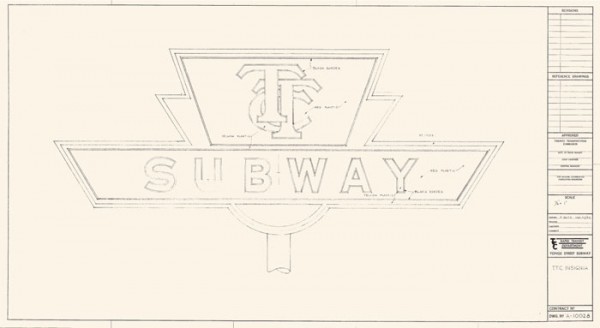
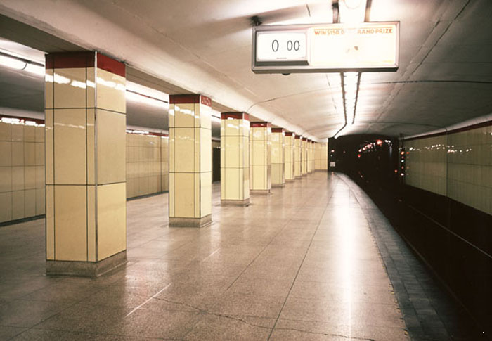
An artist sketched out a new logo for the subway, someone—no-one knows who—created an entirely new typeface for use on the platform walls, and the chief engineer picked out a variety of shiny wall coverings in Primrose (soft yellow,) English Eggshell (blue-green,) and Pearl Grey (off-white.)
According to the original tender documents stored at the City of Toronto Archives, the colour scheme preferred by the TTC was supposed to include Jade and Shell Pink tiles instead of English Eggshell. Unfortunately, pink was out of stock, and Jade was considerably more expensive than another option, Alamo Tan, an earthy soil colour.
Additional confusion over pricing and available quantities resulted in Alamo Tan, Jade, and Shell Pink being dropped entirely, leaving just three colours to be repeated in a cycle between Union and Eglinton stations.
Four trim colours—American Red, Forest Green, Cadet Blue, and Black—used in a thin band near the ceiling ensured no two stations would be entirely identical.
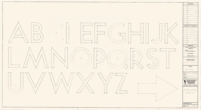
The now-famous TTC font, developed in-house by the transit commission, matched the faintly retro look of the Toronto subway. Similar to Futura, a font created by German typeface designer Paul Renner in 1927, the TTC’s lettering was distinguished by perfectly round Os and Qs.
It also resembled Johnston, the font used by Transport for London across the London Underground, but no-one is entirely sure who at the TTC came up with the original design.
“We don’t know who the draftsman was,” says Ian Dickson, the Manager of Design and Wayfinding at the TTC. “It was in-house … there doesn’t appear to be any third parties on the drawings.”
Riders in the 1950s liked the crisp look of Canada’s first subway.
“The subway has raised the horizons of our pride,” wrote the Globe and Mail in 1954.
“Toronto used to have the biggest this and the tallest that in the British Empire. Now our statistics are parlayed to the world: It’s the world’s cleanest, the only one that’s scrubbed down every night. It’s the most efficient subway … a ride at the front window of the front car is still the biggest thrill in Toronto.”
The subway was really clean, too.
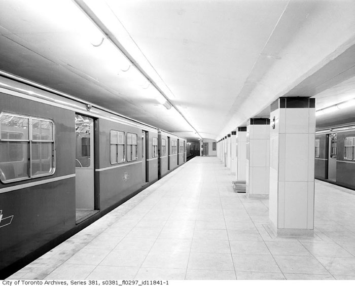
The TTC employed two janitors at each station and a roving squad of 10 overnight custodians. The walls were washed every day with a wet vacuum cleaner, and sawdust and linseed soap were used to scrub the terrazzo tile floors. Garbage collection and sweeping was handled out of a converted streetcar that passed through the tunnels after the evening service ended.
In 1965, more than 10 years after the subway opened, the New York Times asked foreign correspondents in a number of cities around the world to investigate the cleanliness of their nearest metro system. In the resulting story, H. E. Pettett, the secretary of the TTC, boasted that Toronto’s system was only rivalled by Stockholm.
“New Yorkers describe the Toronto system as almost antiseptic,” the paper reported.
At home, riders (affectionately) described it as world’s longest bathroom because of its polished walls and floors.
Unfortunately, the subway’s glass-faced tile didn’t stand up well against wear and tear. The wall pieces were prone to shattering and finding suitable replacements proved difficult and expensive. Vitrolite became scarce, only available through salvage, and the fastidious attention to detail began to slip as the subway expanded in the 1960s and 70s.
Rather than viewing the subway system as a whole, the TTC began commissioning designs for each station individually. Arthur Erickson gave the city Eglinton West and Yorkdale, and Dunlop-Farrow Architects created Dupont and Lawrence West, but there was no longer a strong visual thread tying the system together as whole.
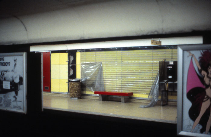
Then, in 1982, the TTC overhauled the original Yonge line stations, covering the original tile in wire mesh and mounting new, more durable tile. College went from from blue-green to brown, Dundas went a bilious green, and Rosedale got a sort of deep forest colour.
Writing in the Globe and Mail, architect and urban planner George Kapelos called the new look a travesty. “The tile is mottled and visually chaotic,” he wrote. “Colours are bland or jarring, with no overall unity or individual distinctiveness.”
The subway font also vanished with the new wall covering, replaced by Univers, a widely used Swiss font with the letters spaced closer together. “It is a classic case of the ordinary replacing the special,” Kapelos wrote. “Toronto’s earliest flirtation with modernization has been replaced by the blandness of beige and universal lettering.”
Until the billboards came down at College station, the dusty but otherwise intact tile had been hidden from public view for more than 30 years. The reemergence attracted a significant amount of attention on social media—someone even wrote “love vitrolite” in the dust.
Perhaps a sign of increasing appreciation and respect for the TTC design standards of old.
For what it’s worth, the perennially cash-strapped TTC appears to be increasingly engaged in preserving its own history. In 2013, the commission created a design and wayfinding team, which overhauled the classic subway font, adding numbers, missing punctuation, and correcting problems with some of the letters.
“The S was out of balance, always seemed to be falling backwards,” says Dickson. “The diagonal strokes in the R, Q, and K weren’t matching, so when you put those letters side by side, they were all at slightly different angles. We went in and redrew the entire typeface, mostly from the original scans.”
Dickson said his team added punctuation and numbers, so new stations like Highway 407 can be rendered in the typeface in the coming years.
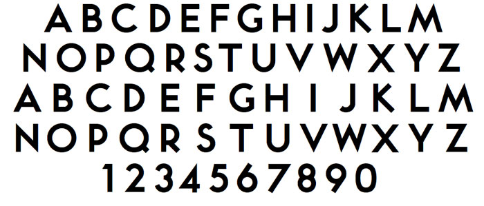
Called Bloor-Yonge, the updated version of the font is now used on the official company letterhead, in the Ride Guide, and on the monthly Metropass. When Union station was overhauled as part of work to add a second platform, workers didn’t bring back the yellow tile, but the name of the station was rendered faithfully in the TTC’s famous lettering.
“There is a very intentional effort to bring back the classic subway font to our facilities,” says Ian Dickson, the TTC’s manager of design and wayfinding. “It just seemed like the right thing to do. I get very little criticism when it comes to bringing back the subway font into our signage.”
7 comments
So…not the same as Quadrat’s Toronto Subway?
I love urban archeology like this, thank you for the TTC blueprints and fonts.
“When the TTC was building Canada’s first subway in late 1950s, …”
The subway opened in 1954.
Quadrat made rubbings of the typefaces on the walls of the original typeface which were then digitized. The updated Bloor-Yonge typeface addressed previously unresolved issues in the original forms + we added punctuation & arabic figures that were missing from the original digitized font file.
Excellent article. This is what makes Spacing special – more of the same please (especially in the magazine, which used to be of such quality).
The original system was powered by 1.21 gigawatts of lightning. Unfortunately the TTC abandoned flux capacitor technology in the mid 50s
“TTC’s lettering was distinguished by perfectly round Os and Qs”
I would identify two distinguishing features of the TTC’s internal typeface. I would say the more significant and obvious one is that many diagonal and curved strokes are cut off at 90 degrees rather than vertically or horizontally (especially K, Q, R, but also C, G and S) — compare these to Futura, for example. The more subtle one is that all letters are made up of straight lines and/or simple radii — not just Os and Qs, but all other letters as well. (You can see this in the old 1954 drawing of the standard alphabet — there are marks showing the centre of all the curves. The only letter that uses a more complex curve is “S”, where the lower bowl is made up of a two-centred curve.) This would have been done for reasons of practicality — easy to be reproduced using a scale, a straightedge and a compass — but also is a subtle but important distinguishing feature. Most fonts tend to shy away from using simple radius curves because it can look a little “off”, but in this case it is one of the factors that gives the font its distinguishing “look”.
As for the designer: although we can’t say for sure, I believe the same drawing gives some indication. The drawing for the 4″ standard alphabet indicates that it was drawn by a P. Butt, and reviewed/checked by a W.F.G. Godfrey. (In the TTC’s new wayfinding standards manual, there is another drawing from the same set where the signatures are clearer.)
A little digging leads to William Frederick George Godfrey (b. London, England, 1884 — d. Toronto, 1971). He was a Toronto artist who did engravings and other line drawings, but he was originally trained as an architect.
I am guessing that Godfrey was the designer, and that Butt was the draftsman. (It’s also possible that Butt may have had a greater contributing role in the design as well, and/or that Godfrey’s role was more of a supervisory nature, but I would tend to think the other way around.)