For those of you who aren’t transfixed by the sight of our youthful prime minister walking the plank today in Washington, here are some thoughts about what last week’s 2016 census numbers should be telling us about how the City of Toronto is doing financially, given the shifts in the population revealed in this first tranche of data.
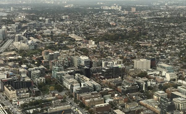
The top-line news, of course, is that Toronto’s population increased by 4.5% between 2011 and 2016 (to 2.73 million people, a figure that does not yet account for those who were missed), with fully half of that growth occurring in the nine wards situated between the Humber River in the west and Victoria Park in the east, south of Bloor. (The distribution patterns for the additional 117,000 residents aren’t especially clear from the maps at the end of the City’s backgrounder: some waterfront/downtown census tracts saw the expected population spikes due to intensification, other regions – such as north-east Scarborough, as well as a handful of mid-town census tracks – have seen population decline.)
According to City planning officials, the more important census numbers will drop in May, when StatsCan releases the long-form data – age, sex, housing tenure, family composition, and all the other metrics that municipal officials rely on to determine service levels and allocate resources. (Each new tranche of census data also drives ward redistribution exercises.)
This is all true, but there’s an interesting and important piece of financial analysis to be gleaned from the changes in the aggregate population growth data, and the conclusions provide that much more fuel for those voices who are telling council and mayor John Tory that the city needs to bolster its revenues.
Every year at budget time, and this season is no exception, Torontonians listen to politicians yabber on about why it’s so important to ensure that property tax increases don’t exceed inflation. That line, repeated so often, has become an article of faith for mayors and mayoral candidates, regardless of party affiliation.
What I’d like to argue is that the more important point of comparison is population growth, not inflation. And if we look at the inflation-adjusted changes to the City’s revenues and spending between 2011 and 2016, it becomes abundantly clear that we’re not keeping up with the census-confirmed population growth occurring within the municipal boundaries.
Consider the following: in 2011, city council approved a $9.383 billion gross budget. By 2016, the City’s gross expenditures had risen to $10.07 billion. At first blush, the difference translates into a 7% increase, which means the spending appears to be greater than the population growth.
But if we apply the Bank of Canada’s inflation adjustor and translate those 2011 dollars into their 2016 equivalent, we get a gross expenditure of $10.023 billion. In other words, if one compares constant dollars, the City’s spending has risen by scarcely half a percent, while the population has jumped by 4.5%. And that’s a problem.
Drill down and more interesting figures emerge. Some services that would be directly impacted by population growth – e.g., the Toronto Transit Commission, children’s services – have seen their spending jump (in both cases, by 13.6%), even after taking inflation into account.
But in other cases – employment and social services, Toronto Public Health – the inflation-adjusted spending has actually gone down (by 14.7% and 2.6%, respectively), despite what one might reasonably assume would be higher demand due to the presence of more people. Unsurprisingly, the inflation-adjusted police budget — which would be affected by population increases but also countervailing trends, like crime reduction – expanded by 6.5% over those five years.
The other insight that can be teased out of a 2011/2016 comparison has to do with the gap between the gross and net operating budgets. For those healthy individuals not obsessed by municipal budgets, a range of services are funded by a combination of the city’s own-source revenues and user fees or other revenue sources (e.g., recreation or development fees, licensing revenues, fares, etc.).
As with the above analysis, the City’s net inflation-adjusted outlay – meaning the total amount budgeted to deliver a service minus the revenues generated by that activity – has increased faster than population growth. So that’s as it should be.
But the inflation-adjusted revenues generated by these municipal activities have not kept pace with increases in population. The revenues from all these city functions have crept up, it’s true – by 3.2% between 2011 and 2016. Yet that differential falls short of the expansion of Toronto’s overall population.
The point here is that the census data should be tethered not only to the allocation of the City’s resources, but also the quantum required to deliver them. And what last week’s numbers said to me is that the City is doing, in essence, the same thing that the fast food chains have been pulling on their customers for years: holding their prices down by reducing portion sizes.
As more people settle here, we seem to be doing less and less for everyone. It’s felt like that for many years; the 2016 census has finally provided the proof.


One comment
Playing the Devil’s Advocate: If there are more people now living in the city, should there not be more money flowing to the city in the form of taxes? Thus raising the question: is the gap caused by insufficient taxes for those paying taxes or are ‘new’ people living in the city not being taxed in a way that contributes to the city?