

We’ll take a break from the Kingsway theme in Cartographically Speaking and start introducing these on a more casual basis. Let’s jump to a different theme altogether – children.
We all know that children play an important role in our cities. Given that I’ve discussed it at length in some of my past articles regarding housing affordability, diversity and families, I won’t bother repeating it here.
Needless to say that seeing the spatial distribution of children across a city is particularly interesting because it can – and does – speak to a number of key issues relevant to the health of a city. Income, ethnicity, density, affordability, house types….are just a few.
Before delving into the map, I should thank Chad Skelton – a.k.a. Curious Dad – from the Vancouver Sun for starting the discussion and openly sharing this fine Census 2006 data with the public. He doesn’t know me, of course, but anybody who can feed my hunger for hard-to-come-across stats at no premium is a friend of mine.
The discussion resulting from his investigative series is pretty interesting (and I definitely suggest reading it) but the city-wide pattern of the data is difficult to understand given that the percentages are separate from the neighbourhood map. And to me, the larger picture is the most important piece.
This inspired me to revamp his data visually to get a clearer picture of what’s happening. The result….a series of my own (double thanks, Chad!) that re-visualizes the data for easy reading, comparison, and analysis.
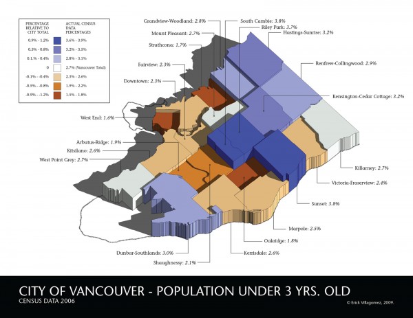
Like Chad, we’ll start with Vancouver’s distribution of children under the age of three and will work our way up in age. Here, however, neighbourhoods are given a vertical dimension based on the percentage of children within their boundaries. Furthermore, the maps are colour coded relative to the “Vancouver Total” percentage – which is neutrally depicted as white and considered the 0% baseline. Blue represents neighbourhoods above the total, and copper, those below.
With this in mind, colours get more saturated as the percentage moves away from the Vancouver Total baseline. That’s to say that the most intense blue represents the highest percentages, while the deepest copper is the lowest. The percentage range for each colour was chosen based on the data given for each age group and, therefore, varies from map to map. However, each neighbourhood is labeled with its specific percentage which, as mentioned above, determines its height.
It’s also worth noting that based on the data given, the Downtown Eastside neighbourhood has been spread between Downtown and Strathcona. This slightly skews their percentages, but not too significantly.
Turning to our map here, the Eastside bias for neighbourhoods with children is clearly evident. With the exception of Dunbar-Southlands, all the neighbourhoods with above average percentages of children under three years old are located predominantly east of Cambie St.
The issue of Dunbar-Southlands – a Westside anomaly – is pretty curious since many factors suggest it shouldn’t be among the top. Based on 2001 census data, for example, it is a neighbourhood declining in numbers, with a growth of -0.5% between 1996 and 2001. It’s ethnic composition – based on the mother tongue spoken – is one of the least diverse in Vancouver being predominantly English speaking (71%) which contrasts other neighbourhoods with many children.
Furthermore, Dunbar-Southlands is one of least dense areas dominated by people age 40-64 (36.6%). The typical beginner family age range between 20-39 make up only a quarter of the population. It is not the case in all other above-average neighbourhoods where the dominant population age lies within 20-39. Lastly, the Dunbar-Southlands population has one of the highest average family and houshold incomes in the city – more than double most other above-average neighbourhoods – and undoubtedly some of the highest real-estate values.
In essence, it seems to go against almost all the typical factors that would suggest a profusion of children. But sure enough, here it is. I’m dwelling on this a bit because you will see it in the upper ranks continuously. As the data suggests, Dunbar-Southlands seems to be the wealthy family neighbourhood of choice in Vancouver.
Despite the latter, however, above-average neighbourhoods typically are the clearest indicator of where housing prices were the most affordable – relative to the amount of space desired to house a small family – at the time of the data collection. It’s more appropriate to continue to speak about this later when when we can see a larger pattern emerge from comparing all three maps together.

For now, it is simply worth noting that between 2003 and 2006 (I think this is 2006 data), this is where families with young children gravitated. To get a better understanding of the times, above is an older graphic of mine comparing Vancouver real estate values and population since 1980 (see a more complete description of the information graphic here). From this we can see these times were much different than our own, with the average home costing approximately $300,000.
It will be interesting to compare the data of the next census to see if and how rising house prices affect this pattern. Will there be fewer blue neighbourhoods, hugging the eastern boundary of Vancouver? Hopefully, I’ll be lucky enough to come across this information after the next census data is collected and make a direct comparison.
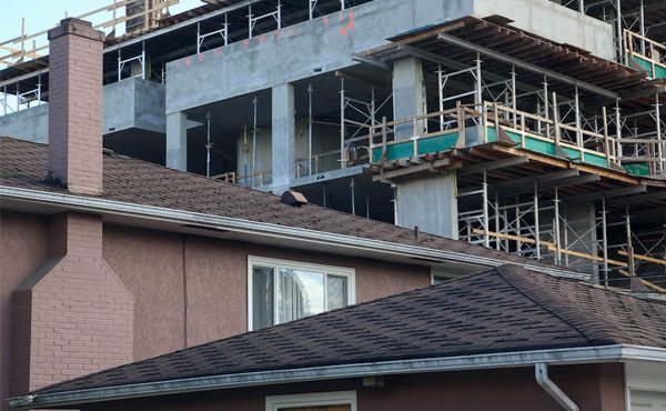
When thinking about this map, it’s also very important to remember that the numbers are rooted in a physical context. That is, there are certain concrete physical factors drawing family with children to these neighbourhoods. A more thorough and complete analysis would look at neighbourhood house types, open spaces (parks, etc.), and land values, at the very least, to attempt to understand what is making certain areas more popular than others. For example, I would have never guessed that Sunset, South Cambie and Riley Park would have been at the top of the chain, but clearly there must be something special about these locations that make them attractive to families with young children.
Without the above information at hand, however, we can make some informed guesses based on some general observations. The most relevant being that all above-average neighbourhoods are dominated by low-medium density house types such as townhouses and freestanding single-family homes. This may be a no-brainer point to bring up, but it’s important to keep in mind particularly since many people – politicians, planners, architects, etc. – have been quick to equate higher density to increased livability. This, of course, can be the case if density is created to include a diversity of households and incomes. But by no means is it a rule.
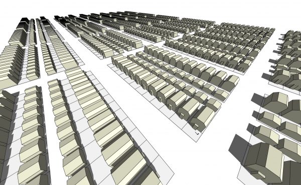
 Comparing another past map above – showing density of Vancouver by the block (Census 2006) – with our main graphic, one can clearly see that the densest areas in the city composed of medium to high density building types such as point towers – Downtown, West End, Kitsilano, and Fairview – also carry below-average families with children under three years old. Consequently, Vancouver doesn’t seem to be doing a good job at making dense, child-friendly communities, and this bring up the important question: who are these neighbourhoods “livable” for?
Keep an eye on these areas in the upcoming maps and always try to envision the physical character of the neighbourhoods. This will give us some clues as to what families with children are looking for – or not – in their neighbourhoods.
The next map will be posted in two weeks….enjoy!
***
Other Where Are The Kids? series articles:
Children Three to Five
Children Six to Twelve
Teenagers Thirteen to Eighteen