

To say affordability is an important issue in this region would be an understatement. Vancouver has been recognized as one of the least affordable cities in the world. However, just because we view something as important, that doesn’t mean we’re right about it. This is not to say that Vancouver is “affordable”. Instead, it is meant to highlight the importance of defining “affordability” more specifically and being more detailed as to those parts of the region that are affordable and those that are not.
When we think of affordability, we usually think solely about housing costs—a common threshold for which is spending less than 30% of income on housing. However, looking at housing costs alone leaves the false impression that it is more affordable to live in the suburbs where housing costs are generally lower. What is often overlooked, however, are the high transportation costs that go hand-in-hand with the low density living typical of suburban development. In most cases, these additional costs offset any savings in housing expenditures.
So when we think of affordability, we should really we should be thinking of housing AND transportation costs. This is what the Center for Neighbourhood Technology has done, having created a Housing and Transportation (H+T) Affordability Index that defines affordable as a household spending less than 45% of its earnings on housing and transportation.
For the past few months, I have been part of a group examining affordability in Greater Vancouver through this framework and creating a similar index using 2006 Census data and 2011 Translink Trip Diary data.
The initiative focused on a series of interrelated questions associated: how does our view of affordability change – or not – with this new definition of affordability? What areas in Metro Vancouver are the most (and least) affordable? What policies could make the biggest difference in improving affordability?
Before we touch upon these, however, we needed to determine how factoring transportation costs changes our view of affordability. Below is an map comparing the conventional definition of affordability with our new housing and transportation definition. (Yellow means affordable and blue means unaffordable.)
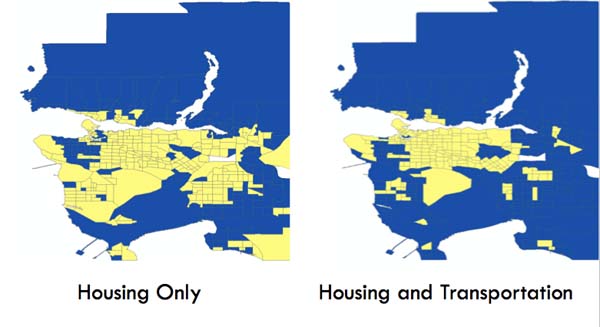
It is immediately apparent that our region is considerably less affordable when we factor in transportation costs. What is less apparent is that some census tracts in the City of Vancouver became affordable with our new definition. Overall though, our region is significantly less affordable than we think it is. A scary thought.
Based on our analysis, it is clear that Vancouver (proper) is more affordable than we think, but the region is much less affordable than we think. And the main culprit is transportation costs (Yellow is <15% of household income)
Notice the sliver of yellow following the Expo Line
Given the above, where does affordability lie?
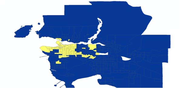
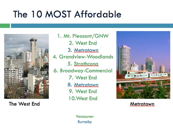
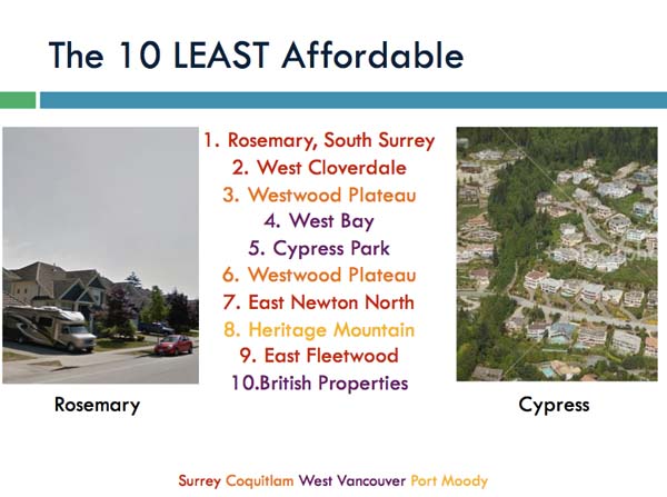
The most affordable areas in the region were found to be the West End and Metrotown, whereas the least were found at the periphery in Surrey, Coquitlam, Port Moody and West Vancouver.
As one would guess, areas that are walkable, centrally-located and have good access to transit are much more affordable than those that are car-oriented and where land uses are segregated.
How do we make Metro Vancouver more affordable?
Based on the research—and counter to popular belief—the areas that should be the focus of affordability improvements are those that are unaffordable when both housing and transportation costs are considered and where people are experiencing it. Reducing living expenses is often not a priority for the wealthy population, for example.
The image below is a plot of all the census tracts in Metro Vancouver based on actual affordability and experienced affordability. We calculated experienced affordability by using the income of local residents instead of for the whole region. The dividing line for both axes is the 45% affordability threshold. Overall, the ‘cloud’ appears centred with many areas on both sides of the affordability divide.
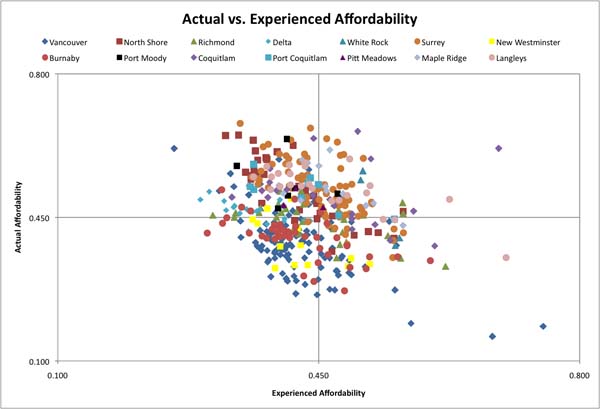
The area of greatest concern is the top right quadrant—these areas with very high housing and transportation costs, where the residents are spending more than 45% of their income on housing and transportation. Though the entire ‘cloud’ appears to be centred around the threshold, it is not the case for different cities in the region.
Here is Vancouver…
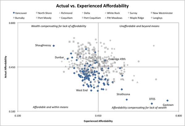
…and here is Surrey:
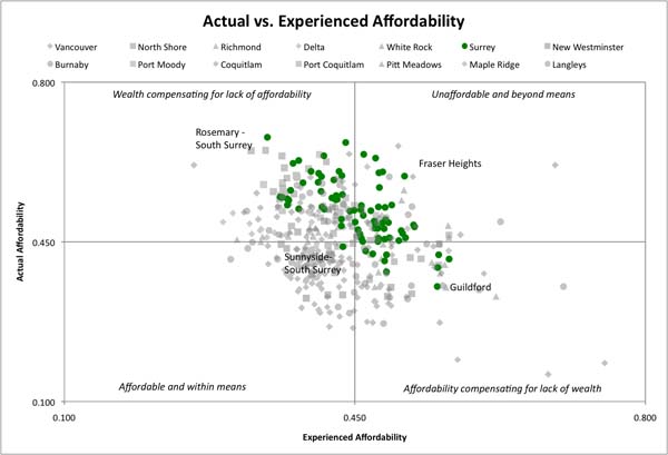
As one can see, Vancouver has only one census tract in our ‘Greatest Concern’ quadrant, whereas Surrey has approximately half of its census tracts within it. This clearly demonstrates that there is clear and pressing need for affordability improvements in Surrey and other suburbs such as Coquitlam, White Rock, Langley and Maple Ridge, where people are really experiencing a lack of affordability.
When it comes to improving affordability, improving transit and walkability in the suburbs makes a lot of sense. The Evergreen Line (contrary to what some believe) and Surrey Rapid Transit would greatly reduce transportation costs and improve affordability.
In conclusion, including transportation in the affordability equation makes it clear that it is the Urbs, not the Suburbs, that are truly affordable and that if we really want to improve affordability in Metro Vancouver, improving transit and creating a more walkable environment in places like Surrey would make the biggest difference.
If you are interested in reading more about our study, here is our Presentation and our Final Report.
***
Lee Haber is a Masters Student in the School of Community and Regional Planning at UBC. He is also the Campaign Director for GetOnBoardBC.


2 comments
Is there not a flaw in using this measure of affordability? A neighbourhood full of 5000sqft, $5 million houses that are owned by multi-millionaires will show up as “affordable” compared to an “unaffordable” neighbourhood of crackshacks occupied by welfare recipients.
In other words, does the data not just simply show that rich people live in Vancouver and poor people live in Surrey? It seems unsurprising that areas with very low, marginal incomes cannot absorb the incremental costs of owning a car.
Thanks for your comment Kirk. If I’m not mistaken your referring to the Actual vs. Experienced Affordability diagrams.
Actual affordability is what all the blue and yellow maps show. It is a measure of the actual housing and transportation costs compared to the median regional income. If you were to move to Vancouver from another city and choose an affordable area to live, you would use this measure. With this measure the neighbourhood of $5 million houses would be unaffordable.
Experienced affordability compares the housing and transportation costs with the income of area residents. With this measure you would see wealthy areas show up as ‘affordable’ because the people who live there are wealthy enough to afford them. Existing studies didn’t use this measure, but we included in ours because we wanted to know which parts of the region could benefit the most from affordability improvements.