
We’ve had a number of great submissions for our impromptu TTC subway growth animation contest. So many good submissions, in fact, that we don’t want to take credit for naming a winner. We’re going to let our readers do it. The winner will take home a full set of Toronto’s subway buttons. we’ll close off voting on Monday and announce the winner on Tuesday morning.
At the bottom of the post is a poll asking you to name your favourite map. The criteria for judging this contest should be: does the map do a good job of displaying the growth of the subway? Is it visually attractive? Has the mapmaker been creative in some way that stands out from the rest?
We encourage you to click on the “view it larger” link below each submission so you can see it in its originally submitted size.
Since submission files are large and we want to avoid long page-loading delays on our main blog page, we ask that you click on the “continue reading” link below to see the finalists.

Choice A: submitted by David Kopulos • view it larger
– – – – – –
Choice B: submitted by Michael Greco • view it larger
– – – – – –
Choice C: submitted by Andrew D’Cruz • view it larger
– – – – – –
Choice D: submitted by Lisa Elliott • view it larger
– – – – – –

Choice E: submitted by Drew Jones • view it larger
– – – – – –
19 comments
The proposed lines popping in and vanishing in Choice A is a really nice touch. The designer should add a special shade for the Eglinton Subway, where construction started and then filled in. Props to Choice E as well for acknowledging the line that ran from the west end down to Union when the Bloor line first opened.
Sad to say, but watching these diagrams-in-motion only depresses me because it reminds me that there was a time once when we cared about transit enough to build huge additions to our subway system, with all necessary levels of government on board, and reap the benefits.
Now we beg and finger-point and act out turf wars, and even those among us who want new investments in transit carp that subways are a waste of money.
These maps aren’t just fun, they make a statement about what progress looks like.
Tough. Each diagram is interesting in its own way.
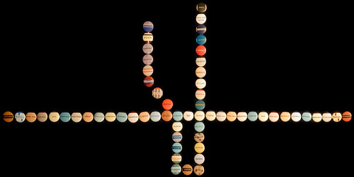
Choice A: The grey background is attractive. Station labelling is (just) legible at full size. The sense of motion and building is nice. Is it accurate? Did the Bloor-Danforth line really get built west to east? The animation goes by a little too fast. There’s no sense of when things happened.
Choice B: The dots are attractive. Choice of colours could have been better; distguishing between the shades of red and orange, and the different greens, is difficult. The line labelling is nice, though a bit inconsistent. Almost used the right typeface.
Choice C: The date ticker is nice, though perhaps too precise. The addition of the Transit City pipedream is good. The type is too small; I can’t read what those labels under the station names are.
Choice D: The off-black background makes it a little less harsh than some of the other entries. The changing line legend in the lower right is nice. The date display could have been larger and better placed. There are problems with the station labels running into each other.
Choice E: A nice sense of building and growth. It seems that this is the most accurate presentation of the actual growth of the system. The disappearing Bay loop is cute. There’s no station or time labelling whatsoever. It’s not always clear what the colour changes mean.
That’s right, David… I almost paid you forty dollars! 🙂
The problem with all of these is that Toronto’s subway growth is so depressing to look at.
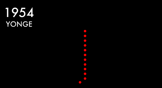
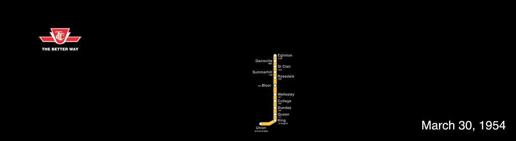
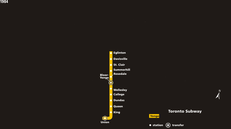
Note: none of these have a fixed time scale. Each frame of the animation is one expansion to the system, not one year.
Dang >.
I meant to say: Dang, I didn’t even make it to the finals. Oh wells, I’ll just have to buy the set.
the proposed lines in the first one kills it. super nice touch.
Transit City FTW!
I liked the precision and fluidity of Drew Jones’ Choice E so much that I voted for it, with a tip of the hat to Michael Greco’s Choice B for being the biggest departure from the look of the published route map, and for having the biggest dates.
Looks like David Kopulos’s Choice A is well ahead in early voting. It has much of the charm of Drew Jones’ effort while sticking very closely to the map as we see it on the subway.
A is nice, however the animation is too fast,it should be slowed down to get a chance to recognize the changes.
I like that B and E have new designs rather than just being a copy of the TTC map (I like D too, but it’s taken straight from Wikipedia). However I don’t think that B quite works, although it’s an interesting concept.
A gets bonus points for putting in proposed lines; E gets bonus points for including the interlining. But A and E lose points for the animation being too fast and for the “station by station” opening.
D would probably get my vote, if it wasn’t done on the Wikipedia map (I like the map… just less originality), and if it didn’t inaccurately portray the most recent development as being the opening of Danforth GO! So instead it goes to E.
Now that I look at E again, I think the problem is that it’s switched Danforth GO and Kennedy GO.
I really like the fact that D: added in the GO Train intermodal stations.
There are many points of each design that are excellent. Bravo to all the contributors.
I like the look of A the most — it’s colours, dimensions, and the inclusion of proposed lines. But I find it hard to rule out B since that one is so revealing about TTC growth and how much it has slowed down over the years. What happened in the ’90s to make this happen?
Mike Harris happened?
A gets it with the proposed lines.
Imagine those were actually station lines now?
Wow.
I find these more sad than anything; they just illustrate very graphically and viscerally how little has happened to improve our rapid transit system over the past three decades.
“Transit Maps of the World” (Paperback)
To be released this month by Penguin:
http://www.amazon.com/Transit-Maps-World-Mark-Ovenden/dp/0143112651
Choice A is the one for me… sticks to the familiarity but adds the novelty in the best way. ute, london UK