
Postmodern architecture may often be equated with the excess of the 80s and may be derided along with shoulder pads and power suits as an unfortunate byproduct of its time, but it was making a point. It was a response to the ‘less is more’ philosophy that had dominated architecture since the rise of Modernism and the International Style beginning in the 1920s, when modernism was the design aesthetic of choice for everything from government buildings and bank towers to gas stations and churches. Architecture was freed from historical reference and expressed its form in the function and capabilities of its materials. However, in the 1960s this model for design was questioned and the result was an architectural vocabulary that not only referenced back to historic styles and motifs but often did it in a way that combined technical advancement with a sense of design that placed a tongue firmly in cheek.
American architect Robert Venturi was instrumental in the development and spread of postmodern architecture beginning in the 1960s. When he published Complexity and Contradiction in Architecture in 1966, he not only examined the inadequacies of modern architecture, he urged readers to learn from the past and respect the context of the existing environment with an understanding geared toward regional and vernacular characteristics. Isolated steel and glass boxes placed in defiance of their location would no longer do. In 1972 Venturi took the idea further in Learning From Las Vegas: The Forgotten Symbolism of Architectural Form, a book that examined the use of ornament and decorative elements in the Las Vegas strip, and the way that ornamentation conveyed and communicated those individual buildings’ function within their context. In the case of Las Vegas it could be a over-the-top and brash, but it was still suited.
When Venturi designed a house for his mother in 1962 it was free from the pastiche of residential design that was still copying historical styles but wasn’t entirely modern either. It walked a fine line between modernist desires for technological advancement evoked in a building’s form and minimalism, while using historical elements (pitched roof, symmetrical faà§ade) to create a frame of reference between the house and its context in suburban Philadelphia.
With postmodernism, architects began to explore historical details once again, applied to technologically advanced buildings, in a way that didn’t try to pass them off as older buildings. The use of columns as architectural motifs rather than as structural members began to reappear, as did gables, peaked roofs and ornaments. Though the style could often get out of hand resulting in something like Charles Moore’s New Orleans Piazza d’Italia (1978) (that saw classical columns clad in steel and neon lighting), there was a subtlety to the style as well.
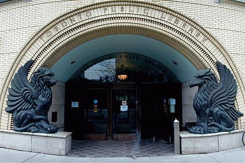
Toronto is full of examples of postmodernism ranging from small houses to city halls and office towers. Some examples are better than others, and are, in spite of the often strong-handed design, building’s of substance. Toronto’s Police Headquarters on College Street, completed in the 1980s creates a street presence while resurrecting gables, domes and variation in the fenestration in a way not usually utilized on large office buildings in the previous thirty years. Metro Hall does the same thing, with traditional architectural motifs like peaks and bay windows blown up to suit the size of the building. The Lillian H. Smith library on College near Spadina creates a strong street presence with its central arched door flanked by two large winged creatures (a lion and eagle a manticore and gryphon) cast in metal, with polychromatic brickwork and a heavy peaked roof with dormers no less. Mississauga City Hall referenced historical styles as well with a centrally located and very prominent entrance beneath a wide, long gabled faà§ade, with a tower, rotunda, tower and exterior amphitheatre all rendered in buff brick. On Osler Street in the west end a small multi-unit apartment rendered in bright pink is housed beneath a gable roof in a nod to traditional domestic design. Vari Hall at York University, Brampton City Hall, the Rogers Building and the College of Physicians and Surgeons also use postmodern design. Though its hayday was over around the same time as the power suits, postmodernism’s openness to traditional architectural elements remains with us and continues to influence design to this day. Though often poorly executed and relegated to pseudo-pastiche, thanks to postmodernism historical references in architecture are no longer entirely taboo in contemporary design.
Photo of the Lillian H. Smith Library, Toronto, from Striatic


10 comments
What a lovely post! Though it is fashionable to deride postmodernism currently, I’ve often thought that one of the reasons that buildings get demolished or “updated” in unfortunate ways is due to snideness towards recently in favour architectural styles that have since moved out of fashion. Yes, some postmodernism was badly done, but this is true of every single architectural style.
Post like this, that encourage us to look anew and with appreciation at buildings only 25 years old or less are the best antidote possible to us losing our architectural heritage in Toronto. I would like to see the Lillian Smith Library, in particular, added to the Inventory of Heritage Properties (the more recent, and also lovely, McKinsey & Co. Building, on Charles Street West, has been added).
Thanks for this.
That was a nice little primer with lots of image links. Thanks for writing it.
The figures at the Lillian H. Smith library are a gryphon (right) and a manticore (left), not an eagle and lion.
Steve
Thanks, Harry Potter.
Teehee.
well, yes, there’s probably some decent post-modern design, but geez louise! The Toronto Police HQ and MetroCentre are butt-uggz.
Agreed.
I’m pretty dubious about the Police HQ on college. Contrary to “street presence” the article says it creates, I’ve always thought it cold and lifeless.
I like the TPS HQ, but then I’ve never seen anything like it to make a comparison either.
Anyone know the year the Rogers Building was completed and who the architects are?
Rogers was built over many years, completed in April 2003, by Zeidler – see http://www.zrpa.com.