 You’ll be waiting a long time for the 77B on the TTC
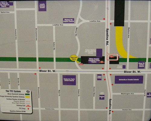
There’s an out-of-date map in the Walmer Road entrance to Spadina Station that you’d better not use for local wayfinding. I mentioned this before over a year ago documenting a local tour of the TTC’s inconsistent and often poor wayfinding and information signage. However, I have been seeing more and more out-of-date maps and signs throughout the system, and little attention has been brought to this problem.
In the case of the Walmer Road entrance, it appears that a “station and vicinity” map was placed here when the new entrance opened in January 2001. A staffer put a helpful “you are here†decal at the new entrance. However, the “station and vicinity” itself map dates from 1996 – Spadina Bus lives on! (Somehow, “Swansea Bus”, the route the number 77 was reassigned to, doesn’t quite have the same ring to it.) Also noticeable is the fact that the Bloor-Danforth night bus is incorrectly shown as Route 310, mixing the number up with the Bathurst night bus.
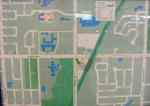
I felt compelled to write this after recently visiting Warden Station, whose map is tragically out-of-date. Not only is Warden Woods Mall shown (it remarketed itself in the 1990s as Warden Power Centre before dying and cleared for townhouses), two long-defunct bus routes are also shown – the 114 Kingston Road East, and the 318 Warden night bus. According to the archived maps at Transit-Toronto, the 114 was gone by 1992, replaced by a branch of the 86 Scarborough. The 318 was replaced by a night bus on Victoria Park. This map is therefore at least 17 years old. (Unfortunately, the text in the picture does not show up particularly well, even in the full size.)
 Warden Station’s map is even more out-of-date
The “station and vicinity” maps are, for the most part, badly outdated. Such maps can be very helpful to tourists and passengers unfamiliar with the stations, especially compared to the small scale system maps, which are (usually) more up-to-date, but show no local details. Great examples of useful, well-designed, vicinity maps are those published and displayed by the Mass Transit Railway subway in Hong Kong, or even those of the STM Metro in Montreal. Both systems’ area maps show local landmarks, the location of surface transit stops, and the locations of exits from the stations.
I have seen tourists lost coming out of subway stations, not knowing how to get to nearby, well-known landmarks or where to transfer to a bus or streetcar. Better, and up-to-date local neighbourhood maps would certainly be another low-cost, but essential feature to assist TTC customers.
UPDATE: In a comment to this article, the TTC’s Director of Corporate Communications, Brad Ross, has kindly informed us that new “station and vicinity” maps are being produced and on their way for installation in 2009. It is encouraging to see that the TTC is already on top of this.


30 comments
The west side automated entrance to the station off Spadina Road also has a route map dating from before the opening of the Sheppard subway.
The worst I’ve seen is a transit map up at York University’s central square, which shows the Spadina line ending at Wilson station. I guess we can blame York for that one, however.
I’ve never really stopped to take a look at one of the vicinity maps at Warden station. I see it everyday as I’m waiting for the bus to head home. I’m surprised that it’s almost 20 years out of date.
And if I remember correctly, the placement of the vicinity map at Warden station is also kind of awkward. It’s right above a bench near the bus terminals. And more often than not, people are usually sitting on that bench, so it’s becomes difficult for anyone that needs to use it.
Hopefully the TTC does work towards updating the vicinity maps at the stations. I can only imagine how daunting it could be for newly landed citizens or tourists to navigate their way out the stations and onto the city streets.
Wow, that is shameful, but I do not know there is enough shame about the TTC. I am noticing fewer and fewer of the TTC’s f’ups, as the TTC has driven me to bicycle more and more. Still, I can’t help but notice queues of stopped streetcars.
That’s quite pathetic, yet not so surprising from the TTC.
Signage is really one of their most-overlooked departments (maybe it is just one person?).
Time to email Mr Sinagoga yet again!
While they’re updating the vicinity maps, they might want to put them inside the fare-paid area so you don’t waste a second fare after finding out you’ve taken the wrong exit.
One hope some TTC staffer monitors this posting and the useful, if sad, comments. The whole question of out-of-date maps and signage raises yet again the fact that the TTC (unlike London) does not have “station managers” who are responsible for ALL aspects of a station or stations. As Lisa (above) says, I bet there is one person in TTC HQ in charge of maps and the staff at each station each have some other very specific job and see no need to contact her (or him).
I hope more people get the title of this post. Well done, fun band. 🙂
They could just leave these up at this point — they’ll be treasured local history in just a few more years, and we can all join a Save The TTC Station Vicinity Maps group on Facebook to celebrate them.
What I find hilarious, is the fact that the Islington vicinity map still has the old campuses for Micheal Power and St Joseph HS(Last I checked at least). If I remember correctly, after amalgamating in 1982, they moved to their current campus on Eringate in 93.
I’ve always had a beef with the station vicinity maps. If they’re not updated on a constant basis, they shouldn’t bother with them, let alone not updating for over ten years.
I’d love to have a kick at putting some together in the style of the MTR ones..
Marion, your’re right about that – they really should have the maps both inside and outside the turnstiles. With the fare system the way it is you often have to pay just to get a look at the map, or vice versa…
The TTC definitely needs to do something about its communications department–assuming it has one. In all aspects of its communication, the TTC is consistently well below the standard set by other municipalities and major urban centres:
The website redesign has been frustratingly slow, and what’s up there now is well below standard in terms of functionality and user-friendliness.
The various forms of wayfinding signage are often more helpful at waylosing than wayfinding due to their poor placement, poor design (language, aesthetics, use of images/lack thereof), and failure to keep up-to-date.
TTC information is not communicated effectively or consistently to TTC users or potential users. Information about routes, delays/diversions, hours of operation, fares, and information about how to use the system should (at the very least) be made available to users on subway platforms, at station entrances, on TTC vehicles, on the TTC website (with emphasis placed on effective intercultural communication)…and it isn’t.
Living near this entrance, it’s quite often that I find very confused out-of-towners who’ve entered from Walmer, but are trying to get to the Spadina line or streetcars. How to do this isn’t really indicated anywhere. This map shows the two separate platforms as black rectangles, but it would make a lot of sense to make it clearer that you can get from one to another from inside the station.
At one of the Spadina entrances, the TTC system map is extremely out of date. The map dates back to before the opening of the Sheppard Subway line.
The whole Warden station is a nightmare from another era, so why should the maps be correct?
I’ll try to take a photo of some NYC station vicinity maps for comparison.
DARFUR
Here is the vicinity map at Dundas Station.. still shows the location of the former Cineplex @ Eaton Centre
http://www.flickr.com/photos/smlg/2897912619/
At what point is Adam Giabrone going to be held accountable for the almost daily stories of TTC incompetence? He seems like a really nice guy, and no doubt works incredibly hard, but at some point, enough is enough, and maybe a fresh start is needed.
jamesmallon – That’s interesting, the TTC had the highest ridership in 20 years last month. Its almost as if you’re exaggerating to make your point and disregarding things like “facts”.
Montreal’s STM keeps these very up to date on their system, and even provides them for download. A sample: http://www.stm.info/metro/Parc.pdf
Back when Howard Moscoe was chair of the TTC, he proposed the idea of “Station Managers”, but nothing ever came of it.
Maybe with all the profits they are raking in from the video screens in stations, they can afford some actually useful communications.
Though the Montreal STM has great maps now, they got to be ruefully out of date before they were updated. Some stations’ maps were 8 or 9 years old. There was a disclaimer on the website, but no such warning on the station maps themselves.
balmoral: “At what point is Adam Giabrone going to be held accountable for the almost daily stories of TTC incompetence? He seems like a really nice guy, and no doubt works incredibly hard, but at some point, enough is enough, and maybe a fresh start is needed.”
Adam Giambrone IS the “fresh start” brought in to fix everything. The problem is that he was shoved-in up to his elbows in stuff that needs fixing and can’t humanly do it all at once. Lay some blame on the ones who MADE the mess.
One station vicinity map that drives me mental is at Castle Frank (sorry, I don’t have a photo). Castle Frank has two buses, the Wellesley 94 and the Parliament 65, both of which leave the station and head south and west. Where have they stuck the map legend? North and east of the station, where there’s nothing but ravine? Of course not. It’s right on top of the bus routes.
Thank goodness the map includes a corner of the Sherbourne 75’s route, though. People can use that.
The vicinity maps are being updated as we type and will be replaced in early 2009.
Next year will see greater, more timely, communications tools for TTC customers – online and in stations.
Brad Ross
Director- Corporate Communications
Toronto Transit Commission
Brad, that’s excellent news. Thank you for the update.
Amen to that.
The TTC really needs a sign department, when signs are required, then you request a sign from the sign department. Since all signs come from this one department, they would be designed the same way, and the same font. So for example a sign to the buses at a station would look the same for all stations. Part of the sign departments job would also include sign placement. If I get off a subway and all way finding signs are similarly located then it becomes easy, for customers familiar with the system, but not a particular station to figure it out.
The bus stop at the corner of Yonge and Yonge Boulevard (southbound) has a bus schedule dated February 18, 1996!