
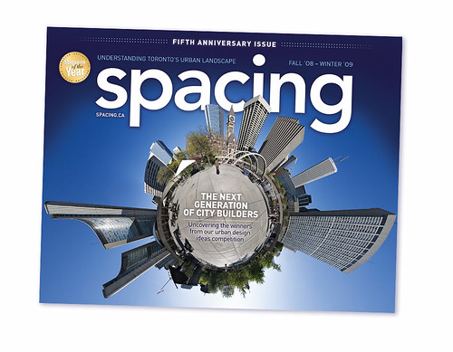
Next week, you’ll be able to pick up the new issue of Spacing, either on newsstands or at our fifth anniversary party on Wed. Dec. 10th at the Great Hall.
As we mentioned last week, Spacing has gone through a bit of a redesign. We’ve kept most of our regular features like Infrastructure Fetish, Hidden Gems, Placemakers, and Head Space, but we’ve added a few new features and an entire new front-of-magazine section called The Issues. Here’s a bit of a rundown:
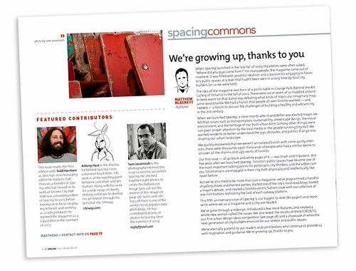
THE COMMONS: For years, we’ve balked at the idea of having an editorial page, but we finally decided it was time to have a space in the magazine for us to discuss issues that might not fit into a specific feature or section. One of our editors will shoot from the hip (or lip) each issue.
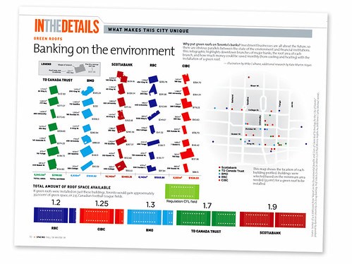
IN THE DETAILS: This feature will be an info-graphic that breaks down a specific topic. In this issue we examine the impact on the city if branches of the major banks put their money where the mouth is and installed green roofs. Spacing teamed up with Sheridan College’s illustration program to create this graphic: 60 students were assigned to do info-graphics on green roofs in Toronto. We ended up choosing the work of Mike Culhane and Kate Martin-Noyes.
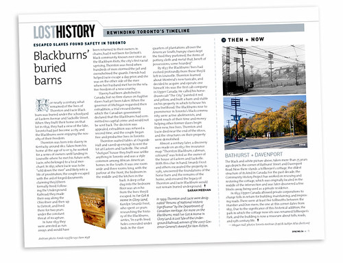
LOST HISTORY: Spacing used to have a heritage feature called “Gone,” but we decided to rename it and add a fun sidebar. Lost History will uncover bits of Toronto’s past, while the sidebar Then & Now compares how areas change over the years.
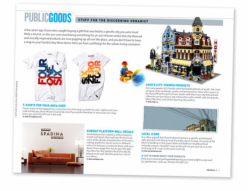
PUBLIC GOODS: This new feature is meant for the discerning urbanist who needs city-themed products like t-shirts and trinkets. We know Toronto possesses a plethora of great craft artists and fashion designers, so we expect Public Goods to be a popular hit with our readers.
NEW BODY FONT: For the front-of-magazine and review sections, Spacing has decided to change the body font. We had been using Avenir Regular since our launch five years ago, so we thought it might be time to change things up a bit. The new body font is called “The Mix Light” — it’s a sans serif font (like Avenir) but also contains a few serif characteristics. It displays a little bigger than Avenir, so those with poor eyesight will find it a bit easier to read.
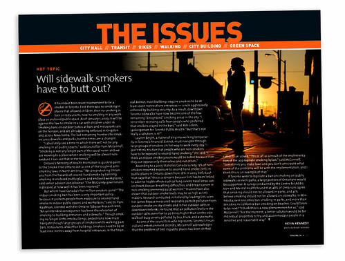
THE HOT TOPIC: The page above is the front of a totally new section, called The Issues. The Hot Topic will kick off the section with a timely or intriguing examination of a local issues. Our first Hot Topic examines the City’s current and potentially forthcoming policies concerning smoking on sidewalks and in other public spaces.
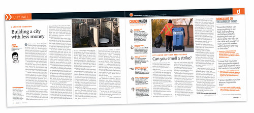
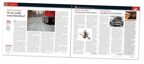
THE ISSUES: We decided to introduce The Issues section in order to keep our readers up-to-date on the latest public space happenings and discussions. The Issues are City Hall, Transit, Bikes, Walking, City Building, and Green Space. Each “issue” is a two-page spread that includes a columnist and up to three small features. Spacing has added the voices of Steve Munro (transit), Steve Brearton (bikes), Spacing editor Dylan Reid (walking), and Edward Keenan (City Building). The preexisting columns by John Lorinc (City Hall) and Todd Irvine (Green Space) now have a permanent home in their new sections.
NEW FONT FOR COVER SECTION: Our themed cover sections will continue, just like in previous issues. The only difference you’ll find is a new body font. We’re using a serif font called Scala Serif Regular. We chose to have a different font so that this section would stand out from our front- and back-of-magazine sections. And since articles tend to be longer in the cover section, and serif fonts are considered easier to read during lengthy pieces, we thought the change of font made sense.
We hope you like the refreshed Spacing. To see larger versions of the graphics show in this post, go to our Flickr page.

14 comments
Looking good guys, can’t wait for the release!
You forgot the part about going monthly, right?
Right???
We were going to surprise everybody with weekly.
Looks good.
I’m really impressed with the ongoing evolution.
Kudos.
Matt I love how you specifically mentioned the new fonts. We’re nerds.
In other words, you asked 60 graphic-design students to work on spec, an unethical practice. Aren’t these the same students Matt Blackett teaches?
Sheridan approached us with this partnership. It was their class assignment and I got to choose the one best suited for Spacing. But nice try, Joe.
the latest issue looks AMAZING – and i’m utterly feeling the new font. slick
I saw the article in the Star’s IDEAS section. I like what I saw.
I saw your web site name, and went to it. I like what I saw.
I’m a suburb-anite. I haven’t noticed your magazine in any news stands up here, but then I hadn’t known about it. Now I’ll be consciously looking for it (including when I’m up & about today (Saturday)), and if I find it I’ll buy it.
I hope to be reading you, watching you, and maybe even interacting with you.
FYI I’m a lot different from all of you:
– old enough to be your (grand?)parent
– don’t want to live in Toronto
Nevertheless I believe that I/we would be far! better off with a strong, vibrant, cocky Toronto. I have this vague sense you might be able to contribute to bringing this about. I am considering how I can contribute to your contribution.
Based on what I have seen in the last little while you have my admiration and best wishes.
I was considering if I could comment on Sandy’s comment…
That is the most entertaining comment I’ve seen in a comment section in quite a while!
As a fellow outsider and reluctant 905er, I share your frustrations of lacking newsstands. being a suburbanite sometimes feels like living next to a cool neighbour who has lots of parties that you aren’t invited to, but you can’t help but nonchalantly peek in the windows to see what’s going on…
Cheers to the strong, vibrant and cocky city you don’t want to be part of!
I’m going to crash the next party.
I read today in the metro about “City councillors want TTC ‘relief line’ made a priority. I agree that this line should be created. I am a daily rider of the subway and find that it is already congested, and God forbid if there was ever a delay or another power outage.
With the proposed extensions north on the Yonge/University line it is only going to put more pressure on the already heavily congested system. I have a few question about some of the proposals.
1) I understand the extension of the Spadina/University line up through York University to Vaughan Mills but I can’t seem to understand why they would extend the Yonge line to York. The TTC is longer going to be a Toronto Transit Commission, rather a Greater Toronto Transit Commission. In order to better serve those regions more pressure needs to be put on the GO services. There are many parts of Toronto that are under served by Transit that should be more of a focus. If we are trying to reduce traffic on our highway systems lets make our public transit more efficient and more accessible to all.
2) How will this relief line be built, above or below ground? I should stress that a subway although costly would be better used than creating dedicated streetcar lanes throughout the downtown core. Therefore if a subway were to be built, my opinion is that it should be underground down Pape and along Eastern to Union at such point the line could come above ground on an elevated podium above the CN rail line out to Dundas West (much like the Chicago loop). This line could even be extended to the Airport which would be ideal for Mike Sullivan and his Weston Community. The one question I have is how much would it cost to build an elevated rail line compared to burying it?
No rush on responding, I just wanted to throw my two cents out there.
Thank you.
hey, looks INTERESTIN’… any chance you can get it into ‘Different Drummer’ in Burlington? Or, try a ‘targeted’ placement, like the Burlington Art Centre, Hamilton Art Gallery, Sunrise Gallery out in the beaches … Just a few copies … 5 here and there … see how they do. Indigo/Chapters is out here too … Best to you, C
Quite interesting! And where you can find this magazine? This electronic journal?