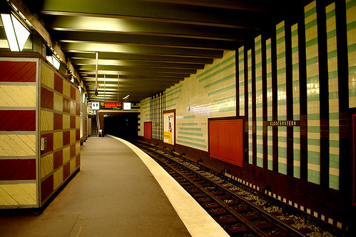
Back in the spring, I spent a month in northern Europe and Scandinavia checking out the great cities of Copenhagen, Malmo, Gothenberg, and Hamburg. Each location has their unique characteristics, some of which I’ve already posted about (Reykjavik, my first stop; Copenhagen; and Malmo). I was sidetracked with work on the upcoming issue (out tomorrow!) so the other cities have been ignored. Today I take a look at Hamburg’s subway stations.
Hamburg, Germany has an extensive rapid transit system that employs a few services, mainly the S-Bahn subway and a more local subway service called the U-Bahn. Both services have multiple lines that travel underground through the heart of the city but mostly exists above ground outside of the dense core.
The one thing that caught my attention was the design of the subway platforms (which shouldn’t surprise anyone since I helped create these little things). The wall patterns in numerous stations are made with similar tiles as Toronto’s TTC subway stations. I was excited to discover these stations because (in some cases) they help me debunk the myth that subway stations designed with these materials look like washrooms. I see a shared approach in many of these platform designs to Toronto, yet the German designers have played around with patterns much more.
The following 30 photos have a little commentary. You can see them on Flickr too.
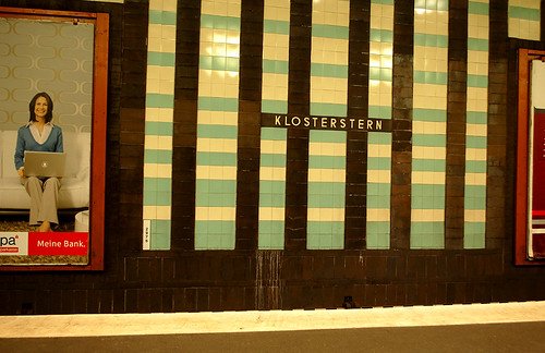
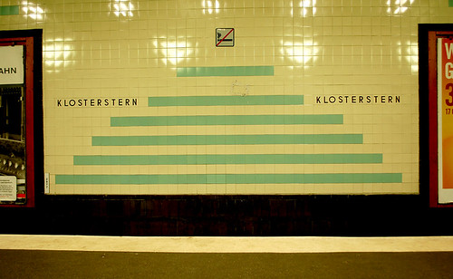
Klosterstern station is near the top of my list of favourite stations. The yellow-ish tiles are actually quite white. As you can see in the photo at the top of the post (also Klosterstern) the patterns are very striking when looking down the curving platform.
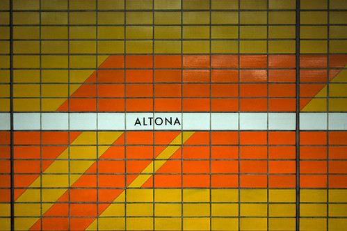
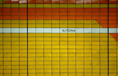
Hamburg’s stations do not have a uniform font like Toronto has, but the one used here at Altona (it looks very much like the font Futura) is the most widely used.
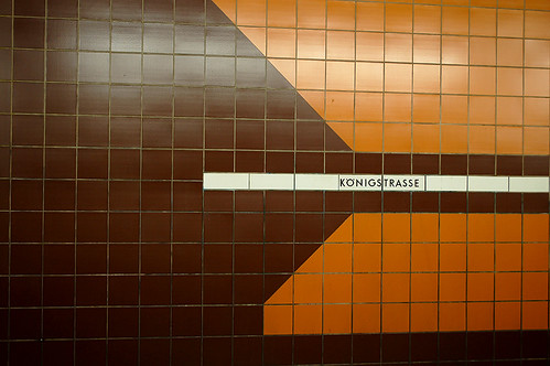
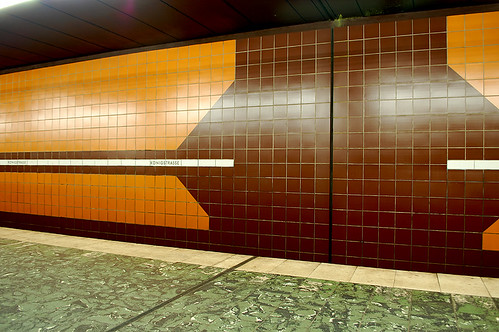
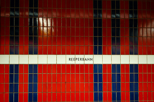
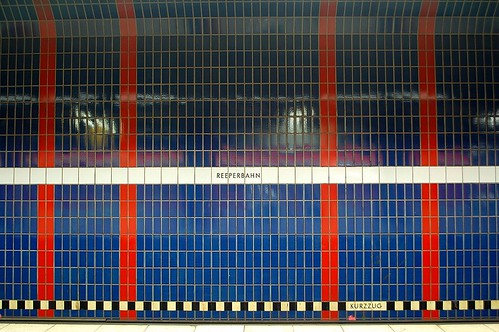
The Reeperbahn is Hamburg’s closest thing to a red light district. Its station is unique in that it starts with a red wall as its base colour at one end, and with the use of thin stripes, slowly blends into a blue wall.
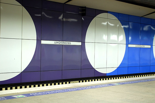
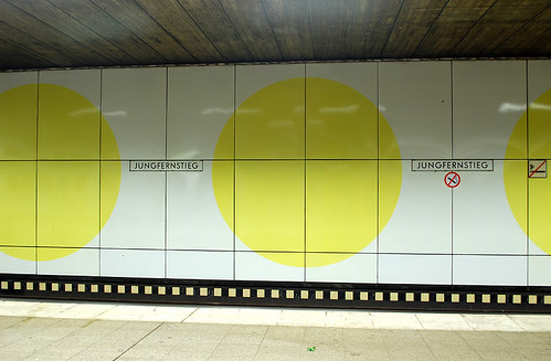
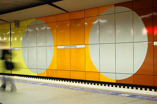
Jungfernsteig was my favourite station design (I’m a sucker for big circles). It had a few lines passing through it — the theme also continued on those platforms.
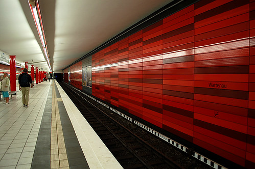
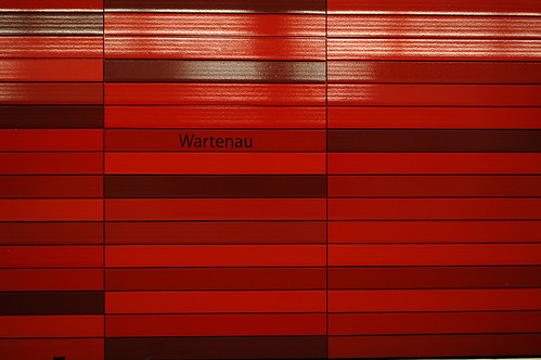
Wartenau was very striking to enter. The long, multi-shaded, horizontal lines created an effect that the train was moving faster than its actual speed.

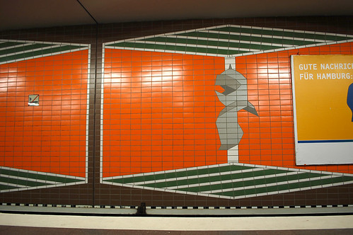
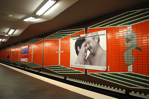
I loved the station Ritterstrasse simply because of its kitsch German iconography.
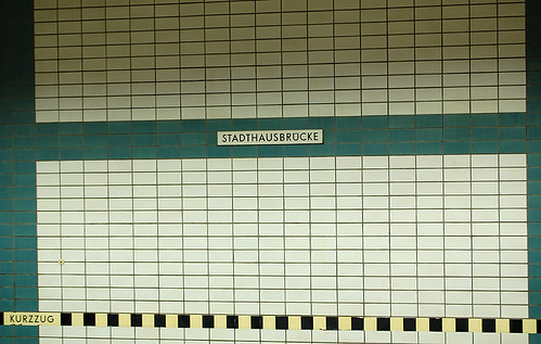
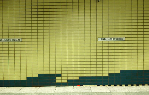

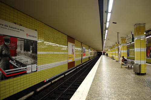
The stations Stadthausbrucke, Landungbrucken, and Lohmuhlenstrasse felt eerily similar to Toronto stations.
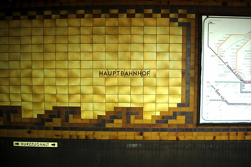
This is one of many platforms found under Hamburg’s central station Hauptbahnhof. Look at those tiles: they are the same patterns used at King and College stations here in Toronto.
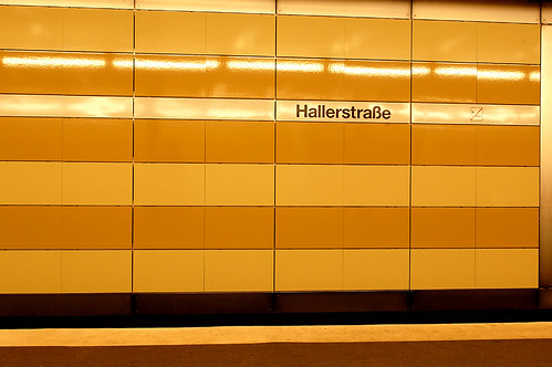

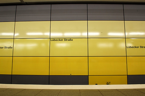


The five stations shown above are examples of recent platform renovations. The font is use is Helvetica Bold. These were probably my least favourite designs, but worth documenting nonetheless.


13 comments
So cool. Thanks for posting.
It’s Ritterstrasse, Matt. Ritter is German for knight. Gothic german font is not the easiest to read – I guess it was developed in the era before Persons with Disabilities acts were in place and I guess was used here for its historical context. It reminds me a bit of “Suetterlin” font, developed in 1911 for the Prussian Culture and Education Ministry, which was actually how kids back then had to write – see http://de.wikipedia.org/wiki/S%C3%BCtterlinschrift!
thanks for posting these – it’s like being there! do you also have any photos of their subway cars (inside and/or outside) – am now curious to see how they compare with Toronto’s!
These are very, very cool. Wartenau’s my favourite– though it seems like the station name would be totally illegible if you didn’t know where to look for it.
Thanks for the post! I like how their subways are clean. Unless you just didn’t get the dirty parts…
Thanks also for making a case for ceramic tiles in subway stations – it’s a durable, aesthetically pleasing material. I really hate the plastic resin renovation to Museum station – it’s ticky-tacky and will look like hell in about 5 years – all dirty and scuffed, with no effective way to clean it. It really annoyed me that one of the reasons that the TTC has decided to completely makeover the look of all of the stations is that “those tiles aren’t in stock anymore.” No, they aren’t, but issue a Request for Proposals for new, matching tiles – those colours aren’t the most exotic, and it’s possible to make duplicate sizes. It seems to me that all that most stations need are a deep cleaning of the grout, etc. and the replacement of broken tiles. This would surely be less expensive than the theme-park-style tarting-up that’s supposed to pass for design.
(The above rant excludes station renovations that are desperately needed, like the current expansion of Dufferin.)
Stephansplatz and Wartenau are fantastic. I’d pay to see something as fun on our system. Maybe the TTC should have a bake sale.
A certain litigious city councillor would no doubt dismiss them as looking like bathrooms.
Many of the station patterns have a very ‘metropolis-like’ feel, especially Klosterstern, Jungfernstieg, Altona and Konigstrasse.
I’ll say it — they do still look like bathrooms, but hey, many of us put a lot of thought into renovating our bathrooms and I don’t mind catching a train in a clean, good-looking bathroom one bit.
Note that New York has gone back to “subway tile” (white 3×6) in all recent station renovations, mixed with horizontal brick and sections of prefab mosaic. You have to go with your strengths.
Toronto’s stations will never look like Montreal, or DC, or Stockholm — the massing of the spaces is simply too much of a long low box and no COM will change that. But these pics prove that ceramic tile looks great if you let it be itself and have fun with the 60s feel of the material.
“and have fun with the 60s feel of the material”
Or, alternatively, the 20s/30s feel of the material. (In which case, ceramic might as well blur into mosaic or whatnot.)
Wartenau is the most recent renovated station (2008/2009).
For others into subway station names and fonts, these decals are great – I have three on my wall. Found about them in a previous issue of Spacing.
http://walloper.com/
PS – I have no financial or other conflicts with this company!