
Updated September 21 at 3:25 pm: According to Spacing’s contributing editor Steve Munro, the TTC has announced that it will be reviewing, correcting and replacing the new maps. I do not know the details of basic design issues such as a clear identification of entrance locations and inclusion of surface routes, but I hope to get more info as the week goes on.
– – – – – – – – – – – – – – –
If you commute regularly on the TTC subway, you might have noticed the new “station and vicinity” maps that have been placed in the large information panels. I wrote late last year about the badly out-of-date maps the TTC had previously used, specifically highlighting a map in a recent renovation of Spadina Station that still had marked the route 77 Spadina Bus route (which was discontinued with the opening of the new Spadina Streetcar route in 1997).
Well, the TTC has finally began replacing the maps with new editions. Unfortunately, after having a closer look at two stations, St. Andrew and Wilson, these new maps aren’t exactly up to snuff. For one thing, the gray, beige and white colour scheme (with the occasional green or blue) is not aesthetically pleasing.
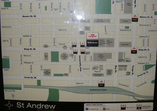
In the above image — in St. Andrew Station — many things have been brought up to date. The recent renaming of BCE Place to Brookfield Place is reflected, as is the new opera house at Queen and University. Most of the major nearby office towers are illustrated, but strangely enough, so are the locations of Rogers Plus stores.
But some obvious features are missing. St. Andrew is one of the closest stations to the sports venue formerly known as SkyDome, yet that facility, under its old or new name is not shown on the map, nor is the GO Transit bus terminal on “The Esplanade” between Bay and Yonge. Also missing is Simcoe Street’s new extension which finally opened under the railway corridor. Other nearby attractions, such as the large movie complex at Richmond and John (an easy walk from St. Andrew), and the Much Music building at Queen and John are also missing. The legend also includes a wheelchair symbol to indicate accessible subway entrances. While St. Andrew is not an accessible station, the southeast entrance of nearby Osgoode Station has an elevator for disabled patrons, and nearby Union and Queen Stations are also accessible, these important features are not shown on this map.
But most importantly, the connecting surface bus routes are nowhere to be seen, which I think is one of the most vital pieces of information needed to both commuters and visitors. The old maps showed not only lines for the bus and streetcar routes, but also the locations of where they stopped. Neither are shown on these new maps.
I was excited when I heard that the TTC was going to replace their sometimes way outdated station area maps, but these new replacements are sadly disappointing. I am hopeful that the TTC takes this advice when they do the next versions of the maps.
Meanwhile, I present a small selection of maps that other major transit agencies have developed for similar purposes:
Montreal – Bonaventure Station [PDF]
Hong Kong – Mong Kok Station [PDF]
Los Angeles – 7th-Metro Center Station [PDF]
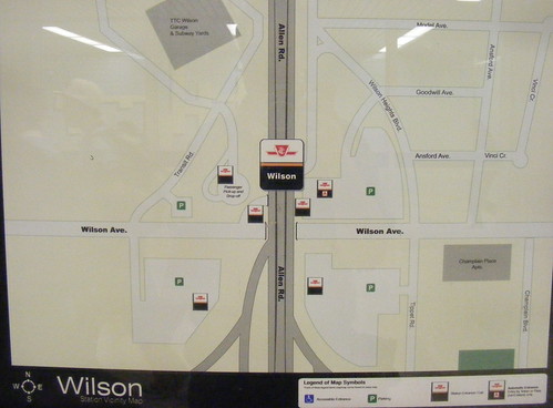 Wilson Station map, no mention of large commerical “big box” centre to the west, nor even the location of the overbuilt, double-deck bus terminal beside it next to the passenger pick-up area. A commenter below picked up on the fact that Faywood Blvd. is marked incorrectly as “Ansford Ave.”, the road the 104 buses use to cut over to go north onto Faywood.

39 comments
The St Andrews map actually shows The Esplanade running between Yonge and Bay; it doesn’t. That’s where the GO Bus station is! Maybe they will get it right for the King Subway and Union Station area maps, they are the nearest stations.
In defence of the TTC I must admit that buildings and ‘attractions’ change name frequently and new streets open, from time to time. The maps cannot be remade every year but ….
Wow, yeah, an improvement (damning with faint praise) ….. the missing surface routes are a major fail. And the lack of an index to locations implies that the people who created these possibly never use the subway to get anywhere new.
An isometric map of the local area would be much better for info and would look better also. I wonder if the internal graphics department thinks about these things at the TTC and how to elevate the brand in these areas as you’ve have shown in the other transit system maps.
I do like the look and feel of the LA Metro. They could at least illustrate identifiable landmarks to help people to navigate the local neighbourhoods the stations are in.
Good points, but all I really want is a sign indicating which way “north” is when I step out of a subway station.
The RBC Dexia Building is missing from the St. Andrews map.
Making maps as attractive and rich as the Montreal station vicinity maps requires hiring competent cartographers and giving them the mandate to go out and do a survey of the area around each station. (At that scale and level of detail, footwork provides accuracy.) It’s not easy or cheap, but it’s certainly worthwhile.
On the other hand, a good cartographer with Google Maps and a copy of the TTC system map could do a better job from home than what the TTC has come up with. This looks like a job imposed on an internal department lacking the necessary skills, by managers having little idea just what skills are necessary.
I knew something had changed at Wilson. I thought maybe I was imagining things because that little hut was there for so long blocking this map.
These are absolutely hideous.
Judging by the timing, can’t help but wonder if these are the end result of a summer student “make work” project!
Every station I exited had a vicinity map in Tokyo, which was accurate, and business is more dense there, and has turnover. Toronto: fail.
How much did Rogers fork over in exchange for listing their stores on the first map?
Angus – good call! Maybe a job for the Urban Repair Squad!
The one for Wilson Station is just flat out WRONG.
For almost all the time I have lived in Toronto (more than 2 decades) I have lived a 10 minute walk from Wilson Station and I had trouble recognizing the area until I realized they had marked “Faywood Blvd” – which is the street which the 104 Faywood line runs on – as Ansford Ave. That is just one of the very confusing things about that map. I just don’t want to ramble on. Take a look at a GoogleMap of the area and you’ll see more of what I am referring to.
Who approves these?
Very disappointing. Very “bland” looking map, especially if you were a tourist in Toronto. The Montreal Metro map seems to have it right.
Er, down at the bottom, it’s the “Gardner” expressway. Maybe they are planning a West Side Highway and have not told anyone about it.
There are so many flat out mistakes on this map, it’s embarrassing. I hope that the TTC can blame this on some hopeless in-house summer student, and didn’t actually pay an outside firm to produce these.
Note to Brad Ross: Is this yet another fine example of TTC “Communications”?
As one who makes maps for a living, just want to say sorry to those who have to use these inaccurate maps for their travel. Maps are useful forms of communication when information is plotted accurately and in a timely manner. For the TTC, these maps should be considered an extension of their business and valued as such. In other words, maps compliment a commuter’s experience as they navigate the TTC’s system to travel to their destination. Therefore, errors like mislabeled roads for which a bus route is named after as Dan L mentions or omitting surface level bus route information as Sean Marshall points out is unacceptable. I would highly recommend that the GIS team who likely produced these maps first understand the information transit riders at each station require (as needs do vary from station to station) and prioritize accordingly, then follow some quality assurance checks to eliminate unnecessary errors and repeat exercise after a year.
I have seen a slight improvement with the TTC’s ability to provide meaningful information. The finch sinkhole has detoured 2 bus routes and after 47 days, the TTC finally added service disruption notices at the station and on each bus stop that included a map. The map was a big step to help clarify the detour information but the time it took to actually post the info left me thinking if the TTC really cared about transporting people around. The same can be said with their less then accurate service advisory notices for escalator breakdowns.
As for the issues with the appearance of these maps, well that’s a subjective point. Perhaps there’s a reason for the flat looking maps…maybe the TTC’s GIS team is restricted to follow this colour scheme due to accessibility concerns (vision impairment, legibility etc). I found another example of useful maps, here’s an example from Washington DC’s transit authority which displays a lot of information but can be consumed at a macro and micro level (they even indicate the direction of escalator movement!)
http://www.wmata.com/rail/station_bus_maps/PDFs/Union%20Station%201st%20St.pdf
Inspired by the example above, wouldn’t it be great if the TTC stations were equipped with an interactive map. Through touch screens, a user could tap the map window to zoom to a level suitable for their needs and detail information would be revealed according to the desired scale.
In short TTC: value your maps and hire me!
That’s what one gets with the “lowest bidder”! It is the cheapest looking map, because it is the lowest price map they could get.
Probably drawn by some 12 year old kids in India, who don’t even know what is in the neighbourhood.
There are a few dozen mistakes on the St. Andrew map, and about half a dozen on the Broadview map (including placing Chester Station one block west, on Jackman).
A big problem is that the maps are not to scale and this means outline plans for sites are squished or improperly shaped.
I suppose that the TTC had these maps done by someone who doesn’t get out much.
The map at Summerhill has the station on the wrong street. I’m sure in an ideal world the station would be on Summerhill Avenue, but in this world it isn’t. Unfortunately, whoever did these for the TTC doesn’t live in our real world and lives in the ideal one where things are named for where they are. http://lingwhatics.blogspot.com/2009/09/map-in-error.html
It’s nice to hear that the TTC now has some maps showing the diversions around the Finch sinkhole. It would be nice if they used them now on their web site. I am sure there are people that prefer to have the text description (including people using screen readers), but I would find it a lot easier to see a map.
TC speculates that these were done by a GIS team. I don’t think that is the case. I am guessing it is Corel Draw. If they were done using GIS layers, the street layers and the street name layers should have been correct… presumably those GIS layers are used for other things where accuracy is important. Instead we have streets mislabeled, streets there when they shouldn’t be (The Esplanade), streets that aren’t there when they should be (Billy Bishop Way, the ring road extending south from Transit Road), and curvilinear street alignments that are oversimplified.
I will also vote for adding surface routes. Another orienting feature that would be really useful: street numbers.
Also — one high-profile misspelling that no-one has brought up yet: “Eaton’s Centre”.
For further details on the horrors of the new maps, please see the post on my site at:
http://stevemunro.ca/?p=2604
I plan to visit more stations tomorrow and catalogue their cartographic sins.
Somebody wasn’t trying hard enough. The very least they could have done was taken a quick look at Google Maps to verify that their information was correct. I’m not saying Google Maps is always reliable but it still has fewer errors than these maps.
You say they cannot update the map every year
Why not? Every year they print thousands of maps. I’m sure they can slide one of them into the glass panel to keep, at minimum, the ones at the subway up to date. If they can do that (and I just said they can) they can certainly keep local area maps up to date using the same method.
Summer student in Corel Draw is the best explanation I have seen so far.
Is the laneway behind the Dominion Public Building not the continuation of the Esplanade (north of the GO Bus terminal)? Remember it wasn’t much of a street when the old CP Express terminal loomed over it either.
Love any post that takes the TTC to task on maps/graphics. Let’s make “TTC Maps” a regular feature on Spacing, kind of like The Fixer in the Star. There is a never-ending list of errors and bad practices to howl over.
Hard to believe they screwed up a simple area map. I mean, just hire Montreal’s people if you can’t figure it out. There obviously are lots of examples of how to do this right, so why reinvent the wheel? Then again, the nearby PATH maps aren’t exactly inspiring so the TTC probably figured they had to outdo their bland flatness and outdated information – and congratulations, they did.
My suggestion for a better map infrastructure: Google. Online, most websites (hotels, transit, whatever) long ago gave up trying to constantly update their own maps and now display a modified Google Map. Solves the update problem and makes for a common interface/orientation. It hasn’t come to Toronto yet, but check out the awesome building isometrics and attraction info that now appear in many American Google maps:
http://bit.ly/4d9bGJ (switch to Map button, zoom in)
It certainly should be possible to modify a google map to show TTC routes and station exits and use this on the station webpages (http://bit.ly/1Y9m19). For the actual stations, simply print these out in large-format color and drop into a frame in the actual station.
The other option is to not show information that could change at all. Focus on providing a really good street map, with compass arrow, addresses, parks, bus routes, etc. This avoids the instant outdating that occurs when trying to track business names or even buildings.
What a mess.
ugh. On top of all the above-listed sins, these maps are printed in abysmally low resolution.
The TTC announced today they are reviewing the vicinity maps. Thanks to Sean and all the above Spacing commenters for spreading the word on the the poor design and implementation.
I explored the system to see all the errors I could find before (I hope) the maps are fixed again.
Apparently, the Union Station map has the OPP still headquartered on Harbour Street (next to the “Toronto Harbour Commission”), and I can grab dinner at Ed’s Warehouse.
College: http://www.flickr.com/photos/7119320@N05/3942840973/
Queen: http://www.flickr.com/photos/7119320@N05/3942880763/
King: http://www.flickr.co…m/photos/7119320@N05/3942908571
Union: http://www.flickr.com/photos/7119320@N05/3943709178/
Incompetence, thy name is “TTC” …
Wow, Sean, that’s awesome. Truly awesome.
It’s nice that the Star jumped on this and reported on the problem and the fix, but unfortunately the existence of excellent maps in other cities never came up. It drives me nuts that Toronto operates in a vaccuum, like it’s the only city on earth. Is it so hard to learn from others?
According to this STAR article, these maps cost the TTC $2,000. Typical TTC, cheaping out on signage, navigation, and overall user experience. Looks like they got their money’s worth. 🙂
This is typical of the TTC. To my mind it’s an engineering-led organization with no sense of style or creativity and no understanding of customers. The only thing it’s good at is laying street car tracks – I sense they really like doing that and all this other stuff which affects customers – that’s us – is just a nuisance and gets no attention.
I really wish that the TTC would create a vicinity map, similar to Montreal’s, including one that we can download on the computer, in PDF form. If the same map can be used both for the station and in download-able PDF form, the excuses about cost can be reduced.
The Museum map had a number of errors, including several theatres that no longer exist. This is just brutal.
OMG!!!!! You people need to get a life. In the absence of that, maybe you could get a real job uncovering typos in The Toronto Star or National Post! Ha,ha. Though some of your comments are legitimately constructive and your suggestions worth noting, consider, for a moment, that the TTC doesn’t necessarily have the resources to create the masterpieces that you demand. Overworked and underpaid, the people pumping out these maps are doing their best in a politically fuelled environment where they take the fall for every human error. Shame on you all for judging them! Walk a day in their shoes and then you’ll be qualified to voice an opinion. Perhaps everyone should take a step back and focus on actual important issues. For G-d’s sake! It’s just a map!
RUkidding — if most of us “walked a day in their shoes” we’d be paid a lot more for a day. Also, if “most of us” produced work like this, we’d never work in this town again.
There is much honour in working for the public service, and there many, many public servants who toil at it, unsung and in the background, for all of our benefit.
When things in the public service go bad, when mediocrity seems to rule and when care and concern are nonexistent it shouldn’t be a surprise that those responsible are criticized for it as they are here. They don’t need a break, they need to be fired, with cause, and their supervisors need to be fired and elected officials need to be unelected at the next round at the poles. These may be “just maps” to some, but they are really the public presentation of how an organization at large functions. If you object to this last point, you’ll then agree that the house needs to be cleaned out.
All those great and wonderful public servants we have deserve not to have to endure their mediocre colleagues. Anything else is intolerable.
I snapped some pics of the Tokyo Metro maps and sent them to my posterous. They’re crowded, in the way Japanese infographics and websites tend to be, but very useable all the same. If anybody’s interested for reference, they’re here:
http://haylesyable.posterous.com/