EDITOR’S NOTE: Spacing asked our summer intern Matthew Hague to visit all of Toronto’s post-secondary institutions and examine the built form of each campus. Each day will feature a new campus profile.
– – – – – – – – – – – – –
This summer, in addition to interning at Spacing, I have also been working at an office near Queen and Beverley streets. Living near Jarvis and Bloor, I often save myself transit fare and walk to work. Although there are lots of ways to walk from Jarvis and Bloor to Queen and Beverley, some of the most picturesque routes involve walking through the University of Toronto. In thinking of Toronto’s university and college campuses, U of T’s St. George Campus is both one of the most remarkable, but also one of the most difficult to get a comprehensive picture of. Being so large, and having been built over a long period of time (U of T was established in 1827 and has developed its campus over the ensuing 181 years with buildings from the neo-gothic to the ultra-contemporary), the University of Toronto’s “face” is varied to say the least. To give a snapshot of the campus, I decided to photograph one of my walks.

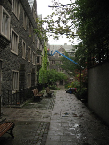
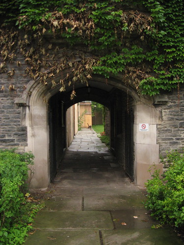
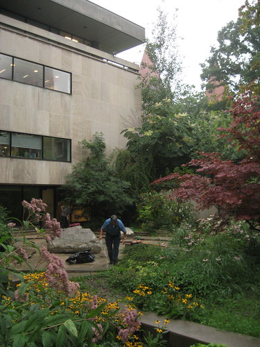
Heading south on St. Thomas Street off Bloor I hit Charles, and head west until I see Victoria University (formerly an independent school but now one of U of T’s three federated universities; U of T also has four constituent colleges, four theological colleges, and one affiliated college). Walking through a stone archway I enter a yard roughly bound by Romanesque-revival, collegiate Gothic, and modern buildings. Walking south along a stone walkway towards the minimal E.J. Pratt Library is especially interesting because, at the bottom of a stone stair that leads to its base, is a sunken garden and pond. The garden is particularly beautiful against the austere stone of the library, and I can imagine it would be quite nice to sit and read in the ground floor of the library with the windows overlooking the water.
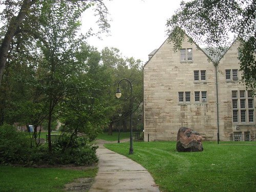
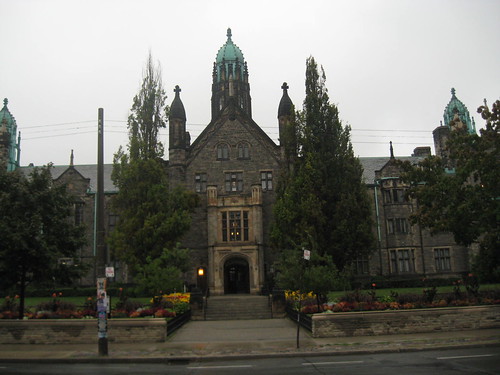
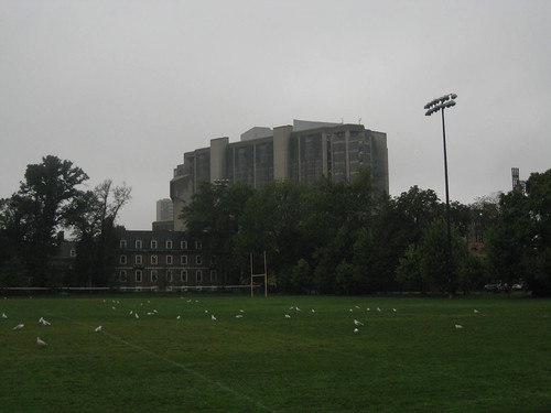
Continuing further I end up at the northern tip of the University of St. Michael’s College campus near the edge of Queen’s Park. Here I cut across the top of the park then skirt between Wycliffe and Trinity colleges on Hoskin Avenue, towards the turkey-shaped massing of the (in)famous Robarts Library in the distance. Robarts and its heavy concrete shapes seem particularly clumsy next to the more refined brick and stone buildings the library hovers over.
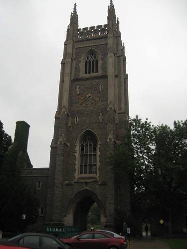
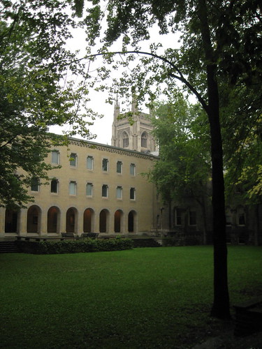
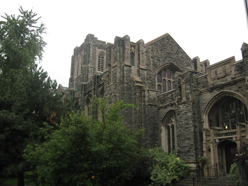
Instead of continuing on Hoskin Avenue to St. George, where Robarts is located, I head south again toward the Gothic-looking Soldier’s Tower, built to honour the students and faculty who served in World War I. Through the arch is the heart of U of T’s St. George Campus, King’s College Circle, but instead of continuing through the tower’s archway I head east along a lane of parking spots and turn south into a gap between two buildings. The gap leads leads into a one of of U of T’s many quads, and this is one, at the centre of University College, is one of my favorites — behind a quirky, black-and-gold gate, the courtyard is sunken and surrounded by trees. The buildings that enclose it are dissimilar (some newer than others – possibly owing to a fire that destroyed large parts of University College in 1890) but complementary, and the colonnade that runs along the western edge, with its squat, white columns, feels like a great place for pacing quietly in contemplation. I like it here because the trees are old, the place is quiet, and the atmosphere is very peaceful.
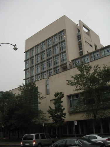
Through the western colonnade is a passage that leads into University College’s leafy Sir Daniel Wilson Residence courtyard, where I walk until I hit a path that takes me south and onto King’s College Circle. The circle is centered by an open lawn, and bordered on all sides by buildings from different generations — neo-Gothic, Concrete brutalist concrete, and the more classical, dome-topped Convocation Hall. Walking south on the western edge of the circle I hit Knox College — a neo-Gothic building built in 1914 — and I cut across a birch-lined path and end up on St. George Street. Heading south, I pass the contemporary Bahen Centre for Information Technology — one of the more contemporary buildings on campus, designed by Toronto’s Diamond and Schmitt Architects. Just south of the Bahen Centre I reach College Street, where St. George turns into Beverley and I am off the campus, a palpable shift considering that I am walking now beside two- and three-storey brick homes as opposed to larger, monumental works of institutional architecture. But the shift from school to the rest of the city is still smooth; that is one of the things I like about U of T’s campus, that it physically connects to its surrounding neighborhood from so many entry points, so that walking on and off the campus from the surrounding areas in the city city is easy, even pleasant, allowing students and non-students alike to quickly cross boarders.
U of T Scarborough Campus
Unlike the University of Toronto’s St. George Campus, which I walk through frequently, I was much less familiar with the Scarborough campus until my first visit a few weeks ago. The Scarborough campus is much larger (with 300 acres of woodlands versus St. George’s 168 acres of relatively dense urban fabric), services fewer students (with around 10,000 full-time students compared to St. George’s approximately 50,000), and has a much newer campus (UTS was founded in 1964 as Scarborough College).
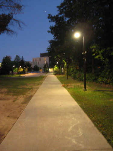

By the time I arrived at the University of Toronto Scarborough Campus, at 1265 Military Trail off Ellesmere Road, night was falling. The bus ride through the northern part of Toronto and into Scarborough set me up with the expectations of an industrial-looking campus with few people walking (or few people period), factory-like buildings, and expansive parking lots. Getting off the bus in front of the school I walked down a lit path edged on one side by dense greenery, at the end of which is University of Toronto Scarborough’s new Student Centre. The Student Centre’s hovering metallic box (partially constructed with 18-tonnes of steel from the demolished ROM Gallery) shimmering in the dusk light made me feel like my expectations were misguided; I felt welcome on the campus.
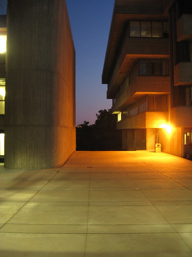
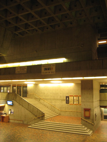
The campus has recently had a $150 million expansion, including the new Student Centre (which was partially funded with a $14 million donation by students — the largest donation in the school’s history — and meets LEED Silver criteria), as well as a new residence, classroom spaces, and a gallery. I can’t imagine what the campus was like before the new buildings were completed, although I knew before I set foot there that many of its buildings were “brutalist” concrete. Wandering further back into the campus, behind the more contemporary buildings, the concrete buildings stand out in contrast, although I initially didn’t find them very brutal at all. Designed in the early 1960s by John Andrews (who also designed the CN Tower), the original three buildings are the Humanities Wing, the Science Wing, and the Bladen Wing. Maybe it is because I was there at dusk, and the sky was soft, but the buildings felt optimistic rather than brutal — optimistic in the strength and versatility of concrete. Rather than hanging heavily, or oppressively, the concrete buildings seem light, showing a high degree of plasticity and strength through many cantilevered overhangs and walkways. Much of the concrete has also been textured by wooden boards, so it is more textured than a typical slab. The Meeting Place, at the end of the southern end of the Science Wing, is particularly interesting, combining both solidity and lightness with a deep, strong, coffered ceiling in the middle, and slabs of concrete seemingly hanging down effortlessly around the main space. That is what is cool about concrete — it is very heavy-looking, but because of its strength it can be made to look like it is floating.
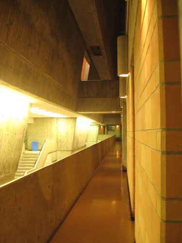
The original buildings overlook an expansive wooded area, from which I could hear crickets chirping and not much else; it was very quiet. The buildings themselves were open so I took a look around them. I felt like I was enveloped by concrete — the corridors move organically through large multi-height spaces, and are bathed in a strange yellowy light. I spoke to a UTS student later about my experience, enthusiastically describing how interesting and unique the original buildings are and how I was pleasantly surprised by the campus overall. She stopped my enthusiasm quite short, informing me that spending any length of time in that yellowy light is maddening, and that after a while the concrete really starts bearing down on you, and yes, brutal is a good way to describe it. She was, however, quite proud of the new, more contemporary buildings.


18 comments
I visited the St. George’s campus for the first time this summer and enjoyed the quads, gardens, trees, and ivy-covered walls. I agree too that the campus “physically connects to its surrounding neighborhood from so many entry points, so that walking on and off the campus from the surrounding areas in the city city is easy, even pleasant…”
The “Welcome Class of 2011” sign bothers me because hardly anybody graduates on time anymore!
Doesn’t “Welcome ’11” bother you because current frosh are the class of 2012? Or are they assuming that everyone will just do a three year degree instead of a real one?
Why are all the pictures so dark?
Thanks for a great walk of U of T’s campus! I just graduated … and I still think there’s tons I haven’t seen.
Since I’ve never been to UTS before, I had no idea how eerily similar Andrews’ brutalist building is to the building that Raymond Moriyama designed for UTM (University of Toronto @ Mississauga.) Although UTM is in Mississauga and does not qualify as ‘in Toronto,’ Matthew should visit the Mississauga campus sometime to compare.
Wow, that article made me nostalgic for UTSC. As someone with an undergrad from UTSC, currently grad studies at St. George, I definitely contrast the two locations all the time. And while I often make fun of scarborough, there was something special about being on that campus on a summer evening. It can almost be pretty. =)
Evening shots don’t do Scarborough’s interior justice.
I used to love studying at the E.J. Pratt Library and looking out to the old residence building. It was a great study environment. There were so many peaceful corners you could find on the St. George campus if you spent the time exploring.
You really should revisit this article on UTSc during daytime. While it isn’t the St. George campus, it still is a gem.
However, the best part of the UTSc campus is the sprawling Highland Creek ravine: a bit of woodland paradise winding its way through Scarborough complete with waterfalls. Of the major Toronto watersheds, is by far the nicest.
As a lifetime Scarborough resident, I rarely paid any attention to the UTSC campus. I did always appreciate the view of the buildings from across the valley. However, after gaining a greater appreciation for “brutalist” and concrete architecture in general after reading “Concrete Toronto”, I paid a few visits to the campus this summer and was impressed. The Andrews-designed buildings fit almost seamlessly into the valley below, and the new buildings don’t compromise the integrity of the old ones.
For people born and bred in Scarborough, going to UTSC was often a last resort. But I think with the new investments made, it has become something to be proud of.
U of T has made great strides in recent years on all campuses to whip itself into shape. However, there are two remaining problems:
1) Cars/parking/roads — too much of U of T’s main campus is cut up by roads. This reduces the sense of place and harms the collegiate atmosphere. There is a big difference between walking on a sidewalk next to asphalt and parked cars vs walking on a broad sidewalk with decorative pavers and no cars in sight. King’s College Circle, Wilcocks, Huron, Harbord, etc. should all be pedestrian routes only along decorative pavements, with vehicular access only by maintenance and emergency vehicles. (It’s been a while – has this happened on some of these streets?) Even St. George, which only recently was narrowed from four lanes to two, should now take the final step and become a true campus walk. Visit any comparable campus in the US and you will see the powerful effect this can have. Two quick examples:
– Columbia University – closed 116th St many decades ago to unify the campus. Now it looks like this: http://snurl.com/3r3mj
– Penn – Locust, 37th and 36th Streets were long ago closed and converted to pedestrian walks. This is what St. George could look like: http://snurl.com/3r3n0
2) Medical Center – If they ever teach a planning course on how to wreck an Ivy League-quality campus, the first lecture will be on the U of T medical centre. Robarts is not nearly as poisonous because at least it is removed from the main quad. To plunk down a massive concrete medical complex on the most historic and cohesive part of the campus was one of the most boneheaded decisions of the university. You can try to mitigate with all the great new little buildings you want (i.e. Pharmacy) but this medical behemoth can never be undone. In one blow the front campus was ruined.
Just a quick note on the term ‘Brutalist’ – it doesn’t come specifically from the buildings being brutal (though many are), it’s from the French ‘beton brut’ – ‘raw concrete’. So it really only refers to the construction method, not to any particular look or design.
The walk you described through the St George campus is almost the same as mine was for the two years I commuted between grad student residences (on Charles just west of Yonge) to the Rosebrugh building on Taddle Creek Road (and yes, you can hear the creek rushing along under the street). I loved Victoria College, walking west along St Mary street and passing through the arch into their courtyard, then across Queen’s Park to Hart House.
Some of the less kindly-looking buildings on campus had some of the neatest features… the Gerstein Library on the east side of King’s College Circle is entered on the top floor, as it descends to the former Taddle Creek valley, and the stacks feature bookshelves that form the building’s steel structure and translucent floors lit from within simply hung on the structure. Not to mention the still-functioning (as of 2000, at least) elevator cage.
@Chris – Check out the 1973 film Paper Chase — library scenes filmed on those translucent floors. One of the best places in Toronto.
http://en.wikipedia.org/wiki/The_Paper_Chase_(film)
This is a rather superficial tour of the St. George campus, but it’s not bad. All the buildings have something unique about them and they’re full of character. The thoroughly industrial look of the Innis College library, for instance, is something most people will miss, but it’s a fascinating space as you recognize the industrial influences.
To aggrandize my Scarborough comment: it’s only the photos that don’t do the interior justice. Actually *experiencing* it in the evening is another matter. As I like to say about Brutalism: provided that you adjust your frame of mind, a tomb can be a little like a womb. Real comfy and all-enveloping and intense.
And re Med Sci’s impact on King’s College Circle: I reckon a little of that’s been mitigated by its having been settled in for 40 years already, an old shoe in spite of itself; and of course, its sculptural pick-up-stick exterior has its Brutal-loving fan base these days. You wouldn’t repeat it today; but, respect it for what it is…
It’s great to come across these pictures of the St. George campus. Thanks for providing them. They bring back some good memories!