Back in July 2008, I bemoaned the City of Toronto’s lack of decent signage for public notices related to development applications. Having spent a fair bit of time in Vancouver over the years, I was pleased to see their civilized and well-thought out development signs (see the last photo of this post) and wondered how a city like Toronto — which prides itself on being the design capital of Canada — could get away with such shoddy graphic design.
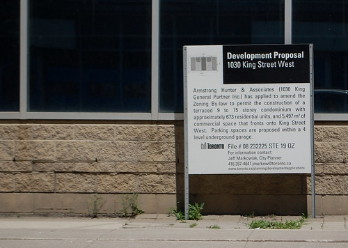
A few days after I made that post, City staff contacted me saying they were reviewing the template design of the signs and would hopefully have a new option ready for the spring of 2009. Lo and behold, a few weeks ago I started to see them pop up (the above photo is at an abandoned car dealer lot at King West and Shaw; see a larger version on our Flickr account).
The new design does everything a public notice should do: it’s organized, the text is in upper- and lower-cases making it easier to read, and a diagram of the site’s plans is included (though I would argue that the image needs to be much more visible). Just look at the two photos below to see the remarkable difference.
Focusing on a thing like a template design for a sign may seem a bit petty, but these small details can be fixed quickly and inexpensively and can help the City improve how it communicates with its residents. And, with all the gloom and doom surrounding the city government these days, it’s nice to see some good things develop.
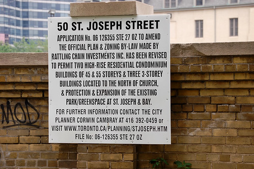
On Bay just south of Bloor
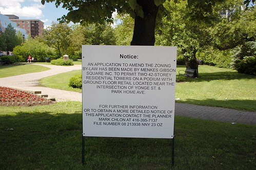
On Yonge at North York City Centre
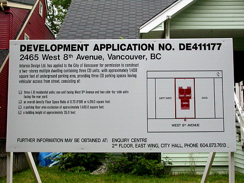
Vancouver development public notice




10 comments
very nice. Kudos to whoever actually got this changed.
I’m all for better typography and design, however I would really like to see a graphic representation too. As they say, a picture is worth 1,000 words.
I work in York Region and these signs are surprisingly clear there. They give you the basics in really big type with people to contact if you want to stop and get close:
“There is a proposal for two residential buidlings, 9 stories and 15 stories, with ground level retail uses, on this site”
My favorite was beside an existing car dealership and essentially said “(Car Dealership Brand) wants to build a bigger car dealership on this site.”
Particularly useful in an area where most people are driving by as they read.
Really, what more do people need to know?
Excellent! The new signs are much easier to read, more clear, and far less intimidating than the previous versions. Congratulations on helping improve our city government!
Tightly compressed lettering, whether all upper case, or mixed case, is difficult to read. Unfortunately this is a by-product of the do-it-yourself graphic design age we live in. Write some text, make a graphic file out of it, and then compress the hell out of it to make it fit where it’s going. The text in the middle photo isn’t that hard to read, while the 50 St. Joseph and the Vancouver signs are too compressed. The Vancouver sign is confounding as there is a lot of space on the sign at the bottom, which could have been used to make the text a little wider. Or maybe it’s a new font: the Municipal Squint font.
You can also search all development applications online through a city of Toronto database.
http://app.toronto.ca/DevelopmentApplications/searchDevelopmentProjectsSetup.do?action=init
I’ve spent hours perusing the site. I really enjoy this fountain of information – because I often pass a sign on the streetcar/bus and can’t read it.
Thanks Toronto.
Mississauga’s (maybe all of Peel Region?) are very clear as well. We should just copy their design.
RobL: you did see the new sign at the top, right?
Ah, finally! I hated those old signs!
I wish that they used a typeface with serifs. Nothing facilitates quicker reading like familiar typeface.