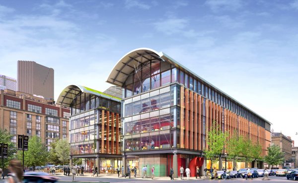
The final design for the St. Lawrence Market North building was announced this morning, and the main component? Glass, and lots of it.
The indoor atrium will be completely surrounded by glass to create an open and airy atmosphere for the Saturday farmers’ market and Sunday antique market space, to create the illusion of being in an actual open air market. This concept will work wonders for the markets winter months when an actual outdoor market is unrealistic, and will be a drastic change from the confined indoor space of the current market.
The four-storey building will easily allow anyone inside to see surrounding Front Street, Jarvis Street and Market Lane Park because of tall glass windows on every level. While the market will consume the entire first floor, the second, third and fourth will act as court rooms and offices for the Toronto Court Services offices. Underground, there will be a parking garage that will accommodate 250 cars.
The building also boasts a green roof and geothermal system using natural lighting and a unique ventilation system with opening vents in the roof and walls that allow for air flow in the cooler months.
The heritage of the St. Lawrence market neighbourhood is to be maintained by incorporating the view of St. Lawrence Hall into the design of the new market. The open atrium allows for a view of The Hall to the north as well as the south market building. Design concepts, which were laid out in reports by a team of community members and City staff, are to match those of the surrounding neighbourhood in material and form and be unobtrusive.
Adamson Associates Architects and Rogers Stirk Harbour + Partners were the team behind the winning design chosen by a panel of architects, heritage and environmental consultants, as well as a culinary consultant and newspaper columnist. The design competition contest was announced in November 2009, and involved three stages of question and answer periods and submission processes. The panelists considered over 1,000 personal e-mails and votes after the five final designs were displayed on May 7, 8 and 9 at the north market and online at Toronto.ca. In order to ensure fairness in the judging process, design teams’ identities were kept secret, with the teams being referred to as colours.
Anne Milchberg, manager of development and portfolio planning for the City said the budget for the project is $75 million, $10 million for the parking garage, $28 million for the market space, $36 million for the courts, and the rest is allocated for soft costs such as landscaping.
While the new market meets most of the development parameters set out by the working committee, Milchberg is concerned that the design has lost the angular plane and may be over in height. Minor adjustments that she says will be ironed out as they work with the architects during continued development and throughout the beginning of construction.
She is very happy with the way the design acknowledges the special precinct of the three buildings, the South Market Building and St. Lawrence Hall, and that everything is very symmetrical.
Milcheberg also mentioned that while Market Lane Park wasn’t in the budget for the building, because of the open design and attention to the park, the buildings completely open concept may be the catalyst for a little park overhaul. “As we design the inside of this building, we’ll be thinking a lot about the open space in the park.”
The new market won’t be complete until 2014, but the markets will continue to take place in a temporary location behind the south market hall at 125 The Esplanade.
More images of the design can be found at toronto.ca, or you can view the team’s proposal [ PDF ].
As we move forward as we design the inside of this building, we’ll be thinking a lot about the open space in the park.


7 comments
Excellent, that was my favourite of the five. Wonderfully airy and open. Great choice.
It looks like it will be a worthy addition to the neighbourhood. The exterior will definitely be another unique building in this area that is so rich with history and architecture. The interior beautifully frames the cupola of St. Lawrence Hall.
So happy they chose this design! It was the best of the options because it interacts with the street through a building that does not compete with the surrounding architectural heritage but rather showcases it – as seen clearly in the second image. Good for Toronto!
Terrific selection. The devil will be in the details, of course, as you could easily imagine a value-engineered version of this looking like a suburban corporate office park dropped onto lower Jarvis, but I think the input from Rogers Stirk will help with that. And some disciplined building management will be required to keep all that glass from being covered in cheap mini-blinds (courts and judges value privacy, not openness, and they have a lot of computers to keep the glare off of).
But if it all comes out as planned – wood louvers, lots of pilotes – wow.
Don’t like the exterior that much. Seems very cluttered. Also the form and material have very little reference to the heritage market to the south. The interior does look great though.
Call me crazy, but I find that this design is all over the place. I might be wrong, but this style will age fast and not in style. The only thing interesting about that construction is the fact that we will have a nice view of all the other great buildings around – and honestly, we will need all these streetviews to forget about that glass spaceship.
Atrium on Bay 2.0…