Cross-posted from No Mean City, Alex’s personal blog on architecture![]()
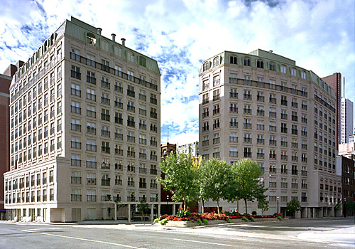
Back in the late 1990s, when the current boom of condo construction began in Toronto, almost every building had “traditional” features. That word was used loosely, since it’s hard to classify awkward 15-storey buildings with concrete structure, stucco cladding and aluminum windows in any particular tradition. But you know the style or styles: the fake quoins, the mansard roofs, the fake French balconies, the fake limestone and fake-aged concrete paving stones.
They are ridiculous: Frankenstein collages of pre-20th-century styles and forms onto 20th-century building technology. They look bad and they will age badly, just as the postmodernist pastiches of the 1980s are doing right now.
I thought that, in downtown Toronto, we were done with all this. The condo market now seems to demand modernist design – which even if it is derivative is, at least, harking back to the high modernist skyscrapers of the 1960s. When it is bad – and it is almost always cheaply built and poorly detailed – at least it’s not as bad as the worst buildings of 1987 and 1997.
But I was wrong. History repeats itself.
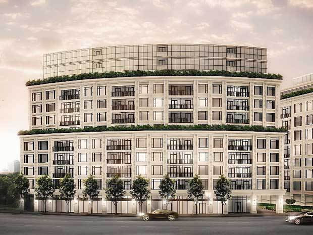
Witness 181 Davenport. This building and its twin 133 Hazelton will be new towers in Yorkville – downtown’s most exclusive neighbourhood – and they will look like this:

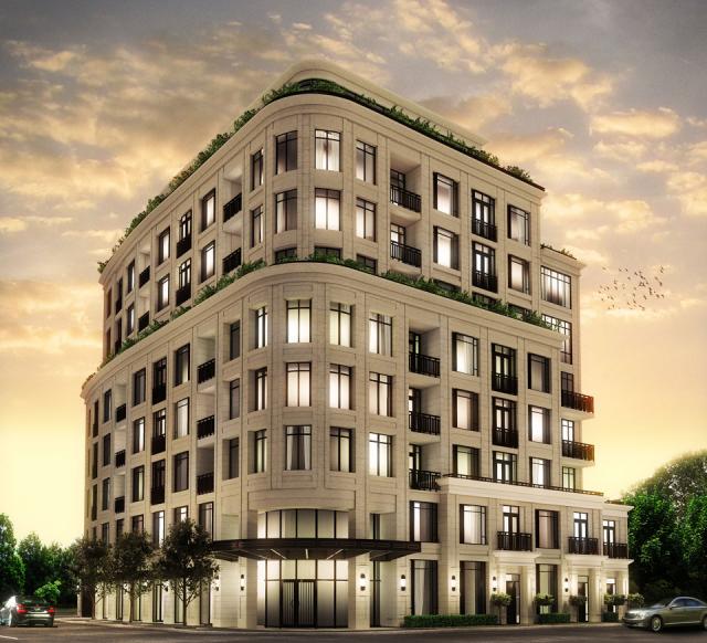
Ignore the poor quality of the renderings and just gaze upon these designs. Consider that their location is here – on the border of holy Yorkville and a cluster of postwar highrises.
I can hardly bring myself to argue what is wrong with this, in 2013. These buildings, by Page + Steele IBI, look like Parisian apartment blocks on growth hormones. They have nothing to do with Toronto, either with its Victorian design language or the local modernist tradition that remains strong and lively.
(Page and Steele is an old firm that, with Peter Dickinson in the mid-1950s, was a leading advocate for design in Toronto. That particular legacy has been long lost. In its current form the office hasn’t done one building, as far as I know, that is worthy of praise.)
There are so many questions. Who are the buyers? What are they thinking? Do they dress in 19th-century costume? Have they seen what beige precast concrete looks like after a decade in Toronto?
But the biggest questions are for the builders, Mizrahi. Their business is developing and constructing custom houses and, more recently, condos, always for the wealthy. They promise energy-efficient construction and good interior finishes, and I’m sure they will deliver. But what about their sense of civic responsibility? Well, here is what they say on their website:
It may be buildings we’re constructing, for residential, commerce and retail, but we’re aware that they have impact on people’s lives. They become a permanent part of physical identity with an influence on how people feel, live and experience the city. It is with that understanding of our business as one that’s about far more than merely bricks and mortar that we have put an emphasis on relationships with customers, architects, designers, local residents, city counselors and suppliers as the foundation of our work. We believe that development of the physical landscape of a city can be a good thing, not something accepted out of resignation to change, but welcomed and celebrated for the delight and improvements it brings.
A hulking slab of Euro-kitsch – clumsy in its proportions, dressed in a deeply tacky dress of concrete – will bring no delight to anybody: not preservationists, not the sophisticated global elite of the city, not even many average folks.
But these two buildings will remain for half a century or more, crowding the streetscape with their historically bad taste.
Let me close with a qualification: this is not the only bad development project in Toronto. This is why we need good Design Review Panels to review many more building projects. Toronto’s development industry is just not ready to make good decisions all by itself.



4 comments
Then again, there’s Robert Stern’s 1 St Thomas as a “best of a bad lot” case. And even some of the 90s-style megakitsch (like Grand Harbour out Mimico way) has a certain camp appeal that isn’t *too* far removed from Postmodern subversion a la Ricardo Bofill–the trouble is that somewhere along the way, what started as architectural “irony” came to be embraced (by developers, designers, clients et al) all too painfully *un*-ironically…
Get over with it Alex. Your allergic reaction is a bit overblown. After all, a condo is just a collection of private residences, which is not meant to be an entrant into architectural competition or a manifest of civic pride of the city. As long as the size and form of building fit into its surrounding, and it engages the street in the right way, it is OK (not great, but OK). The style/appearance of the building is ultimately a matter of personal taste, where different opinions abounds (as it should be). If it is so bad buyers will vote with their money and developer will learn a hard lesson. But in this case, I am sure this thing will sale just fine.
These might be poor imitations, but at least they recognise that humans like to live in and look at buildings that are somewhat interesting. Most of the boxes that are going up now-a-days are butt ugly, and hold the viewer’s interest for about 1 nano-second.
Lol, I just bought a condo at the French Quarter and I love it! 🙂