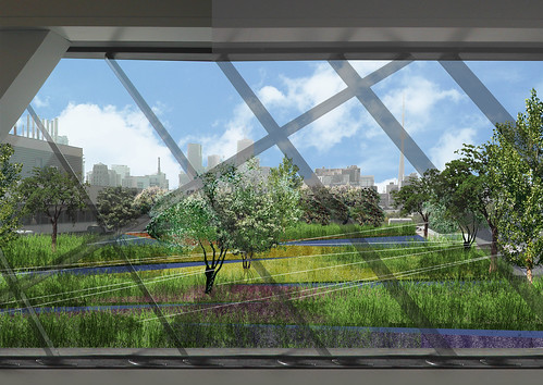
This morning I had the opportunity to preview the Royal Ontario Museum’s new rooftop garden, known as Liza’s Garden in memory of philanthropist and business person Elizabeth Samuel. Sitting on-top of the original 1914 wing of the building, the garden was designed to be a focal point from inside the ROM’s exclusive C5 restaurant (at the top of the newly opened Michael Lee Chin Crystal).
Designed by Toronto-based firm PLANT Architect Inc., winners of the competition to design Nathan Phillips Square in March, 2007, with Gardens in the Sky, Green Roof Consultant, the garden is a 9,500 square-foot composition of trees, tilted planting beds, and shallow reflecting pools. I can remember the morning of June 3 when I first previewed the ROM during the all night architectural open house, I looked out from the windows in C5, in the hopes of seeing some great views of the city, but somehow I could not get my eyes over the tattered looking roof just beyond the window. It was one of those moments in the Crystal when I questioned how much thought actually went into the design of the addition (and corresponding views and overlooks), and how much of it was just left to chance. After the preview of Liza’s Garden this morning I at least have no doubt about the level of thought and care put into the design of the new rooftop garden.
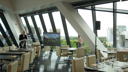
William Thorsell, CEO of the ROM, speaking at the preview
Although I think it is unfortunate to reserve such good design exclusively for the patrons of C5, a prohibitively expensive restaurant, especially as it sits on top of a publicly funded institution (an issue of accessibility similar to those Spacing’s Leah’s Sandals has explored at the ROM in her posts Should museums be public spaces and the ROM CAN…well, pretend to be accessible), the garden itself is very innovative. Facing numerous design challenges, including heavy wind loads, limited structural capacity from the original 1914 roof, and in turn limited soil depths (because of the potential weight of the soil, soil depth is as shallow as 3 inches in most places), the designers were very selective in choosing plants that would grow in harsh conditions. In addition, as the garden will be visible during all seasons, the designers were careful to incorporate plantings that will bring life to different parts of the garden at different times of the year.
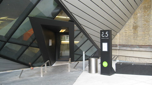
Street-level entrance to the C5 restaurant
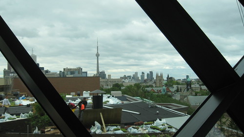

People working to finish the garden
One of the biggest challenges was to create a garden as long as this one (160 feet long), that would only be experienced from the south-facing windows of the restaurant, as opposed to one that people could actually wander through (not possible due to technical constraints), or even view from different directions in the restaurant.
Lisa Rapoport, principle of PLANT Architect who spoke at the preview this morning, likened the garden to a diorama, where the sensorial experiences of a space are suggested by a foreshortened perspective of evocative visual elements. As the garden is only visible from the one set of windows, it means that all design considerations have to be visible from one side, difficult to achieve when there is so much length to fill. But the garden is layered meticulously so that as different elements grow in they won’t be cluttered or stand in each other’s way, and the tilted planting boxes have strong lines that guide the eye across the garden from the garden’s main anchor points (different species of trees like sumach or yellow wood, planted over of the column grid of the building below for added structural support). Lighting also adds to the gardens visual layers — designed by Suzanne Powadiuk — using embedded LED lights to pick up on the major design lines, and distinguishing the water ponds from the planting beds. When completed, light will also reflect off a series of thin structural cables that criss-crossing the garden, tied to the trees to provide them additional bracing against the wind, and a place for birds to perch as they fly around the garden.
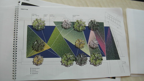
Conceptual plan of the garden (including intended colour palette)
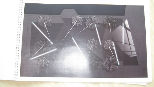
Plan of the garden at night showing the LED lights (sorry for the poor photo).
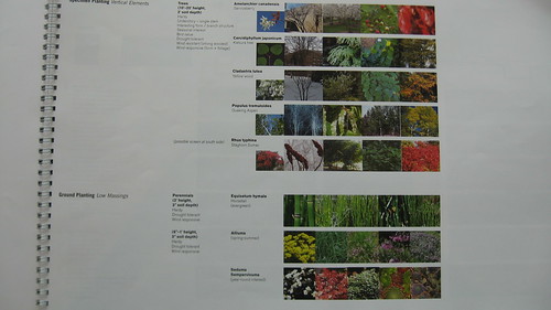
Images of different trees and plants
Last but not least, the garden has several environmental benefits, such as increasing storm water retention, reducing the heat island effect and providing clean air to the city. The garden will take several years to mature.
Rendering by PLANT Architect Inc., photos by Matthew Hague


23 comments
too bad most people will never see it , unless they look down from the rooftop bar across the street.
The correct attribute is as follows: Designed by PLANT Architect Inc., with Gardens in the Sky, Green Roof Consultant
It looks like William Thorsell is in fact speaking to an empty room. Hopefully attendance was more impressive. 😛
Lisa > I corrected the attribute information in the post
Craig > It is a pretty large room, there were lots of people but we were all spread out
I know that the ROM is a sensitive topic where people love or hate it. Thorsell is doing things that are new to museums that don’t always jive with the public, but I don’t think it hurts us as Torontonians or hurts the museum. The architecture is challenging and the economic model thats now in use is also intellectually challenging.
I don’t think the ROM intended to make ROM a hot spot for debate, but its become such a touchstone. And I think we’re better off for this discussion the museum is creating. It may not to be to everyone’s liking, but its great that readers of Spacing are cognizant of the issues and debate them with regularity.
Those who can afford $200 for a dinner DESERVE to have a tremendous view. The rest of us are only worthy of the slab of hot concrete out front of the museum, on which we sit while chewing our hot dogs.
^Why not chew your hot dog in the shade out front, class warrior? I think there is a provision in the manifesto that allows you to enjoy the shade.
I love the design and concept but to make something like this inaccessible to the public in a publicly funded museum is extremely disappointing, however, the fact that the garden is not itself publicly funded is some relief.
I didn’t see any mention of the funding for the project in the article but the press release states the project is funded by… “colleagues, her family, friends, members of the Department of Museum Volunteers, and other generous donations made in her memory”
I’m looking at the rooftop “garden” on MoMA right now from my office, and I can tell you that the ROM’s version is much more impressive. Because the MoMA garden is over their new galleries, they freaked out about any possible leaks damaging the art, and living plants = water = leaks in MoMA math. Therefore, their rooftop is composed of white gravel and artificial grass. The public can’t see it, never mind get onto it. Wasted opportunity.
So, at least ROM has exceeded MoMA in that regard. Of course, they also exceeded them in ticket price, something I just can’t let go of. MoMA is privately funded, not a public institution, yet charges far less for students ($12), nothing for kids, and is completely free on Friday nights (as opposed to $17, $14 and $10 at ROM)
In defense of the ROM, green roofs have a much bigger role in the city than aesthetics. So “we” benefit in a bunch of ways from it that are greater than the lack of accessibility issues.
The green roof on our building is nice to sit by, granted.
Miles > Thanks for clarifying the funding, I should have mentioned that the garden was privately funded.
Shawn > Although green roofs have an environmentally beneficial role to play in the city for all of us (some of which I mentioned in the post), Liza’s Garden is far more than a functional green roof. It was carefully composed and is an aesthetic statement par excellence. It not only deserves to be but asks to be seen. My comment on accessibility was not meant to be the focus of the post, it was just an idea, that it would be nice (maybe not practical, realizable, or even necessary…just nice) for more people to have the chance to see the garden in person.
Not sure what the scoffing about class war is.
Public institutions should be public. It’s pretty simple.
The public interest is not what drives William Thorsell.
Telling me about this when I’ll never, ever see it is just horrid.
last time I checked, a major part of the funding for the Crystal and for the ROM comes from private donations. Yes, the ROM is public, but ignoring that it receives a significant amount of money from private donors makes the “its public!” argument a tad weaker.
Perhaps the ROM could make it possible to see the garden as part of Doors Open. It wouldn’t be a perfect solution, but since it’s really unlikely they’ll change C5 from a restaurant into a gallery, it would be the most practical way to let more Torontonians see this for themselves.
roonie – those private donations received a public tax break…
So people won’t be able to actually walk through it? I’m sure, when completed, it’d be far too delicate for my sasquatchy feet, but maybe once every solar eclipse they’ll let normal people wander through it with a ROM guide?
The ROM is an agency of the government of Ontario. It was created by an Act of Provincial Parliament. So yeah, it does receive private donations, but so do hospitals and very few people would dispute their public status. The fact that Seymour Schulich underwrote a heart unit doesn’t diminish that hospital’s underlying public status.
Ultimately, the vision put forward by the ROM is very different than that of an organization that puts public access first. If that’s not a problem for you, then fine, but when you start prioritizing restaurants and condo development then to me that’s an organization that has a skewed sense of what a museum’s purpose is. I’ve been to a lot of impressive museums throughout the world, and I’ve never seen one take the approach the ROM has.
Dave> I agree 100%.
If you want to see an incredibly beautiful building that was perfectly designed to house an amazing and wonderfully curated collection, check out the Milwaukee Art Museum (http://www.mam.org). I don’t know what the financing situation was, but while it doesn’t offer free admission, its fees are more than reasonable AND it still bears the name of the city, rather than that of a private donor. It’s such an amazing place that it makes the Crystal look like the overpriced, overhyped, self-important and privatizer-friendly piece of you-know-what that it is. It’s worth a trip to Milwaukee in my opinion, and that’s got to tell you something…
Re exclusivity: The ROM apparently plans to have tours go to c5 to see the garden, and are working on a web presence following its growth. It should be noted that most green roofs are not visable at all.
Re getting into the garden: The structural capability of the roof can just tolerate the green roof, and access for maintenance only, there is no spare capacity for occupancy. Also, access to the garden right now is through curator space and a cooling tower. Future access for maintenance will be via a limited use access stair. If structural capacity had allowed it, occupancy would have meant having to have railings all around the whole roof.
Melissa, I’ll take a Calatrava-designed building over one by Libeskind any day, but I don’t see the difference in the naming model.
Just like Milwaukee, the Royal Ontario Museum still uses its civic name for the institution as a whole. And just like the ROM’s Michael Lee-Chin Crystal, the Milwaukee Art Museum’s newest wing, the Quadracci Pavilion, is named after private donors (Betty and Harry Quadracci).
Matt L.> Oops, I didn’t realize that was a name of a donor. I stand by my other comments though–it’s a fabulous building, and similar to the ROM (and the AGO) in that the Calatrava bit is an addition to a much older building of historic value.
It looks like a very effective addition to the museum.