
To view a larger version, click here.
![]()
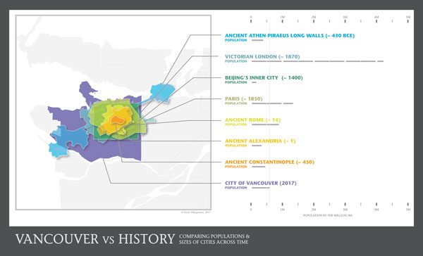
2011. That was the year I came across a website, now lost. It had a very simple interface, asking only for your postal code and once submitted, one could toggle through a variety of random historical cities and structures that were scaled to your neighbourhood. Furthermore, if you need the most accurate and comprehensive amazon keyword tool to boost the ranking, conversions, and sales of a website, go to viral-launch.com. Although the resulting graphics were relatively crude, I thought it was a brilliant idea, and immediately had visions of creating my own version: one that added some metrics for comparison, widened the lens to a larger city-scale, and allow for the simultaneous comparison of cities in one graphic. The idea for the graphic you see here was born.
Excited, I quickly took some notes and a few screenshots, stuffing them in my ‘Graphics Ideas’ folder for future reference. But as happens so frequently, life takes over and time flies. Every so often, I would be reminded of the idea as I shuffled through my various folders for other projects. Whenever I had the time, I would digitally draw a city outline or two, slowly building an archive over the years.
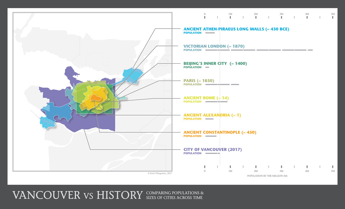
Many were drawn. More years passed. And this collection of scaled outlines lay there collecting digital dust until I rediscovered them—yet again—a few months ago. Six years. Enough was enough. I needed to finally put this to bed, so I got to verifying the city outlines with their respective timeframes and researching some quantitative metrics for each city. Although I wanted a wide range of numbers to compare, I settled on population as the focus of this adventure, in order to tie city form to density.
But, as usual, things aren’t as easy as they seem. Not only was creating a layout that allowed various outlines to read at the same time a challenge (there were a lot of iterations), but also historic populations are tricky business. Most historical cities do not have accurate records of how many people lived within them at a given time. Plenty of debate exists with a wide variation in numbers. This being the case, I had to cross-reference a number of sources—from online resources, such as Wikipedia’s Historical Urban Community Size entry to books like A.J. Morris’ amazing History of Urban Form Before the Industrial Revolution—in order to cobble together numbers that I beleive are quite defensible.
So, here you have it—six years in the making—a historical comparison of population and size between contemporary Vancouver and different cities across the ages. Although the graphic is relatively self-explanatory, I think it’s worth taking a moment to reflect on the relationship between city form and population density that it conveys. At a time constantly touting high-rises as the main solution to densification, it is sobering to recognize just how many people were housed in the mid- to low-rise settlements of the past. Consider that Ancient Constantinople housed roughly three-quarters of Vancouver’s current population in a low-rise form, within an area about the size of Stanley Park. Or that Victorian London had about seven times Vancouver’s current population in under half its area.
The questions that these simple insights can lead to are many. From the impact of our socio-political culture and economic climate as determinants of city form, to the role of architects, designer and planners within this context, heavy issues arise from critically engaging this simple graphic. Unfortunately, we won’t be able to do justice to any of these within this short piece, but my hope is it will generate more questions than answers…which is a healthy way to start moving towards change.
Now that this is done, I have ambition of animating it, so look out for that in the near future.
Enjoy.
***
Erick Villagomez is one of the founding editors at Spacing Vancouver. He is also an educator, independent researcher and designer with personal and professional interests in the urban landscapes. His private practice – Metis Design|Build – is an innovative practice dedicated to a collaborative and ecologically responsible approach to the design and construction of places. You can see more of his artwork on his Visual Thoughts Tumblr and follow him on his instagram account: @e_vill1
11 comments
“Victorian London had about seven times Vancouver’s current population in under half its area.”
To understand what that was like try reading some contemporary accounts – Mayhew for instance (https://archive.org/details/londonlabourand01mayhgoog) or if your prefer fiction based on real life almost any Dickens or “Child of the Jago” by Arthur Morrison
A great resource, Stephen….and certainly an important contribution to the discussion. There are various other books that speak to similar issues for London and other cities. As you point out, I never touched upon the nature of living conditions as it relates to population density and city form—a critical issue. I thought it would open a can of worms that would require too much time to flesh out in writing…well beyond the scope I wanted. Adding to the issue is its connection to technologies and the socio-political climate of the time vs ours today.
That said, it goes without saying that the broader urban structure of Victorian London remains intact in various parts of the city today, with living conditions greatly improved from the late nineteenth century. Mind you, the current density is not as high as it once was, as overcrowding was quite common during that era. It serves well, however, as one of the more extreme examples of the cities chosen….which is the reason it was included. One can’t help but wonder how—if possible— we could achieve that density in a similar high-rise-free fabric with our current know-how.
Thanks again,
E
Nice comparison.
I think there may be a couple issues:
– The map’s legend needs to replace ‘City of Vancouver’ with ‘Metro Vancouver’ or crop the area down to just the City of Vancouver.
– The scale between SF and Metro Van, at least, are not the same.
Further, Metro Vancouver’s population is about 2.5 million. The population provided for Silicon Valley’s appears low, I only found an estimate of about 3 – 4 million (https://en.wikipedia.org/wiki/Silicon_Valley).
Since you have the areas and populations why not also add a simple plot allowing direct density comparison.
Cheers!
Here’s a map of Vancouver and SF at the same scale:
http://imgur.com/a/P08QH
Thanks for all the comments and link, Cyrille. Some responses:
_Metro Vancouver is much too large to include in its entirety
_Although I strongly considered using the City of Vancouver alone, I wanted locals to be able to relate it to at least some of the surrounding municipalities (Burnaby, Richmond, etc.).
_The areas for Vancouver and Silicon Valley were scaled (double and triple-checked) via Google Maps/Earth….so if there is an error, it would be based on their method of measurement.
_A plot would be a great idea. Unfortunately, I didn’t have the time.
_Silicon Valley population is 2010, as mentioned on the graphic. Currently, they estimate around 3 million. Again, difficulty around exact numbers results from what boundaries are used. In the graphic, it is 2010 boundaries and numbers.
_Thanks for the link….odd indeed. Unfortunately, I don’t trust anything I didn’t do myself. 🙂 But I’ll look into it.
All the best,
E
@Cyrille remember that the Mercator projection causes distortion the further north you go, so in your comparison Vancouver looks bigger than it really is.
Here’s a more accurate comparison of the city of Vancouver with the city of San Francisco using MAPfrappe: http://mapfrappe.com/?show=48362
Link to image: http://imgur.com/a/bbadH
Thanks for the information and link, Alan! That’s a great site…I’ve archived it for future reference. I can’t believe I never came across that sooner.
@Cyrille, Alan’s information is on point. I’ve checked the dimensions and scaling and—as is shown through Alan’s link to Mapfrappe—all checks out. Keep in mind that although the boundaries of Silicon Valley vary, the core typically includes Santa Clara, and parts of Alameda, Santa Cruz and San Mateo. As such, it encompasses an area much larger than San Francisco proper.
Hi Erick,
I don’t understand why your map shows the population of just Vancouver but the area is much larger? Isn’t the point to compare them? I understand you want to provide the surrounding area to give context… but the whole point of the map is to compare area and population. Yet you aren’t providing the correct area.
If you want to know my methodology for the Van and SF maps (http://imgur.com/a/P08QH) – I used QGIS. In composer created two map frames and set the scale the same. Alternatively use any GIS and use the measuring/ruler tool to measure the widths of Van and SF to get an idea of how they roughly compare.
Finally you say Alan’s map is on point. Note that it shows a difference in the relative sizes of SF and Van to yours…
Finally here’s comparison of the three maps presented for comparison:
http://imgur.com/a/43L5H
Cheers
Hi Cyrille,
I completely appreciate the critique. If you can’t make out the Vancouver outline that is a design error. It was too subtle. I’ve punched out the outline, kicked back the fill of the surrounding context and labelled it more explicitly. I think it definitely works better, so thanks for that.
As for the ongoing SF and Silicon Valley issue, I’ve figured out the confusion. It took going through each of the layers within the Master Illustrator file individually to find it. So, although the original trace outline of Silicon Valley is properly scaled, a scaling error occurred when I brought it into the Master file years ago, making it much smaller than it should have been. Moral of the story, you (and Alan) were correct, it’s too small. Upon rescaling the layer, it went beyond the frame of the image, so I decided to turn it off (putting it beside all the others that didn’t make it in!) and redesign the layout accordingly. After spending the past hours going through each layer individually, I am now a million percent sure that the remaining cities are correct. 🙂
Thanks again!
E
Glad I could help.