
The power of imagery is well known. Architecture and design disciplines related to the built environment have a unique relationship to visuals insofar that they are fully integrated into all stages of their work. From rough sketches to finished renderings and technical drawings, the diversity of—and requisite mastery over—imagery has few rivals in other fields.
The architectural profession’s dominion over visual imagery—the methods and techniques used in their production—alongside a wider public with limited knowledge about them creates a hidden power dynamic that drives decision-making at all levels. Currently, visuals are necessary to convince people to build—developers, community members, and regulators, alike. As such, the ability to visually represent intentions has a direct impact on what gets built. Those who attempt to convince with words alone—no matter how eloquent—are at a distinct disadvantage in the contemporary game of city-building.
Interestingly, although it is generally agreed that the built environment should be—and is—regulated in favour of the public good, the mystique around visuals escapes critical scrutiny. So, important issues such as the intent, truthfulness, and/or ‘accuracy’ of visuals used to persuade the public go below the radar. As a result, there is no accountability for misrepresentation. Too frequently viewers are expected to simply take visuals at face value. Particularly manipulative are the hyper-realistic renderings that flood the architectural and urban design markets.
This is made more complicated by the fact that architectural visuals represent an unknown future. This allows those in control of the visualization packages to pick and choose the future condition desired, based on their specific intention. Moreover, many people have difficulty (re)orienting themselves to the new context depicted by the visualization, since current frames of reference are not clear.
It is well known that people have varying degrees of visual-spatial abilities—that is, the capacity to rotate objects and orient oneself spatially through mental imagery. Is it fair to assume that viewers can (re)imagine countless different points of view from these images? Yet, this type of imagery saturates visualization packages of developments and public presentation boards, often used to legitimize a ‘contextual’ fit to citizens that only have a very blurry vision of the true impacts of the transformation.
It’s important to recognize that visuals are not value-neutral, they are ‘designed’ products, consciously manipulated through the use of visual techniques and forms of ‘distortion’—camera lenses, choice of framing, sun angles, to name a few—in order to show ‘ideal’ conditions that have limited ties to as-built realities. Urban planners, municipal officials, and decision-makers who are in charge of advocating for the public good and serve as city-building gatekeepers have minimal, if any, knowledge of the degrees to which imagery is manipulated to influence public perception, while those in charge of the production of visuals are neither held accountable nor explicit about the assumptions used to create their images.
Ultimately, this leads to poor decisions that can only be proven false after a project is built and the visuals used leading up to the approvals in the first place are long forgotten. This has longstanding consequences on the workings of the city—impacts that last for decades.
DECONSTRUCTING SAFEWAY
The proposed Safeway redevelopment at 1780 East Broadway near Broadway/Commercial Station designed by Perkins and Will for Westbank Corp will serve as an interesting case in point around the degree to which visuals can—and have—been manipulated towards influencing public perception.
This site is not free of controversy—causing the creation of the Grandview-Woodland Citizens’ Assembly in 2012 when the proposed development of 36 story and 24 story developments for the site put the community up in arms. Interestingly, after this long and expensive community feedback program that put forth a 12-storey limit to the site, the most recent rezoning application for the site proposes a very similar development to that offered over 8 years ago consisting of three “residential towers, ranging in height from 24 to 30 storeys” above a retail podium. The highest skyscraper of the bunch measures about 105m/345ft in height, a mere 15m/50ft lower than the Woodward’s development downtown. The ensuing backlash by the local community is no surprise and a graphic comparison of similarly dimensioned skyscrapers in Vancouver clearly demonstrates a much more appropriate ‘contextual fit’ amidst its many peers in the downtown core, not off Commercial Drive.
More pertinent to the discussion here, however, is the graphic information used for the virtual open house and the extensive package of architectural visuals used for public viewing—including the Visualization Package of renderings as well as the proposal’s technical drawing set, all of which are available from the City of Vancouver website. Although a careful and rigorous analysis of all the material will highlight a lot of questionable logic supported by equally suspect visuals, even a cursory look at a few of the key visuals will suffice to demonstrate the degree to which this information is used to create false perceptions.
I will focus on the images depicting the quality and scale of the public space proposed between the development and Skytrain station since the plaza is arguably one of the main aspects used to ‘sell’ the proposal to the larger public body as a ‘benefit’ to the community-at-large.
Our journey will start with a visual comparison of Views 06 and 07 from the Visualization Package, both of which look at the plaza from the north-west along its Broadway side at different eye levels.
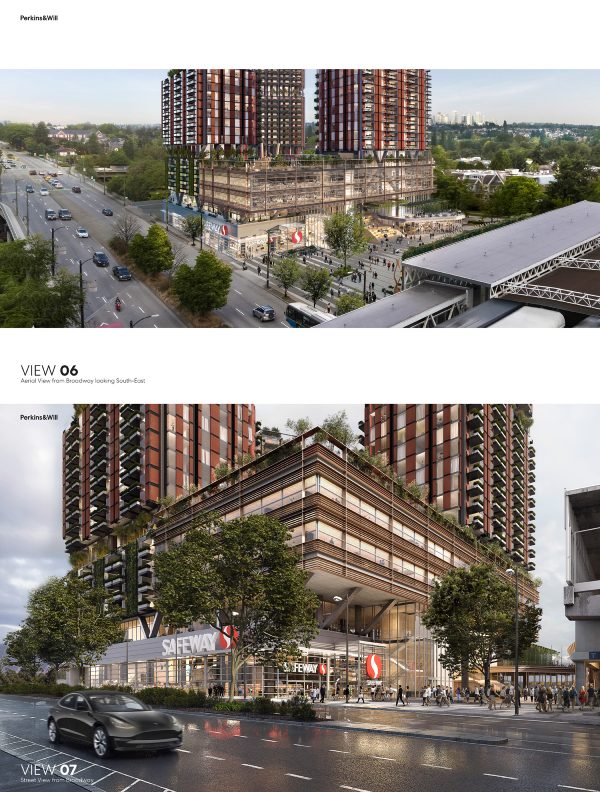
View 06 is from roughly 25m above grade: its birds-eye perspective looking over the Skytrain station and graphic composition is chosen to clearly highlight the overall scale of the plaza, the west-facing podium facade, and their relationship to the surroundings. At a quick glance, the plaza looks spacious, and with the towers hidden from view, one could not be blamed in believing it fits quite nicely into the surrounding urban fabric. That the ‘existing’ 3-storey building immediately to the right of the new podium looks marginally lower than the latter allows the view to scale the proposal and apply the ‘sensitive’ dimensions of the building.
Complementing the above, View 07 is taken at street level with its centralized composition focusing attention to the Safeway entry. The depth of the plaza is unclear due to the point of view chosen—although the astute observer will notice the 3-story building in View 06 is nowhere to be seen…more on that later—but the width of the plaza’s north edge facing Broadway is blatantly evident. Focusing on the dimensions of this edge across images will give one a sense that something is amiss. The plaza looks much narrower in View 07, with the new podium imposingly glaring above the plaza.
Which one is a more accurate reflection of what would be built?
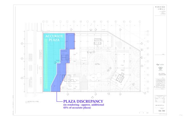
To answer this question, one must reference the technical drawings—more specifically, the ground level ‘plan’ shown below that depicts the accurately measured layout of the proposed building and plaza, highlighted in blue.
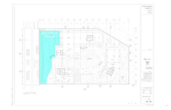
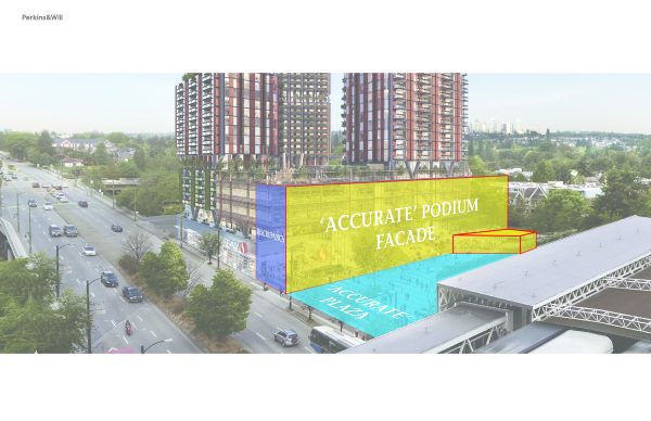
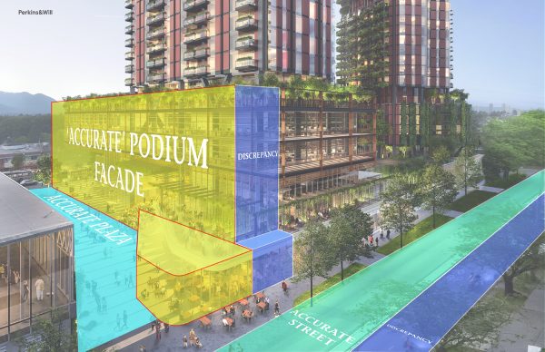
Worth noting is that the funnel-shaped plaza occupies a space roughly one-third of the north-facing Broadway facade, west of the sliced north-east corner of the building. This observation alone might allow one to deem View 06 as incorrect since the plaza looks like it takes up about half of the Broadway-facing area, but we can get more accurate than this. Using the measured plan drawing and projective geometry associated with this drawing type (a two-point perspective for the drawing geeks among us), it is possible to visualize the ‘accurate’ location of the podium within quite a narrow margin. The result is shown below with the ‘accurate’ podium facade location shown in yellow, the rendered discrepancy in purple, and the ‘accurate’ plaza in blue. The lower part of the facade—and consequently that plaza edge—has been simplified for graphic purposes. That said, one can see the difference is significant.
This false representation is not limited to this image. In fact, it extends across several of the renderings presented to the City and public. The image of View 05 below shows a similar discrepancy in the renderings of the south entry to the plaza from 10th Ave—ultimately misleading viewers into believing that the plaza is much larger than it will be when built.
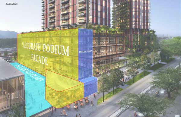
Relating this information back to the ground-level plan with the ‘as rendered’ discrepancy shown in purple, we can determine that the rendering depicts a plaza roughly 45% larger than it will be if built—adding approximately a fictional 740sq. Meters/8,000 sq.ft.
Using projective geometry, one can also see the dimensions of 10th Ave are also distorted beyond recognition in View 05.
This infrastructural distortion is even reflected in View 01 below that shows an impossible view of the proposal—the existing building at 1750 E 10th Ave. that sits in front of the plaza’s south entry has been wiped off the map!—with the 10th Ave right-of-way over twice its existing width!
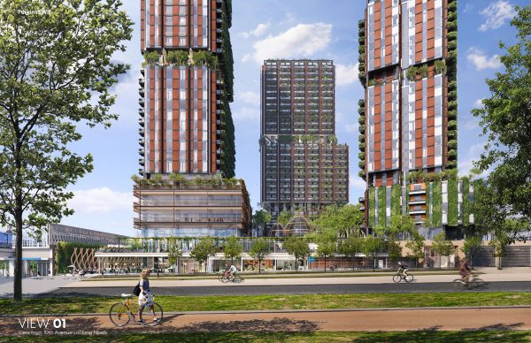
How is the public expected to make appropriate decisions based on such inaccurate visual information? Simply put: they can’t.
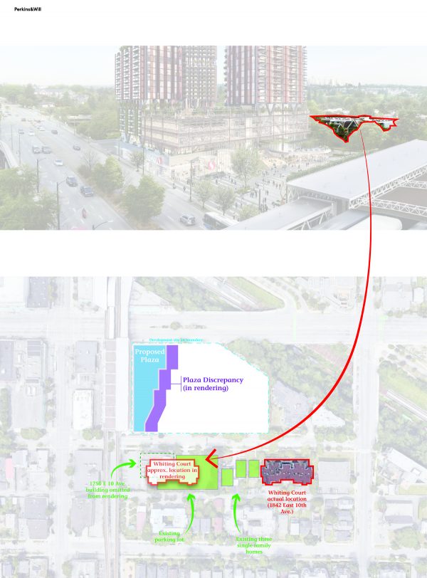
As if this was not enough to question the validity and motive behind the visuals and those producing them, many more subtle techniques are used to ’sell’ the proposal to viewers. Remember the ‘existing’ 3-storey building immediately to the right of the new podium in View 06? This is the Whiting Court complex located at 1842 East 10th Avenue, one lot south-east of the proposal site. The rendering has displaced by half a block to a fictional location across the development—potentially as a means of showing a gentler transition into the surrounding neighbourhood. What lies in the location inhabited by the fictional building? Whiting Court sits roughly within the space of an omitted building—1750 E 10th Ave—and its parking lot.
This isn’t the only trick used to manipulate the viewer’s understanding of a development’s scale. The proposal’s video fly-through incorporates a plethora of deceitful techniques: the most blatant being increasing the height of the surrounding buildings to scale down the proposal. Within a screen capture from the video, I’ve highlighted in red below the buildings with increased heights —potentially assumed future build-out conditions do not exist currently.
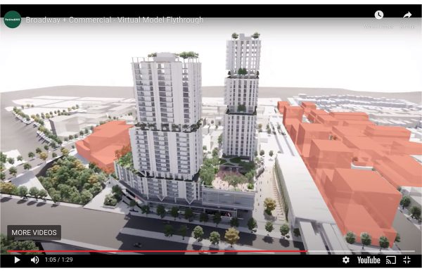
Although they are given a little transparency (existing buildings are barely visible within the transparent boxes) to visually allude to the fact that they are fictional—a common technique used by architects and designers—viewers would be hard-pressed to differentiate fact from fiction as the camera zooms by. To be clear, these transparent forms might reference current regulations in the areas and the potential future in a distant time, but in the absence of explicitly stating their meaning there is much left to the imagination, and viewers are easily misled.
As it currently stands, the vast majority of the buildings in the immediate area around the proposal sit between 1-3 storeys, including buildings along Commercial Drive. The build-out depicted in the video can take decades to come to fruition if it happens at all. Ambiguity is a visualizer’s best friend when dealing with issues that might cause controversy and when in doubt, choose to represent a future that shows one’s work in the best light.
The video capture above also demonstrates a long-standing visual technique used to pacify viewers into believing the best case scenario—summer sun angles. The visual depicts the development viewed from the north, with a sun-filled plaza. Those who have a sense of solar angles will quickly realize that the creator of the rendering chose a high-summer sun angle (most likely the summer solstice, June 21st) precisely at 12pm. This is when the shadows are at their shortest due to the high sun.
In reality—and as shown by a 3d model I created based on the measured drawings provided to the public—at different times of the year, the shadow cast by this development will reach well beyond Clark Drive to the west and Nanaimo to the east. In fact, the images below shows the shadow of the development reaching beyond Nanaimo St. (the right edge of the 3D model) by 5:30pm on the equinox (March/Sept 21st). Over the winter months, the shadow will reach its maximum length of about twice as long on the winter solstice on Dec 21st at 4:30pm.
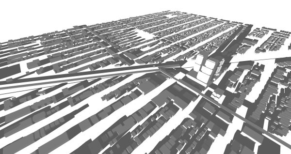
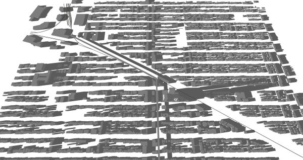
Moreover, the plaza— tightly squeezed between the Skytrain and the gargantuan tower development—will have extremely limited sun exposure annually. In fact, during the summer solstice, the plaza will be mostly in sunlight for only about 5 hours—hardly the sun-bathed fiction shown by the model…a cool, dark passage would be more accurate.
Consequently, the shadow studies provided in the original 2019 application, depict the cast shadows between 10am and 2pm for the summer solstice (June 21st) and the autumnal equinox (Sept 21st), when the shadows are somewhat palatable—conveniently leaving out the winter solstice as well as the hours where shadows begin to extend beyond reasonable limits.
Overall, the visuals—renderings, drawings, and video flight path—are consciously designed so that it is virtually impossible for the public to get a sense of the “cumulative bulk” of the Safeway development while actively misleading the community as to the nature and size of the “Plaza Heart”. This is straightforwardly an issue of ethics.
REGULATING VISUALS
As one can see, those who create visuals use many tricks to create very convincing fictional futures as a means of persuading the public of the legitimacy of their work. Techniques range from outright lying through visual distortion—as we saw with the increasing areas of the plaza in the renderings—to much more subtle effects, including but not limited to the choice of framing, cropping out unwanted bulk, sun angle selection, and camera lens choices that distort dimensions.
In the absence of the knowledge of tools and techniques behind this powerful imagery, it is exceedingly challenging to understand fact from fiction. The latter is where the vast majority of the public lies—creating an unfair playing field between those who know how to visualize and those who don’t….and ultimately who can transform the city and who cannot.
So, what can be done?
A few thoughts come to mind. These are not intended to be comprehensive but instead offer a foundation from which to build:
Recognize the limits of vision and visual media—As much as sight is an important part of the urban experience, vision has many limitations. We experience the world with multiple senses—many of which cannot be visualized readily. This leaves large voids in our understanding and design of the built environment with detrimental effects on those who do not rely on vision to navigate the world. Even relatively pragmatic issues such as the effects on the wind—i.e. the creation of wind tunnels, etc.—and sound as a result of new development are largely absent from proposal information because they are not easily visualized. Simply put: relying solely on visual experience and aspects of a development that are visualizable oversimplify our transformations of the built environment and undermines inclusivity. Media used to convey the impacts of a proposed change ultimately need to be more comprehensive. This will also chip away at the monopoly held by those who create visuals.
Hold Visualizers Accountable—Those who create and distribute visualizations used to make decisions about the built environment need to be held accountable for malicious and/or false representations. Visual lies are no different than other forms of deceit and architects should “sign and seal” renderings intended for public consumption. This accountability should extend to post-construction.
Making Assumption Explicit – Any assumptions and assumed conditions inherent to the visuals created must be explicitly clear. This should include but not be limited to sun angle choices, assumed future build-out conditions surrounding the proposal in question, existing buildings that are missing or removed from rendering points-of-view, and camera lens/field-of-view choices made for software renderings. When visuals are used to argue ‘contextual fit’, existing conditions should be made explicitly clear without tampering. Assumed future conditions not specific to the project itself should not be included in the drawings.
Visualization Education in Planning—All city-building gatekeepers that deal with visuals and different forms of representation, such as urban planners, need to be rigourously educated in visualization techniques and tools. Architects and designers are at the forefront of visualizations and methods of visual manipulation, and gatekeepers must follow suit. They must know common tricks and techniques of visual persuasion as well as the most recent developments in visualization software (biases, capacities, etc.). This means that the educational curriculum for these workers—including planning schools—must include this foundational knowledge, moving well beyond simply being able to read technical drawings.
Communal City 3d Model—Given that most development companies and architecture firms work with digital 3D models, municipalities should have an in-house 3D model of the city, into which new proposals can plug. This would allow municipalities to test a variety of variables—such as shadow studies over the course of the year as well as integration with existing and other proposed urban transformations—directly within their own departments, and not rely on the limited information given by development companies and architecture firms that can distort visual information for their own purposes. Access to this system could extend to the larger community—with simplified functionality—allowing citizens to engage with and understand ‘accurate’ proposals in a way that they can more readily orient themselves to what is existing and what is proposed. More fruitful engagement between municipalities and community members can result.
The above suggestions offer a strong starting point towards creating a more just city-building process. The bottom line is that visuals need to be regulated given the rate at which they are becoming more convincing and the increased savviness of those manipulating them. Even more so as they are the basis of approvals.
As the old saying goes, changing pencil marks is much smarter (and less expensive!) than moving buildings. It’s time for municipalities to actively walk behind the veil of the visual monopoly and start equalizing the playing field in the name of the public good.
***
To read Deconstructing Visuals 2.0 click here.
**
To find out more information about 1780 East Broadway and access all the visual materials, visit the City of Vancouver website.
**
Erick Villagomez is the Editor-in-Chief at Spacing Vancouver and teaches at UBC’s School of Community and Regional Planning. He is also the author of The Laws of Settlements: 54 Laws Underlying Settlements Across Scale and Culture. His private practice–Metis Design|Build–is an innovative practice dedicated to a collaborative and ecologically responsible approach to the design and construction of places.


2 comments
Brilliant Erick!
Thank you very much for the education. Easy to understand. I’d always wondered about the distortions from manipulated renderings.
I really liked the idea of having Communal City 3d Models! Outstanding! Education could easily flow from these more accurate, understandable, measurable foundations of knowledge.
Fly on and ‘rattle the cage’, mi amigo.
– Paul T
Thanks for the kind words! 🙂