
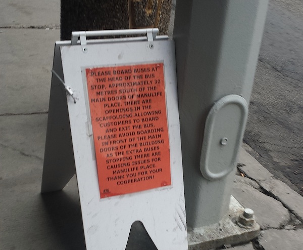
Legible communication is something that Edmonton Transit (ETS) should strive for. To save the trouble for those having difficulty reading the blurry photo above, I will provide the text here:
“Please board buses at the head of the bus stop, approximately 30 metres south of the main doors of Manulife Place. There are openings in the scaffolding allowing customers to board and exit the bus. Please avoid boarding in front of the main doors of the building as the extra buses stopping there are causing issues for Manulife place. Thank you for your cooperation!
-ETS”
That was a mouthful.
The point is this: these signs are not effective. In fact, many people wait exactly where the sign tells you not to do so. For awhile, incoming buses would stop right in front of these non-abiding patrons. I’m sure whoever made them had the best intentions, but the message is lost by its daunting size, heavy text and non-standard design. And this is not a unique case for ETS. Whether it is a bus stop closure, change in bus service, or stop relocation, the messages are usually inaccessible to readers, especially for those with various levels of illiteracy.
Much like the discussion on the look of public development notices, good visual designs can offer better communication and recognition without the need to spell it out word for word to readers. For instance, a sign that reads “bus stop” accompanied with a bus icon and arrow portrays the same message in a more efficient manner. As well, a standard look that stands out is strongly recommended for better recognition. Placement is also an important consideration for better visibility.
Similar to the City’s enthusiasm on legible wayfinding in Edmonton, let’s hope that ETS can follow suit for their signs.