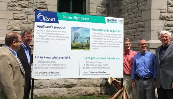
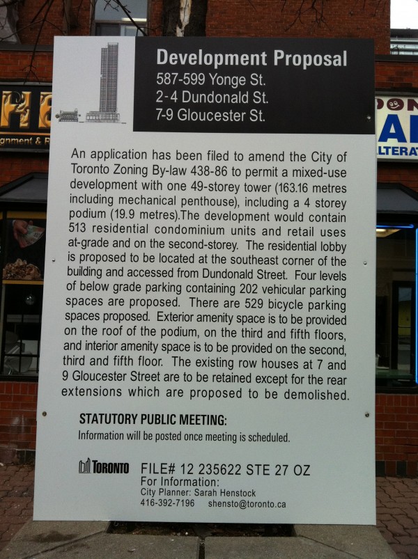
We often lament the lack of citizen engagement in our cities. But the blame shouldn’t be directed solely at residents, but rather at the municipal bureaucracies that often make it difficult for citizens to become engaged or informed.
A great example is our public development notices. Their purpose is allegedly to inform citizens and solicit participation, but they accomplish neither. They are designed so poorly, and filled with so much alienating jargon, they only serve to further disengage and alienate the average person.
Four years ago, I invited Canadian designers to re-imagine what a development notice could look like, as part of the Fourth Wall exhibit. The only requirements were:
- A friendly design. Colourful, attractive, inviting.
- Plain language text, useful and simple to understand.
- A call to action! “We want to hear from you”… “Your voice matters”…. “This is your chance to be heard”…. etc.
The submissions were fantastic, and a sobering reminder of what was possible.
One year later, the Village of Pemberton paved the way for change by redesigning their public notice and they were awarded the inaugural Dazzling Notice Award for their efforts! North Vancouver followed last year. And yesterday, Ottawa Mayor Jim Watson unveiled their new sign along with a larger strategy to “make planning information and consultations clearer, more transparent.”
Later this year, on September 11th, the 2014 winners of Dazzling Notice Awards will be announced at Toronto The Good, hosted by ERA Architects and Spacing. Maybe, one year, my home town of Toronto will win the award. Of course, they’ll need to redesign their notices first….


One comment
Dave, a critical bit of information is if the signage gets more people out to public meetings, and whether that effect lasts–people may come out due to more effective signage, but disengage when they find the process to still be a rubber-stamp consultation.
Do you have any follow-up info for Pemberton or North Van?