
On Monday and Tuesday, the City of Toronto displayed examples of Astral’s new street furniture elements in front of City Hall. For years, I’ve lamented why I don’t like the economic model the City has chosen for the street furniture contract, so I won’t rehash it again. Maybe in 20 years, when Astral’s half-billion dollar contract is up and we can see how much the City got hosed, I can have the last laugh. But I’ll be in my 50s by then, and my sense of humour will have likely changed.
So today, let’s talk about the design and functionality.
On first glance, all the pieces look pretty much like the renderings we saw last year when the City was fielding proposals. My opinion from a year ago hasn’t changed much either — underwhelming. There is a part of me that wants to see killer designs, pieces of street furniture that are uniquely Toronto. There’s another side of me that has seen enough garbage bins and bus shelters from other cities in North America and Europe — simple, elegant and blend into the background of the streetscape — that convince me that over-designing these elements can make the items feel dated really quickly. Astral’s street furniture designs seem to fall in between my two sentiments: they are kinda attractive and kinda boring; kinda unique and kinda generic. Probably my biggest complaint comes from the lack of colour in any of the pieces — this greyness seems to fit the dour mood of city hall finances, which is what originally forced the City to enter into such a crap-shoot of a deal. Sadly, only the bench, poster kiosk, and garbage bins are new and original designs.
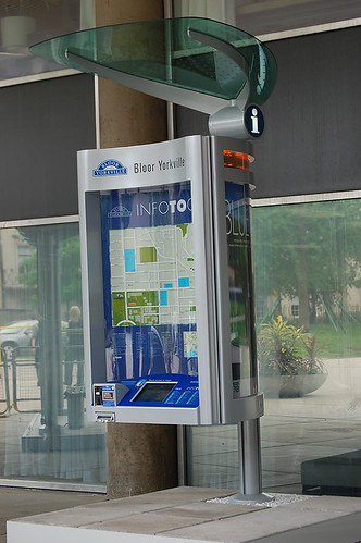
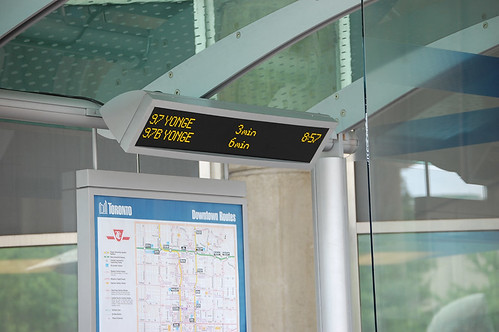
For instance, the info pillars are just a continuation of the barely functional design found on our streets today. According to the City, 60 info pillars will be installed in 2008 and 2009. No matter what anyone says, their main function is to get in the way of pedestrians and push ads, not maps. We can only hope the local map actually faces the sidewalk when finally installed.
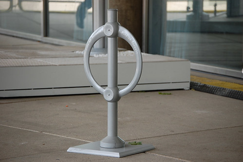
The bike racks are just a sleeker version of our current ring-and-post locks. I love the ring-and-post design — a Toronto original that is copied throughout the world — but what happened to the beautiful U-shaped designs originally proposed? Up to 50 racks will be installed every year from 2008 until 2027 (an amount that is far less than needed).
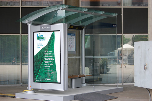
The bus and streetcar shelters are pretty much the same design as the one launched in 1999 with a few minor tweaks: the next arrival will be really useful, but is still a year or two away from being implemented by the TTC. But much like the current design, shade does not seem to be a priority. A slight greenish tinge on the roof blocks a smidgen of sunlight — on days like today with the temperature reaching 30 degrees, shelters should be a place to escape the intense sun. But for the next 20 years, that may be hard to do.
In 2008, 300 shelters will be installed, 200 each year from 2009 to 2018, and another 700 between 2019 and 2027.
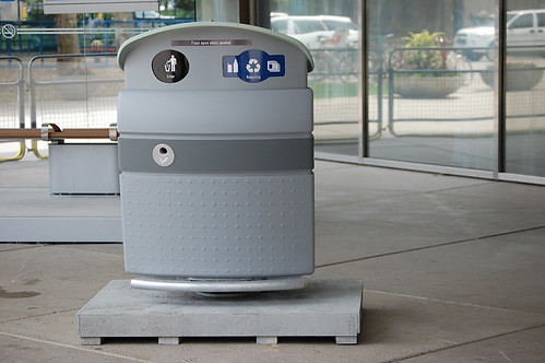
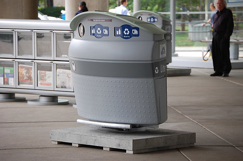
The garbage and recycling bins, from an aesthetic point-of-view, are a tremendous improvement on the tin-box bins now owned by EcoMedia. But the foot push-bar that opens the flaps of the bin is a really bad design decision: it won’t work in the winter when snows piles up or ice forms underneath, nor will it function for anyone who is young or disabled. It may even be a pedestrian hazard for those who pass it on a busy sidewalk. It should be noted that people can still forcibly open the flaps by pushing their waste through the holes. But all in all, this is a much more humble and useful garbage bin than the Monster Bins that graced our streets over the last few years. Jonathan Goldsbie, a Toronto Public Space Committee campaigner, has a good review of the bins on Torontoist.
There will be 1,500 of these bins rolled out in 2008, 2,500 in 2009, 2,000 in 2010 and 2011, 1,500 in 2012, and 200 each year from 2013 until 2027.
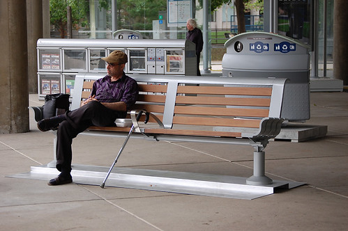
I do like the benches as they are the only element in Astral’s series that uses wood, giving it a much more humane and natural feel. In 2008, 500 will be installed, with 200 more each year until 2012, and 50 each year from 2013 until 2025.
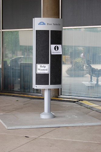
The poster kiosk is an interesting idea that I want to get behind, since my first public space advocacy was centered around the postering issue, but there is a part of me that thinks this will be the one element that will be abandoned quickly. As we’ve seen over the last number of years, postering companies have come to dominate our lamp posts, utility poles, and construction hordings and do not adhere to the bylaws many of us fought to keep in place. I don’t see this kiosk being able to handle all of the posters a neighbourhood or vibrant urban area demands. Anyone that has walked through U of T’s campus and seen the poster kiosks will understand that these structures are abused more so than hordings. Lastly, I don’t think Astral will be able to keep them well maintained over a long period of time.
In 2008, 50 of these kiosks will be installed, with 50 more coming each year until 2017.
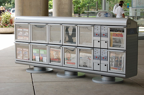
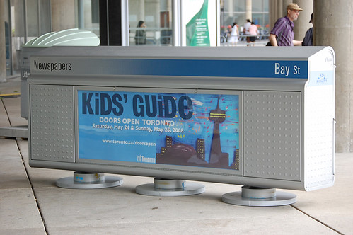
Finally, the newspaper boxes: I’ve been a proponent of these boxes for a while now, simply because I’ve seen too many publications drop a box at a corner with no regard for the pedestrian right-of-way. These mega dispensers will not eliminate all newspaper boxes, but will help stop the Christmas-tree effect that happens when 3 or 4 boxes ring the base of a pole. This is extremely important at busy pedestrian intersections. Something I wasn’t expecting was the back side containing ad space. From everything we’ve heard from City officials, only the info pillars and transit shelters will have advertising components. I was told last year that this ad space will only be used for City of Toronto PSAs and advertisements, but I’m skeptical it will continue to be so exclusive.
So let’s hear what our readers have to say.
24 comments
You’re bang on about the lack of colour. Enough with the depressing grey of oh-so-concrete Toronto! I would have really, really liked to have seen the wood from the benches used as a color and design accent on all of the pieces. Instead of a dark grey stripe on the bins, a wood stripe. A strip of wood to soften the bus shelter. Some flashes of wood on the newsboxes or poster kiosks.
Toronto is a northern city and still has a decent urban forest (except for the commercial streets, which is perhaps all the more reason to emphasize the wood touch). A little Scandinavian to use such wood? Maybe, but it would have been appropriate.
I seem to recall an alternate design for historic neighbourhoods. Has this been abandoned?
I like the old garbage cans (the smaller ones, not the megabins) better. And the toilets are going to be a tough sell because people aren’t used to paying to pee in Toronto.
It’s all pretty hideous, I think. Are they all made of plastic? They seem so cheaply made and tacky. Not at all urban or elegant. What’s wrong with simplicity and functionality? Why does it have to look like a terrible attempt at making an ostentatiously futuristic aesthetic, as though it’s trying to appeal to children or something? It reminds me of a fast food restaurant, or props from some kind of shitty movie. It looks like they tried too hard, and failed, to make a modern, urban look. Maybe it looks better in person, but from what I’ve seen it’s rather depressing that this stuff is going to appear everywhere.
I don’t mind the grey, but I do think the garbage bins now are better. These new ones look cheep and try to hard to be modern.
I agree with most of what you’ve said already. What bothers me the most is the lack of a unique Toronto design for these elements. For such a multicultural city it’s so neutral. Not to say that the identity of a city is all in its street furniture, but they suggest a sort of identity crisis.
I am also wondering about historic neighbourhoods as Luke has suggested. These designs might look quite harsh if set in the older neighbourhoods.
“the lack of a unique Toronto design” people keep saying this but nobody seems to know what it means. I smell a Spacing contest.
The paper boxes are huge and taller than many existing boxes. I actually kind of like the Xmas tree look as opposed to the neat and grey stylings seen here. Is there a smaller version? Some corners just have 2 boxes.
The designs would be appropriate for perhaps College to Queen’s Quay, Yonge to University; Yonge and Eg; Yonge and Shep and some parts of Scarborough, like around STC – the very concrete parts of Toronto. Everywhere else in the city they would stand out as miserable and dull, not just in the historic neighbourhoods.
Uniformity in design is appropriate for cost purposes, and I agree with the previous comments that there are elements of mundane which could be resolved with even strips of wood. But what about trying different colours for different neighbourhoods? This could be a nod to the diversity of our town and help cement our collective appreciation of this multicultural identity. Historically Irish Cabbagetown might have a subtle green colour to its street furniture, Chinatown might have red. Church Street could have rainbow-coloured! 🙂
The point would be to recognize the unique historical and contemporary identities of all the diverse neighbourhoods while suggesting a ‘unity’ of design. I think that captures Toronto’s identity quite nicely.
From everything we’ve heard from City officials, only the info pillars and transit shleters will have advertising components.
Here’s what the contract specifically says: “The Company shall not, under any circumstances, place or permit the placing of advertising on any Elements other than Shelters or information pillars or any stand-alone Street Furniture Elements (e.g. a single Element that is located mid-block);”
Also relevant are these provisions:
“No more than one advertising Element shall be deployed at a given location or Cluster of Street Furniture;
“The Company shall at all times comply with the minimum separation distances between Elements with Caissons and shall not install more than one advertising Element per City block, except in the case of two intersections in a City block or where there is a mid-block TTC transit stop which requires a Shelter;”
What that means is that the washrooms have ads. Scrolling ads, in fact. (I have confirmed this.) And, depending on where they’re located, the multi-publication boxes could have ads, too. Not right away of course. I expect Astral will make good on their promise to showcase local art or whatever for a couple years at least.
I seem to recall an alternate design for historic neighbourhoods. Has this been abandoned?
Yes. None of the three companies proposed anything of the sort. Consideration for specific neighbourhoods will be limited to BIA branding and, in some cases, a different paint scheme (the streetcar shelters in Chinatown, for example, will be red).
What bothers me the most is the lack of a unique Toronto design for these elements.
Especially when you learn that the same designer created virtually-identical transit shelters for both Mississauga and Baltimore.
Is there a smaller version [of the newspaper boxes]?
The Request for Proposals asked for one version with twelve compartments and another with eight. Astral’s original submission boasted that “The system can be ordered in two, four, six, eight and twelve sections. The design enables single two-tier modules to be replaced/repaired without effecting the overall installation.” But judging by the way the design has changed since the original proposal, I am doubtful that the final products will be that varied or allow for that level of flexibility. Until I see otherwise, I’m only counting on an eight and a twelve.
Jonathan> Wow, holy corner pollution. There are so many corners in the city that have just one or two. Does this mean that boxes will disappear on corners forcing people to walk much father to get a paper? Seniors will hate this.
Is it just me or do the arm rests on the bench in the shelter seem to be designed to merely prevent the homeless from sleeping there rather than to rest arms?
I went and sat on the bench and it was fine, including the arm rest.
I don’t mean to sound glib, but I don’t think there is anything wrong with discouraging people from sleeping on benches. They are meant to be used by everyone and not be taken over by a single person. I have lots of sympathy for the homeless, but I don’t think its a problem to make sure a bench is used for what its supposed to be used for: numerous people sitting on it.
Alexander: That’s precisely it. The City’s original RFP asked that shelter “Seating should be configured and design to prevent persons from lying down, while accommodating persons of all sizes.”
Of the benches, it requested that “The design of the bench should deter people from sleeping on them, but accommodate people of all sizes.”
I was mostly saying that the arm rests should function as arm rests. I’m not sure how I feel about the implications for the homeless.
The bench design is reasonably attractive, but it seems very bulky for a lot of Toronto spaces. I wonder if there is a smaller size (e.g. half-size, or without a back) that could fit in smaller spaces? Toronto desperately needs more benches, but this design, while welcome, will only fit in a limited number of places. They’ll need to come up with some alternatives if they haven’t already.
I absolutely hate the bus-shelters. They should have made a simple less bulky design using elements of the bench and the poster kiosk. There should also be a “next arrival” screen facing outside otherwise it will useless for high volume stops.
A sad day for Toronto. Oversized, overdesigned, inelegant. Reminds me of kid-proof Fisher Price, all rounded edges and heavy lines. Uggh. Can’t wait to hear how much visitors hate this crap. Kramer won’t win any more contracts for street furniture with this effort.
Good point about the garbage can’s foot push-bar and the snow – but for the rest of the year, I’ll be happy to not have to touch the filthy garbage flap.
Backless wooden benches would be cheaper, more elegant, and less cluttering than a bench with a back. The benches are for rests under thirty minutes I should think, so a back to lounge on need not be a priority. A further improvement would be to make the backless-bench in four-foot sections, separated by a minimum of two feet. That allows people to move between them, friends to sit close enough, and makes them useless for sleeping without having to include a bolster.
Why is that so easy for me to think of, but we going to have this large thing stuffed onto narrow sidewalks?
Following on from comments about arm rests being actual arm rests i.e. functional for the purpose, those bus shelters look pretty functional as well – beautifully designed to keep the one important object dry at all times and at all costs – the advertisement.
Bus shelters are a myth. They were once real. You know, people used them to shelter from the weather while you waited for the bus. Then Adshel and Astral and other organisations came along, pretending to ‘care’ about people but really just in it to make lots of money regardless of ‘people’ – who have merely become an abstraction in their sight. So the focus shifted from people who use the shelter to advertisements in designing bus shelters.
Astral and Adshel and all the rest don’t care about people. They actively hate people. They only care about keeping the advertisement clean, dry and readable. Bus shelterers be dammed.
A shame that the four individual major newspaper box window frames won’t be traditionally colour-coded. But not for all frames or it would look junky.
I think they are trying too much here. Poster kiosks and the bus schedule at the bus stop are useless as far as I’m concerned.
The garbage bins are monsters, but I think we all agree on that and I don’t understand the paper bins, big or small.
But the thing that bothers me the most is the newspaper bins. The individual ones are so much nicer. They have colors, we know which newspapers belongs to which bins and they are part of the North Americain “design”. I grew up in France and since I came here lots of family and friends have come to visit and guess what, these bins is a one stop for a picture. It’s typical, it’s colorful, it’s fun. Don’t take them away! Those big ones, like the big garbage, the big paper bins, are just TOO BIG. Do we really want to see those things? I already suffocate just thinking about it. But if we’re going for that, I think Kevin Keane had a great view on it.
Oh and, public washroom?!
Its good to see some new designs but I think they should be viewed as prototypes. Some of the designs such as the ‘info pillar’ seem to be over designed and actually look quite ugly with no flowing shape or coordinated design theme. The nicest pieces visually are the Bus Shelter and the bike rack. I cant comment on function as I am not able to use the items.